The User.
Nurses, Doctors, and sometimes Patients.
The Span.
10 weeks.
The Tools.
Sketch and Invision.
The Team.
Yuka Asanuma and Paulina Tsai.
The Problem.
Inside a patient’s room, an alarm sounded. Per routine, a nurse entered to respond, seeing a young boy sleeping peacefully in the bed and the alarm sounding from the stack of IV pumps next to him. The nurse went to check the pumps, a stack of over twelve machines, all hanging off a single rack. Unable to identify why the alarm was going off or exactly which pump was the problematic one, the nurse’s attention turned to the child’s comfort, silencing the alarm as to not disturb the boy. After all, like a baby at midnight, any sort of warning or change in the system could set off its wailing.
Most of the time, the issue was trivial and could be ignored. Unfortunately, as it was later discovered, this was one that could not. How can IV systems better communicate information to medical staff? This was the question that fueled the project.
The Solution.
The Plan
My team was assigned the task by the Seattle Children’s Hospital to discover how an interface could display the Alaris IV infusion system’s information better. The result would reduce problems and potentially save lives. Through 10 weeks of vigorous research, ideation, prototyping, and testing my team developed an interface that visualized the IV data in a simple, accessible, one-stop experience.
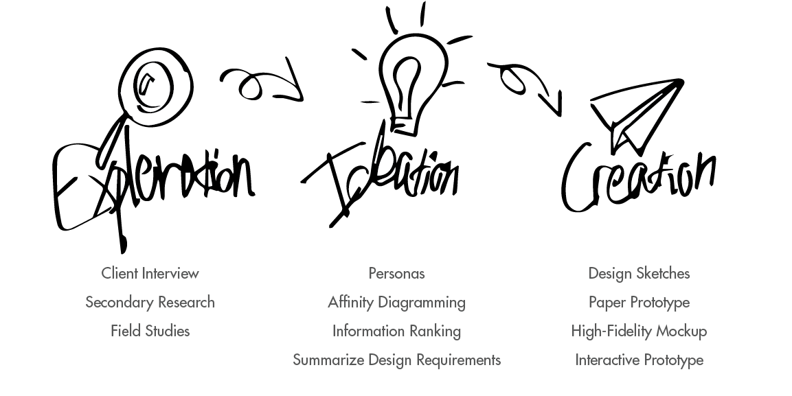
Our process for this project went through several stages:
Exploration.
Client Interview.
The first step was to meet with our client, Dr. Jeremy Geiduschek, the Director of the Department of Anesthesiology & Pain Medicine at Seattle Children’s Hospital. Our goals of the meeting were to understand the problem and to discover our client’s vision for the product. This would ultimately help us define our measurements of success.
At the end of the meeting, the issue was clear. The mass of pump modules and screens for a single patient wasted too much time and hid too much information for a busy doctor. This caused problems with patient care and on occasion had put lives at risk. Our design would be successful if it made looking at the Alaris machines themselves obsolete.
Secondary Research.
After establishing our goals, we conducted secondary research to increase our understanding on the topic and search for information that could further inform our design. For our secondary research, we looked into scholarly articles surrounding the project space first.

We also conducted competitive analysis, looking particularly in three similar products that supported checking the IV pumps away from the location. We were able to procure some design implications but ultimately found that there were no products serving the same purpose as the interface we were designing.
Field Studies.
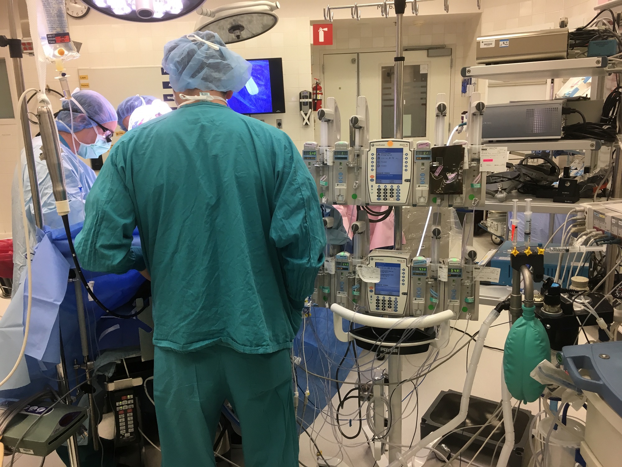
To begin our primary research, we first started off with field observations. We conducted these by observing medical staff interacting with the Alaris IV infusion system in different contexts. Our goals was to see exactly how interactions occurred, how long uses took, what interactions were most common, and more. Our field studies revolved around the Cardiac Operating Room (OR) and the Cardiac Intensive Care Unit (CICU). When the observation period was nearly over, we used contextual inquiry to further develop our observations. With this we had a clear idea on how staff interacted with the Alaris machines, as well as knowledge on needs and pain points.
After processing what we learned from field studies, my team and I wanted to augment and confirm that information with primary users through field interviews. We approached common users, such as doctors and nurses, and asked them a number of questions both regarding what we already knew and also what we wanted to know more about. Our participants ranged from nurses to anesthesiology heads. We used these interviews to better understand our users’ viewpoints so to design from a user-centered state-of-mind. We would also use these interviews to establish our design personas. We also interviewed members of the hospital’s informatics team to understand our technical design limitations.
Ideation.
Personas.
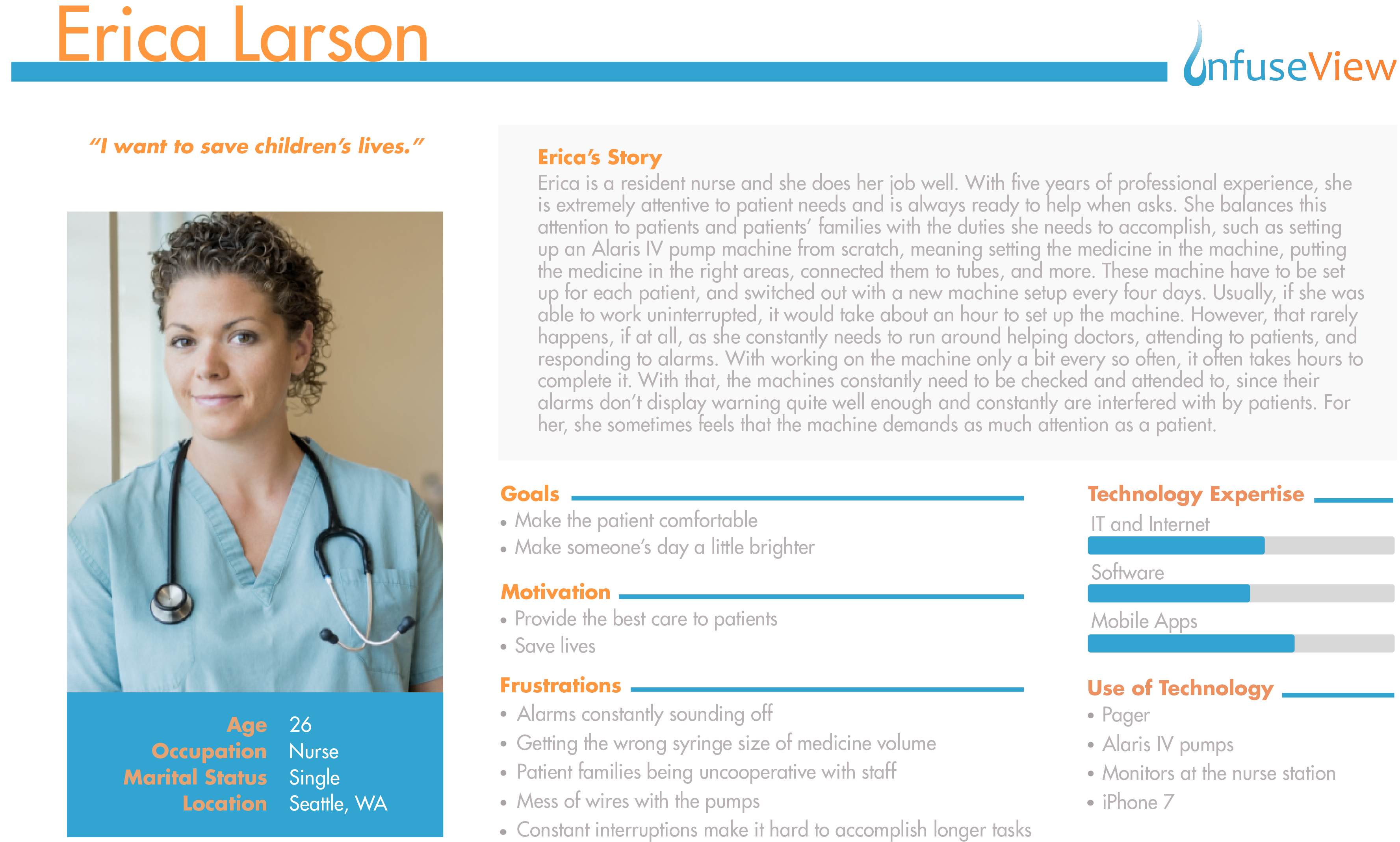
The very first step of our ideation stage was to establish our personas. Personas would serve as the base of our design, our target audience, and the deciding voice in all design choices. We developed our personas based on user-research and our observations from our previous field studies. These personas would include goals, motivations, experience with technology, demographics, their user scenarios, and more. Three personas were created to establish our audience: two primary and one secondary.
Affinity Diagramming.
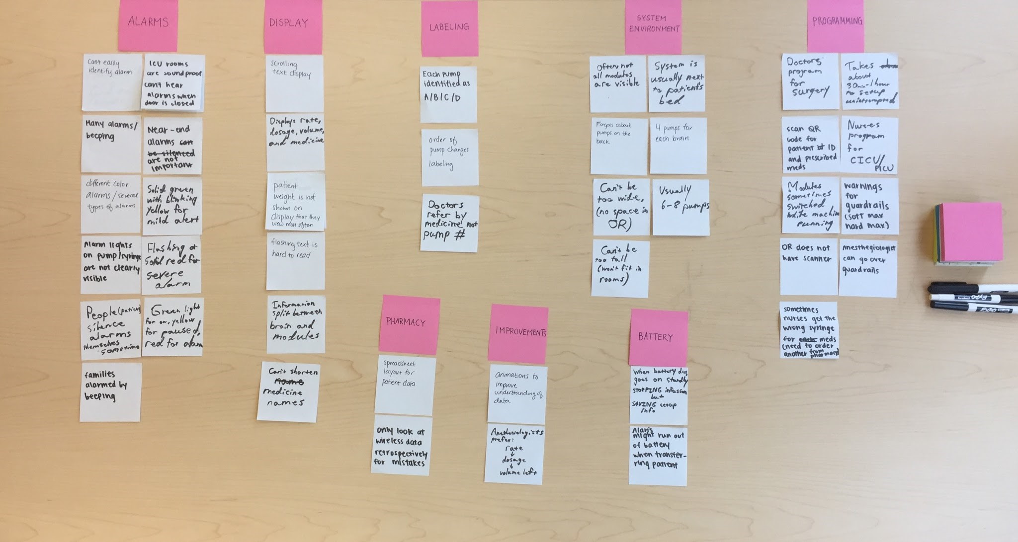
Using all the information gathered in the research stage, we began affinity diagramming. This process was done through each team member writing a need, requirement, or issue on a sticky note. We then would group similar notes together to effectively “brain-dump” what we knew and identify key issues or needs. Through this, we identified major problems in the current alarm setup, while also noting important needs to be aware of. After sorting, we began brainstorming design implications to answer each category.
Information Ranking.
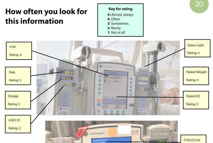
At this point, after understanding the users and the context, we felt that there were some gaps in our knowledge regarding what information doctors looked for on the IV systems. We had to gather qualitative data quickly to continue our design process. Because of our inherently busy target audience, we had to develop a research method that was fast and easy to do, while giving us the information we wanted. To solve this, we developed and sent an annotated image asking to either confirm or correct the ranking, as shown on the right, allowing a quick and accurate way to collect qualitative data.
Design Requirements.
At this stage we compiled all of our information together to create a list of design requirements, each supported with our research evidence. These design requirements would serve as the basis of our design and ranged from contextual limitations, such as avoid requiring touch interaction because doctors and nurses are often wearing gloves, to more specific points, such as prioritizing medicine name and dosage in the display.
Creation.
Sketches.
At this stage, we were required us to transfer all that we learned from our research and ideation into actual reality, while keeping the user in mind. From our research and ideation, we found that we needed three primary elements within our design:
- Each pump module's status view
- Accessible dashboard layout
- History panel
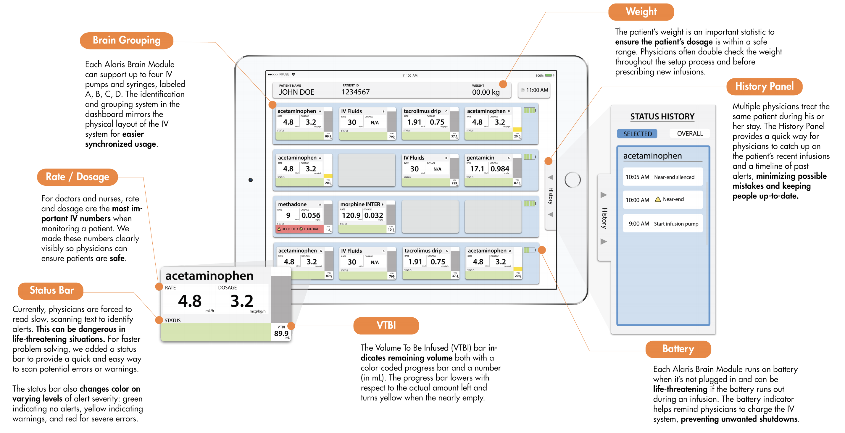
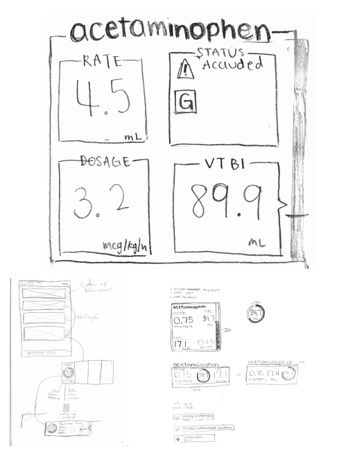
To encourage unique thinking and design, we each separately sketched numerous designs for each element and brought them together for peer review. Each element had its own set of design requirements, and we decided on which direction to move towards based on how well it met those user needs. For example, we chose our final pump module status view because of how easily readable it was in high-stress situations, how it prioritized most commonly accessed information, and how cleanly it presented the data.
Paper Prototype.
Confident with our final design sketches, we compiled them together into a prototype for testing and evaluation. We added pieces of paper to mimic interaction, letting this interface more closely represent our design intention. We envisioned this to be on a portable touchscreen interface, as that would best match our user scenarios as well as being feasible for the hospital to mass-produce.
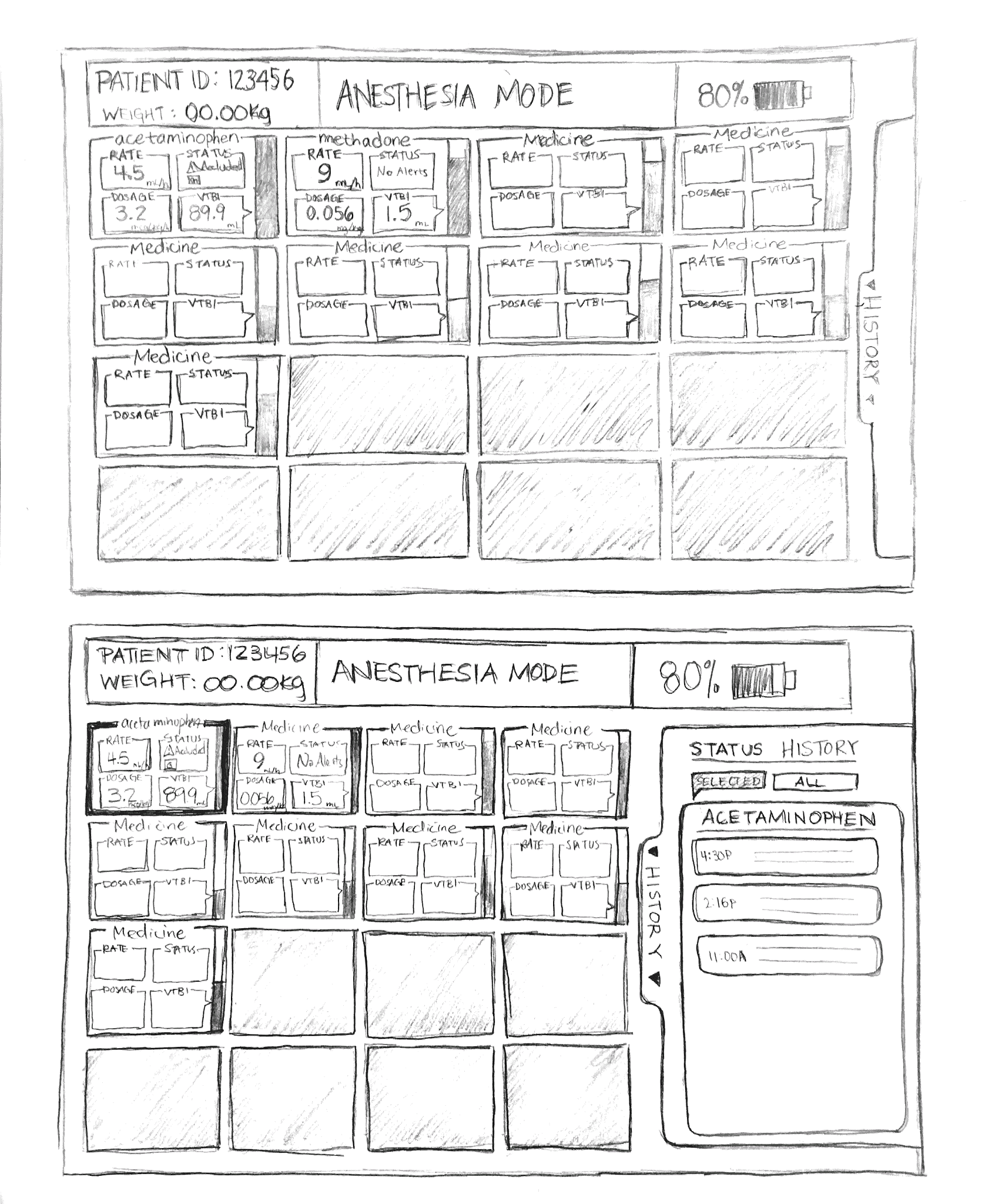
We tested this interface with doctors, so that we could ensure both medical accuracy and usefulness. We also tested it with pre-med students, to ensure it was accessible and intuitive to less experienced users. Gathering what we learned through testing, we were able to iterate to a more final, higher fidelity design.
High-Fidelity Prototype.
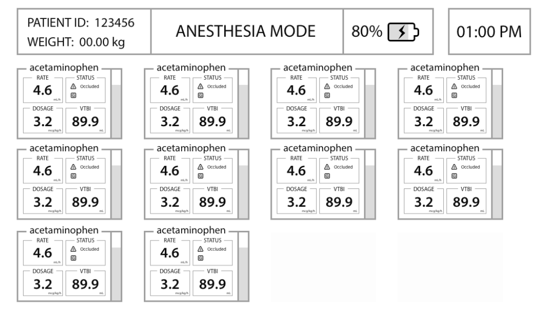
A higher fidelity prototype helped us show our client more accurately what our design is and if it matched their vision, while also helping us further test more detailed aspects of our design. In this process, we began a series of rapid prototypes and testing. We would create a high-fidelity prototype, test it with some users, make changes to it based on feedback, test again, change again, etc. This process continued until we had a design meet and surpassed our client's needs.
Below is one of our first high-fidelity iterations. We kept features low, since we wanted to focus feedback on the layout of the design as well as the readability of the information in the pump module views.
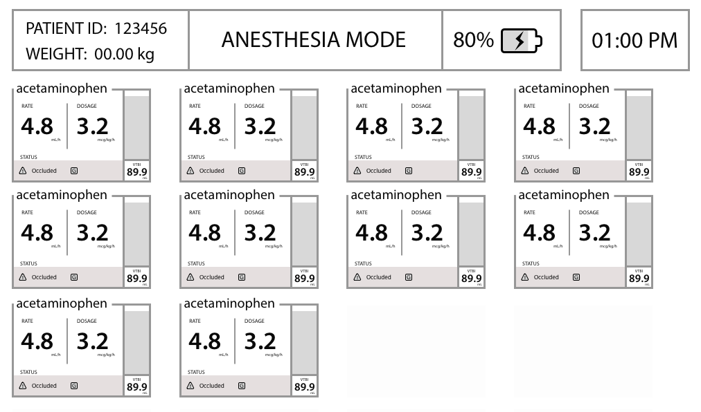
Below is our prototype after the first initial rounds of testing. It shows mostly change in the pump modules, and how we re-examined the visual priority of information, such as the lower priority of VTBI.
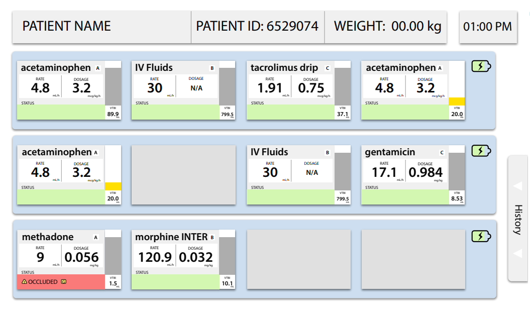
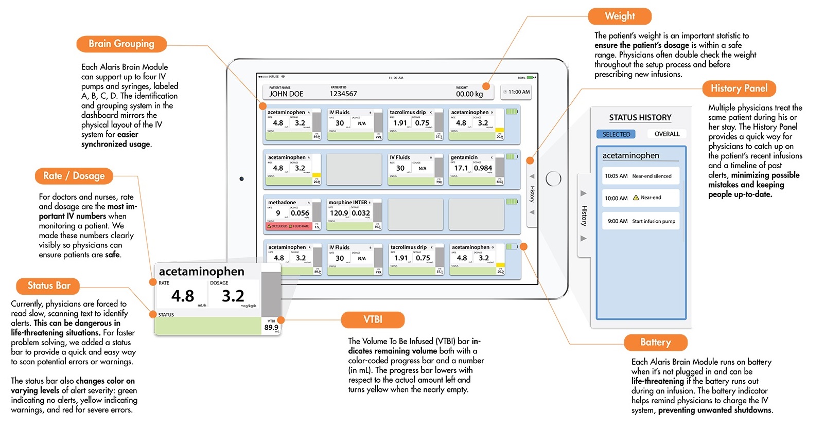
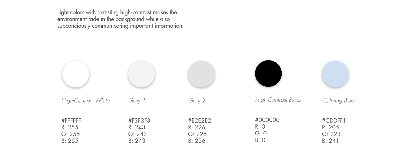
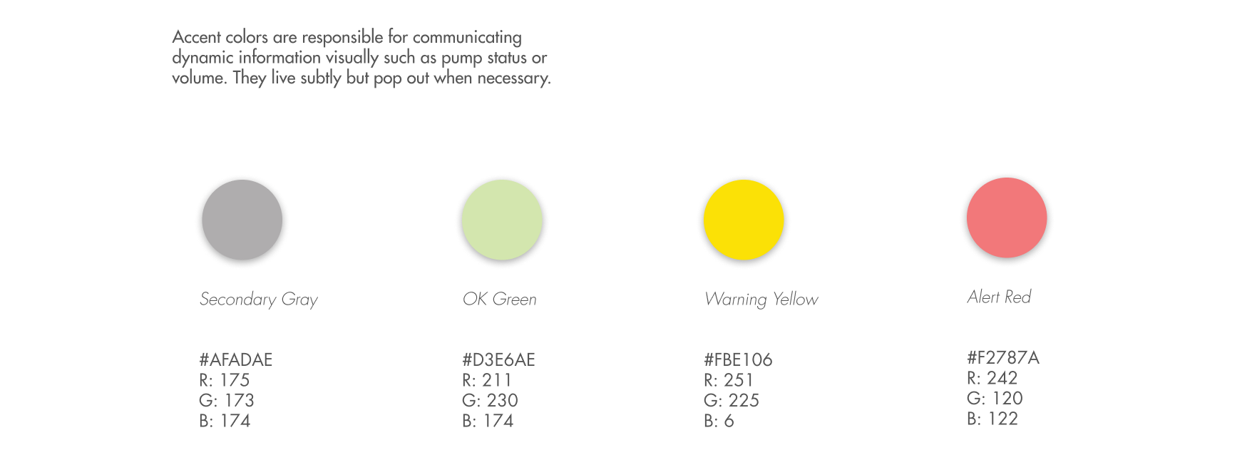
Below represent our final high-fidelity prototype after rounds of iterations. Muted green and blue colors with red accents for alerts were chosen due to our secondary research and user feedback. The module grouping by brain was another result of user feedback from the testing cycle.
Final Design.
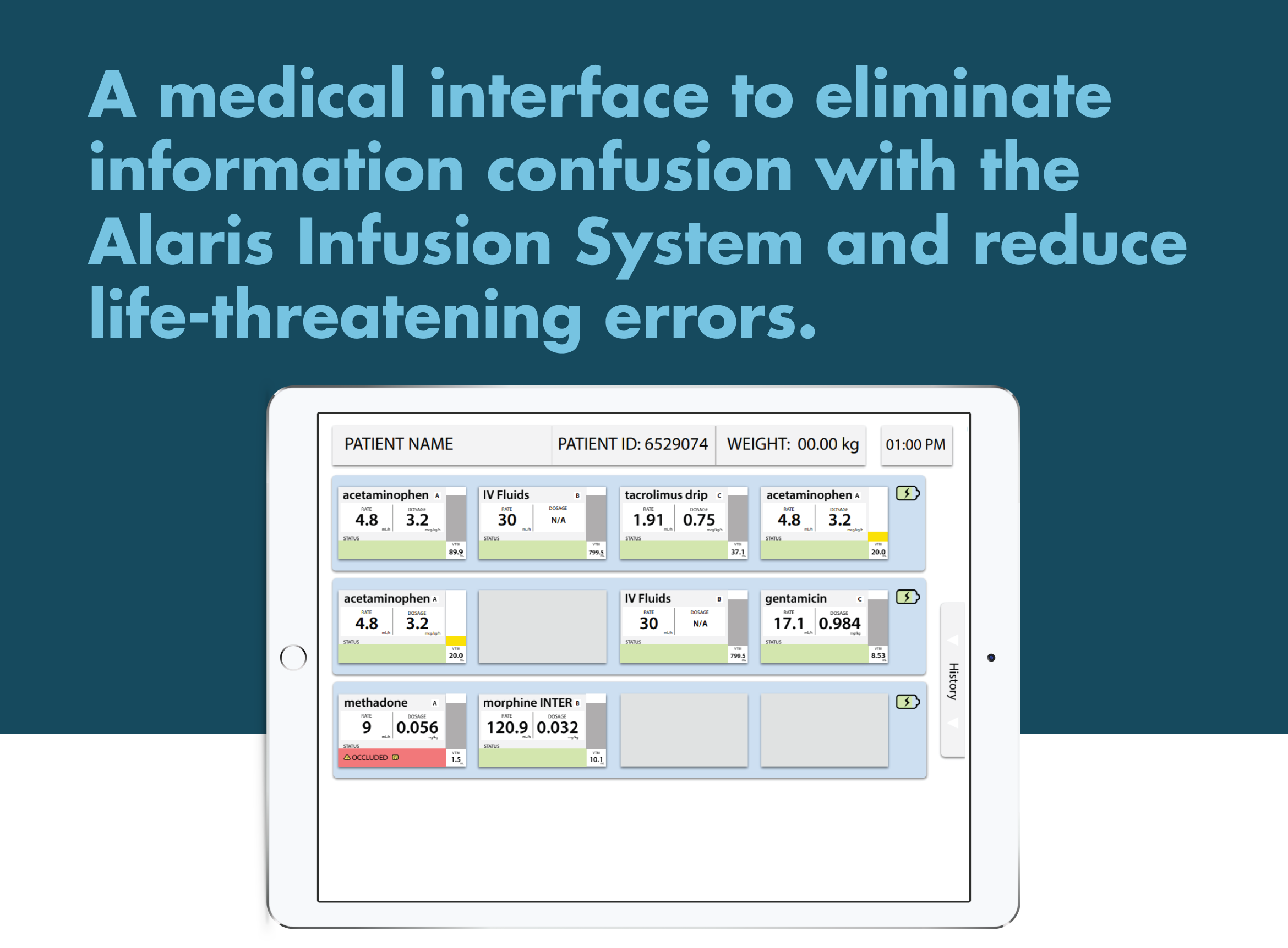
For the final stage of our design, we created an interactive prototype using Sketch and Proto.io. We used this format to represent the final design to our sponsors at the Seattle Children’s Hospital. Our design creates a centralized one-stop hub for the IV pump systems for a patient. A process that might take 20 minutes is reduced to less than a minute viewing on a single clear screen.
Moving Forwards.
Looking back on the design and creation of our design, I can confidently recommend it as a strong interface to solve the problems with IV infusion machines that doctors face. However, there are a few limitations that could be addressed with further work. Currently, the interface can only be used with newer Alaris machines that have wireless communication. Otherwise, it can’t take live data from the pumps. In the future, I would hope to search for a way that the interface could be used widely with different IV machines, whether it was wireless capable or not, or even an Alaris pump or a different brand entirely.
The full design was sent to the Seattle Children’s Hospital innovation team at their request.
Concept.
Layout.
Environment Color.
Accent Color.
Form.

Features
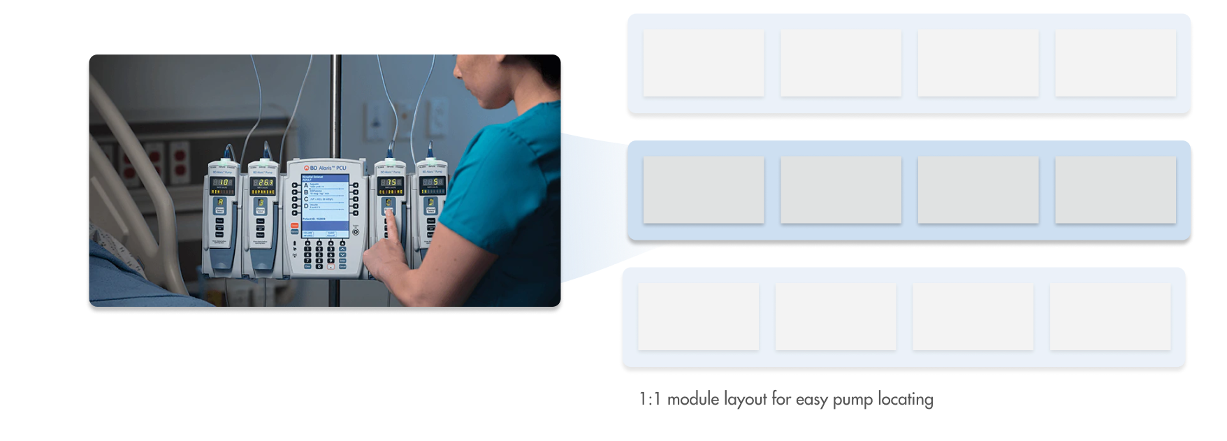
A module-to-brain layout makes it easy to quickly locate which module has issues.
History panel easily shows patient data, without obscuring important information.
Realtime pump information ensures that users are always fully informed.
Color-coded alerts with icons for immedient attention control.
Final Note.
With our final design of InfuseView, we created an interface that reduces a doctor’s cognitive load and helps save lives.
If I had to opportunity to do it again, I would spend more time collecting data from doctors and surgeons, be it through interviews or prototype testing. Though I am confident with the final design we have now, the design process could have been expidited or smoother with more input from those medical professionals, as well as exploring deeper motivations.
This design was sent to the Seattle Children’s Hospital innovation team for development.