The User.
Managers, Experienced employees, First-day employees.
The Span.
15 weeks.
The Tools.
Sketch and Invision.
The Squad.
Chia Hsieh, Gaurav Tamhan, and Peiran Tan.
The Problem.
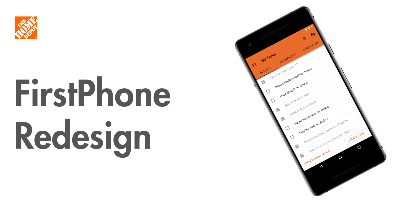
The FirstPhone is an enterprise device used in The Home Depot locations to accomplish various tasks, such as removing products from inventory. However, the amount of apps on the device has accumulated immensely. This has resulted in slowing down employees and making it harder for new employees to learn, resulting in massive time wasted and money lost for The Home Depot.
The Solution.
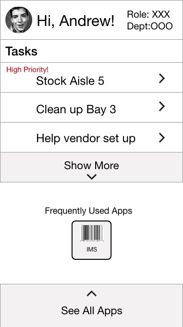
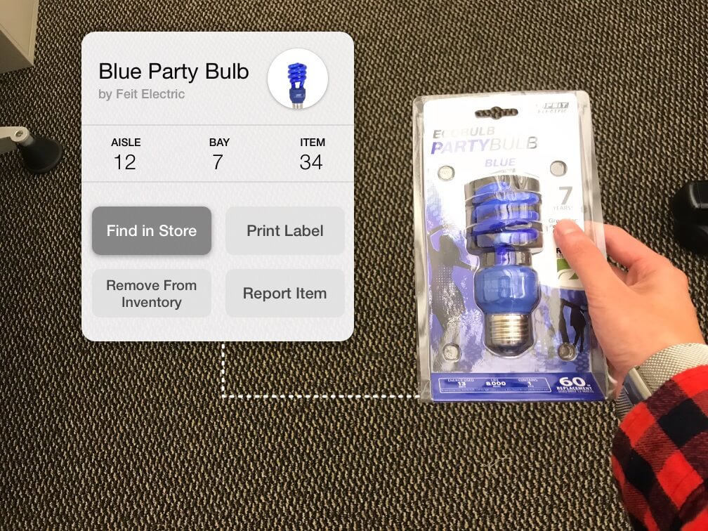
This led to a final experience for our users, where AR was the strongest candidate. Below is an example of a simplified flow.
The Plan.
This project’s goal was to aid our primary users – Home Depot associates – by creating a system that is easy for first-time users to learn and pick up, while also expediting the workflow of experienced users.
When approaching this problem, I first strategized a plan. Though it might change later on in the project, it would be a good way to get everyone on-board and focused.
Based on the problem and user space, the process for this project went through several stages:
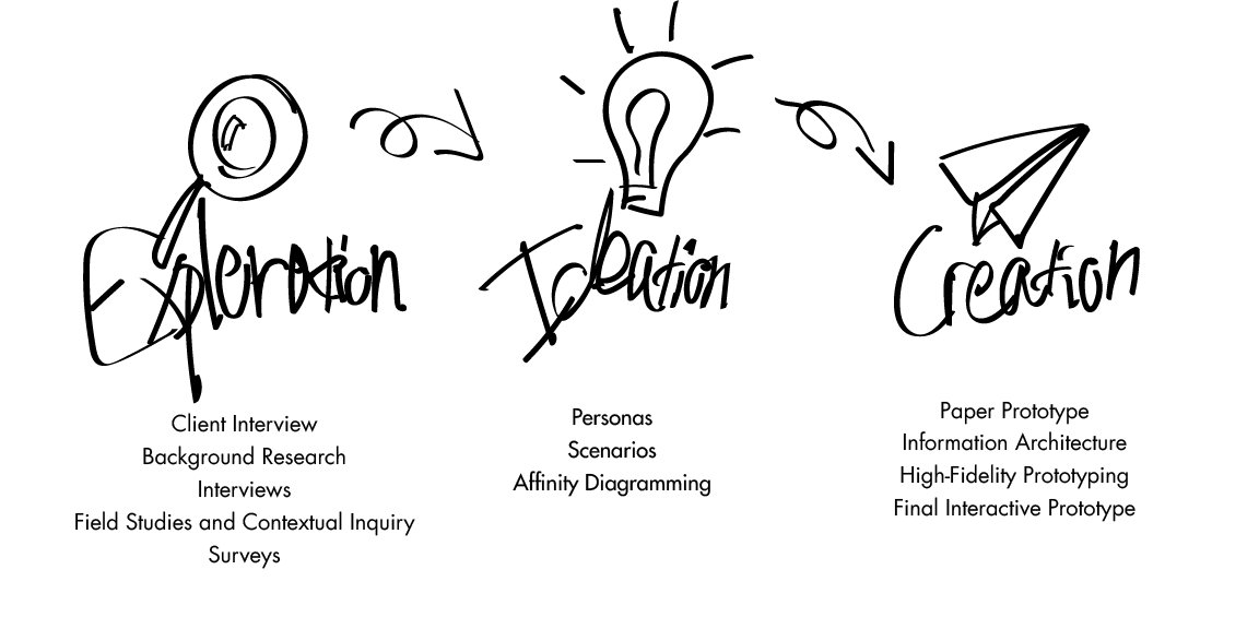
Research.
The project was initially presented to our team by designers from The Home Depot with their big problem statement:

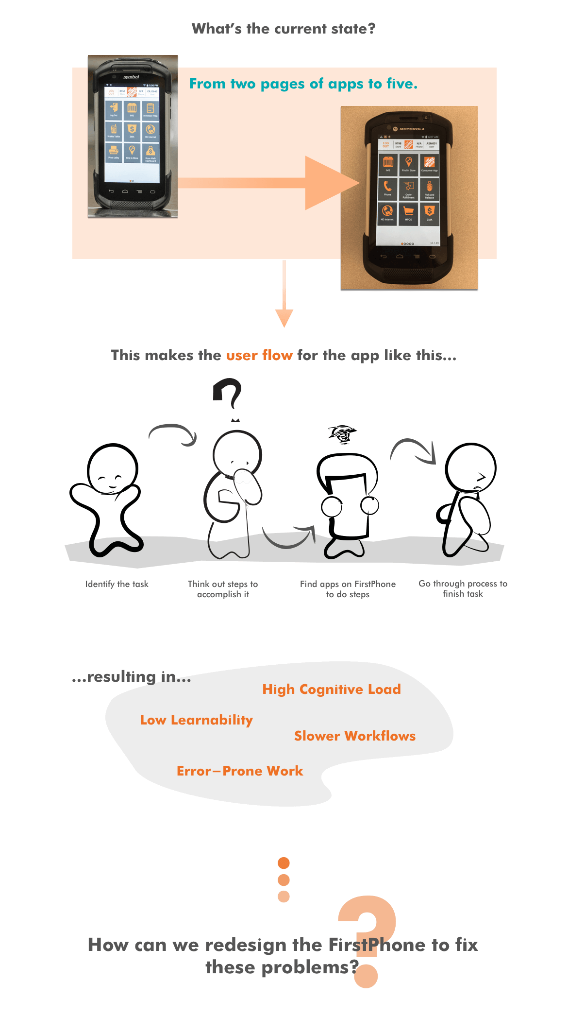
Associates working at The Home Depot stores were responsible for a number of various tasks ranging from helping customers to voiding items from inventory, and they used their FirstPhone device to handle. When the FirstPhone was initially designed, a multiple apps structure may have made sense. Each app could handle a different task, and an app page was fairly recognizable to users, leveraging on their previous smartphone experience. This design was easy to develop, and also easy to expand. Unfortunately, as the roles of associates evolved, so did the FirstPhone.
Eventually two pages blossomed into five pages of apps. It made it tedious for users to remember the purpose of all the apps, how to access them, and more. Hours and hours of training was necessary for an employee to simply learn how to use the FirstPhone. It was a case of conventional design trends backfiring.
The FirstPhone had up to nearly forty apps to scroll through, each with a specific purpose. However, many of these apps would never be touched by most employees.

Background Research.
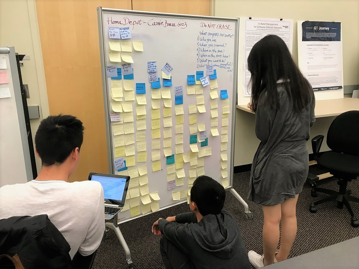
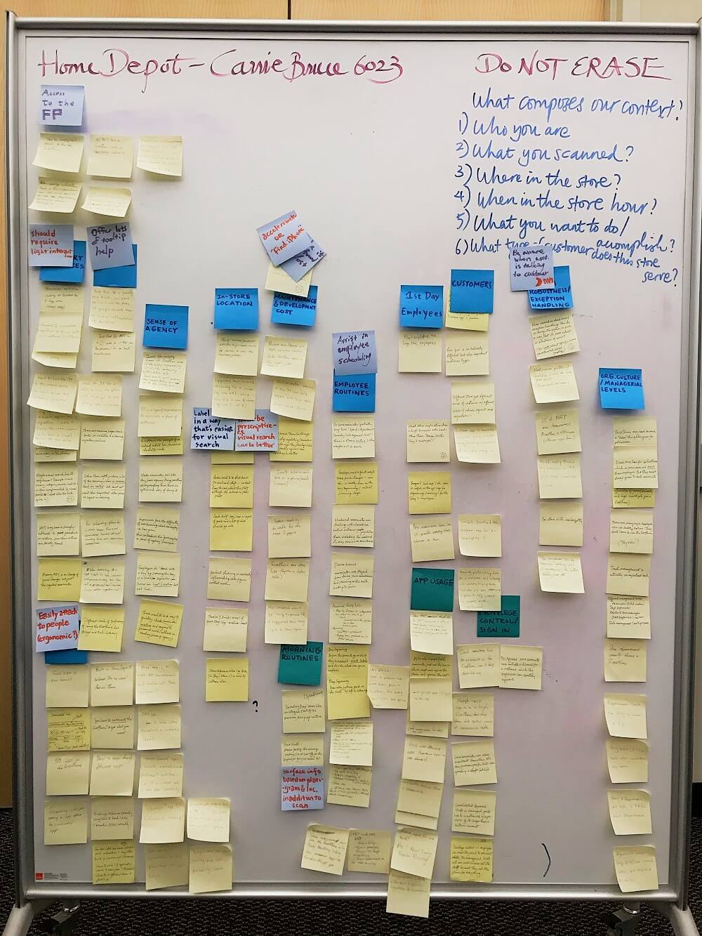
To get a picture of the problem area, we started out with doing some background research. I interviewed The Home Depot UX designers and looked up FirstPhone materials online. We also obtained a list of current apps on the FirstPhone, which helped clarify the main problem of having too many apps on the device.
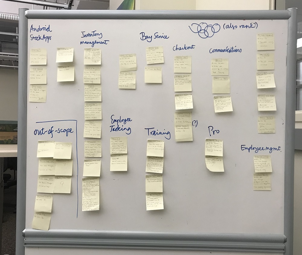
To dissect exactly what functionality was on the FirstPhone, we wrote down the name and function of each app, as well as which role uses it on a sticky note. We sorted these notes into similar categories so that we could easily uncover relations and overlapping functionalities.
Here we found an interesting fact: many apps accomplished the same goals, but just in different ways. Boiled down, the functionality of the FirstPhone could be reduced down from 40 to around 10 purposes.
This research was really helpful in giving us a scope of the problem, and set us up in thinking of what we wanted to learn from our primary users.
Interviews.
I reached out and set up a number of interviews with our primary users at The Home Depot locations.Interviews allowed us to confirm existing information from the industry contact and secondary research, and to catapult us into thinking in context of the store employee’s day-to-day work life.
For this, our primary goals were to:
- Figure out the current flow of The Home Depot associates when using the FirstPhone.
- Understanding the context and cognition behind when using the FirstPhone.
- Understanding frustrations and motivation related to the role.
- Day-to-day operations and practices.
- User demographics.
For a better understanding of the flow, we did ethnographic field observations, with follow-up contextual inquiries if we needed a deeper understanding on anything we saw.
In general, we found a user flow for an associate would be like this:
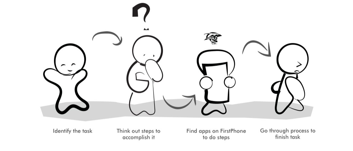
However, many usages of the FirstPhone often deviated from their intended usage, being “hacked” to work the right way. For example, an employee needed to print labels and knew of four different apps that had the ability to print them. However, the one he used was meant for a different role, but he chose it because it could print labels through fewer steps. Associates often had their own workaround methods to accomplish a task, purely learned from either experience or co-workers.
Surveys.
Having completed our background research and spoken with a few in-store associates, we had a pretty good idea on current problems and behaviors related to the FirstPhone. To solidify our data, I pushed for us to confirm our findings with a larger audience, and the best way to reach a large audience with our resources was through an online survey. Fortunately, we had access to over 200 Home Depot employees through an online reddit page.
Surveys provided us with metrics that allowed us to reaffirm our research, and provided us with definitive backing as part of our evidence-based design process.
In our survey we wanted to see:
- What functions were the FirstPhones mostly needed for.
- How many apps are actually used by the user.
- Ease of use of the current FirstPhone.
- Key aspects users value in their work.
Our findings from the survey were pretty telling that the FirstPhone could be greatly optimized:
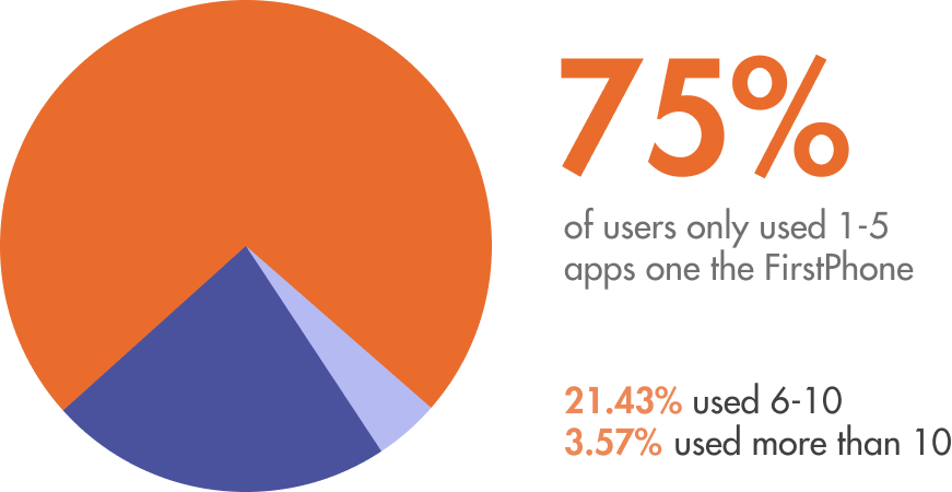
Only 1-5 apps are used by 75% of The Home Depot employees.
With over forty apps, only a few are used consistently for mostly inventory management purposes, such as printing labels, seeing item details, and adding/removing items from inventory.
Speed and accuracy are the primary working values.
With customer interaction as the primary job for most The Home Depot associates, completing various tasks with speed and accuracy is extremely important, something that the FirstPhone does more to hinder rather than assist.
Fast for seasoned associates, slow for new.
The Home Depot associates are generally split in two groups: seasoned veterans and day-one employees. Seasoned veterans have figured out methods to use the FirstPhone quickly, while day-one employees encounter a huge learning curve.
Personas.
From our research findings we derived three personas and their respective working scenarios. This allowed us to understand and remember each one of our users, while also using scenarios to note how they completed their goals at Home Depot and what they valued from systems helping them. Our design would need to improve their working process from the scenario, without drastically changing it and forcing people to relearn a new complex system.
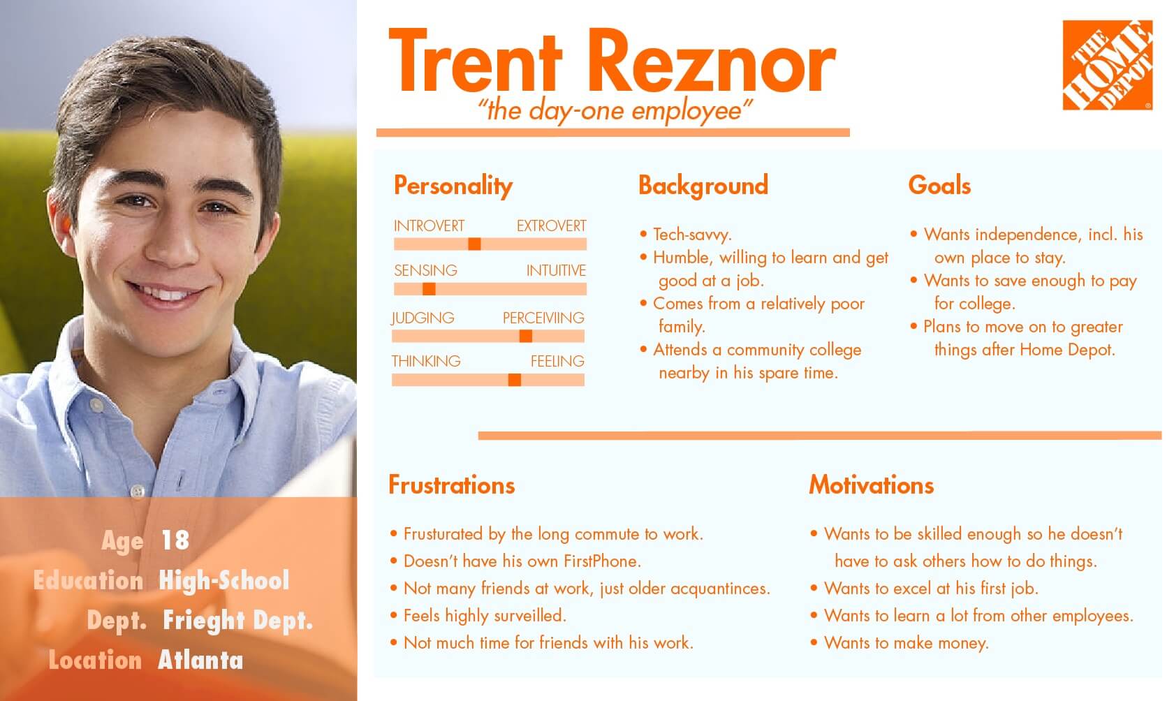
The Day-One.
One primary persona. The Home Depot employees are generally split between veterans and day-one employeees, who are usually younger but have a lot to learn fast.
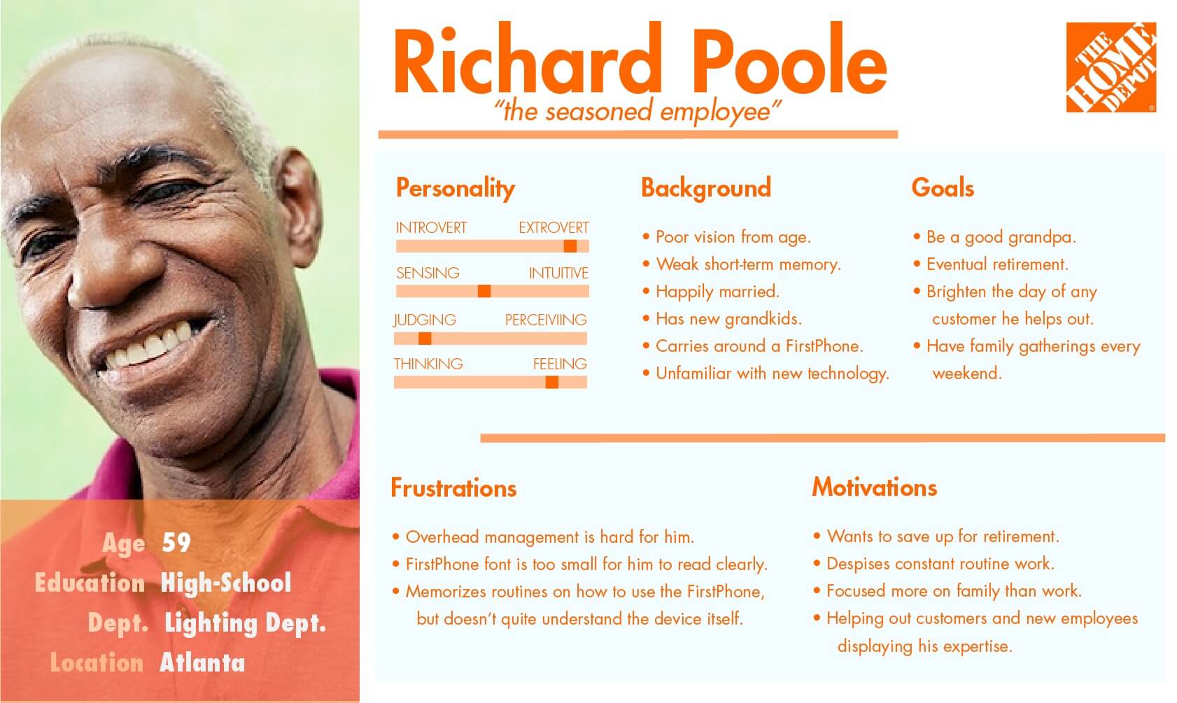
The Veteran.
Lots of accessibility problems, but efficient and knowledgable. They can use the FirstPhone well primarily off of hacks or muscle memory.
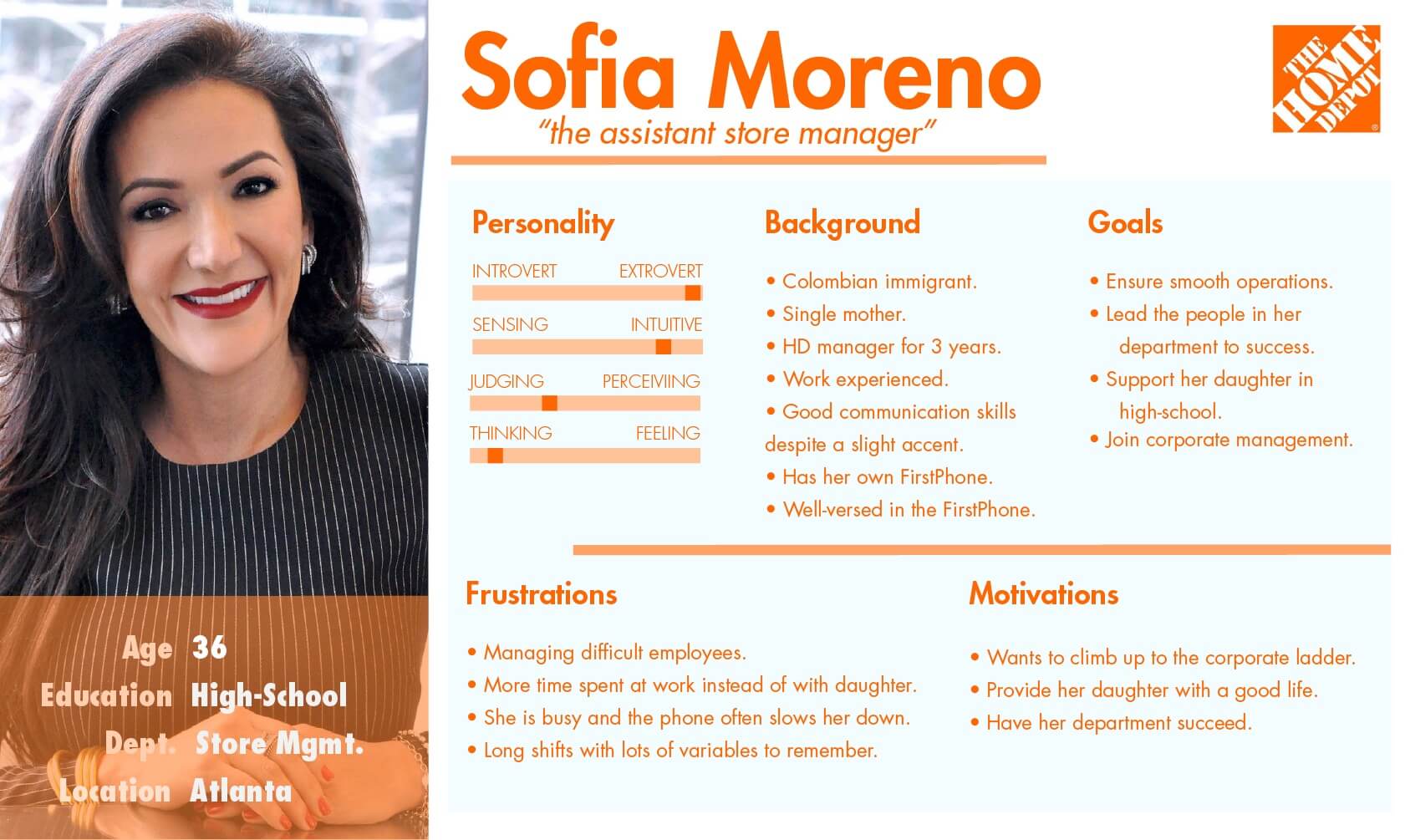
The Manager.
Ocassionally uses the FirstPhone for management, but focuses most of her attention on making sure everything is running smoothly in her department.
Affinity Diagramming & Principles.
To analyze all the information we gathered thus far, we each wrote down snippets of data onto sticky notes. We then conducted an affinity diagramming session where we organized data points into similar categories, and then wrote category titles for each group. This was extremely useful for us for aligning all our thoughts and getting a comprehensive view of our research into a single view.
For each category, we each independently wrote possible design implications on separate sticky notes and attached them to the relevant categories. We then reconvened and went through each possible design implication, going through the feasibility and the justifications for each point. Based on our personas, we ensured that each design implication was positive for each of our personas.
I love starting concepting with principles of design. So we converted these design implications to guiding design principles:

Efficient
Efficiency is the key focus of both associates and The Home Depot itself. Our design needs to support fast workflows.

Accessible
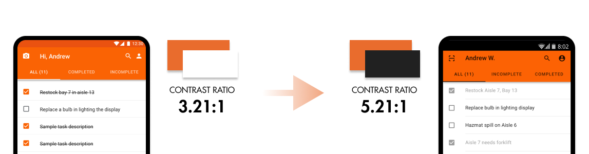
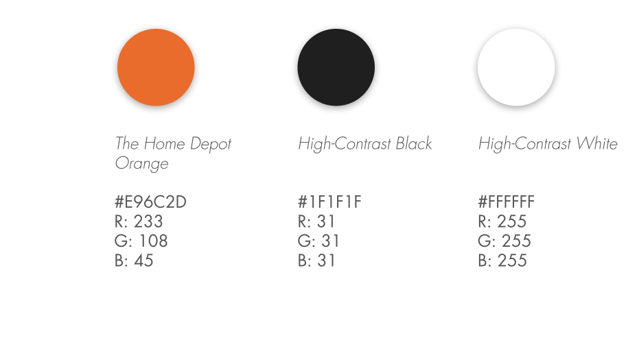
Lots of users are old, and lighting can sometimes be dim. Our design needs to have high contrast and understandable even to the non-tech savvy.

Customer Focused
A primary interaction for associates is helping customers. Our design needs to aid in fast and professional customer interactions.

Pervasive
Currently, one FirstPhone might be shared amongst four or more employees, leading to huge slowdowns when waiting for an available FirstPhone. Our design needs to be pervasive to be used by anyone at any time.

Intuitive
A huge portion of associates are “day-one employees”, and need to learn the new system. Our design should be intuitive enough so the employee can focus on their job rather than learning a tool.

Personalized
Associates often fail to switch to their own accounts on the FirstPhone due to lack of awareness or to save time, leading to lots of corporate issues. Our design should make this fast and simple while offering personalized benefits to the user.
At this stage, we realized to provide the best user experience moving forwards, we needed to rethink the way approached tasks with the FirstPhone entirely.
Design.
Concepts.
Using all our information gathered, we sketched various concepts that rethought the approach on how someone would complete tasks with the FirstPhone, while meeting our principles. We narrowed it down to three designs, which of we made low-fidelity wireframes. We brought these into focus group meetings with The Home Depot associates for testing.
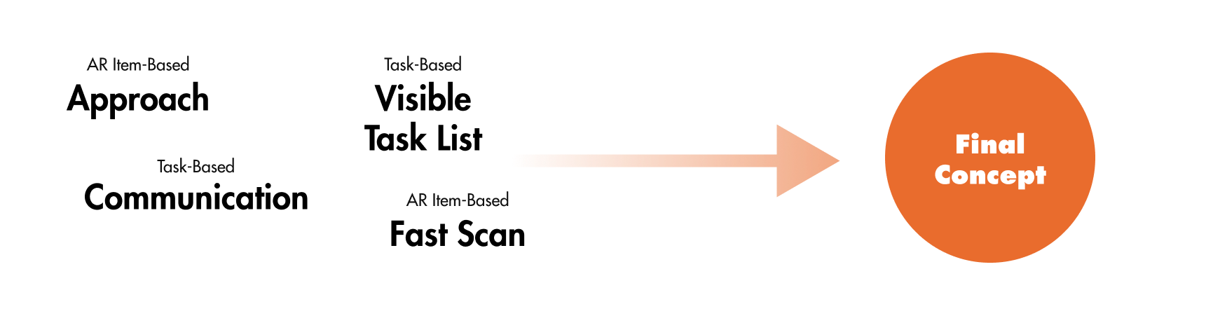
Our three concepts were a task-based design, a process-based design, and an AR item-based design.
Task-Based Design.
The task-based design focused on the user flow of users starting from a task, and seeing associated apps that they could use to complete the task. This concept’s goal was to change the thinking from “which app do I use to fix this problem” to a simple “which task do I complete”.
Process-Based Design.
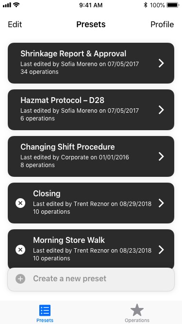
The process-based design was inspired by the fact that many employees had their own process of doing things. It removed the concept of apps and simply had “functions”, such as scan an item. Users could chain functions together to create their own processes.
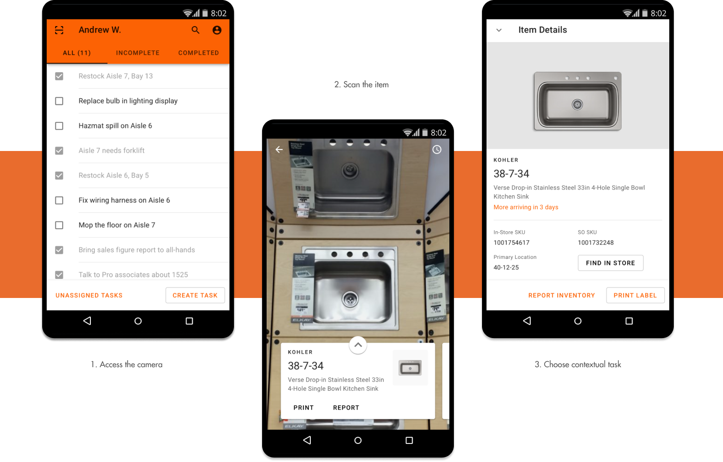
The AR Item-Based Design.
The AR item-based design came from a more “scan-to-start” idea, where the user would start with the item first, instead of thinking how to find an app to pair with an item. Users would simply point their camera at a product, and a list of relevant tasks to be done with the item would appear. This concept emphasized simplicity and context-aware actions.
From our testing, associates liked the AR-based design the most with the item-based approach and the quick interaction, with the focused tasking and communication part of the task-based design. We combined winning ideas from each concept into our final design.
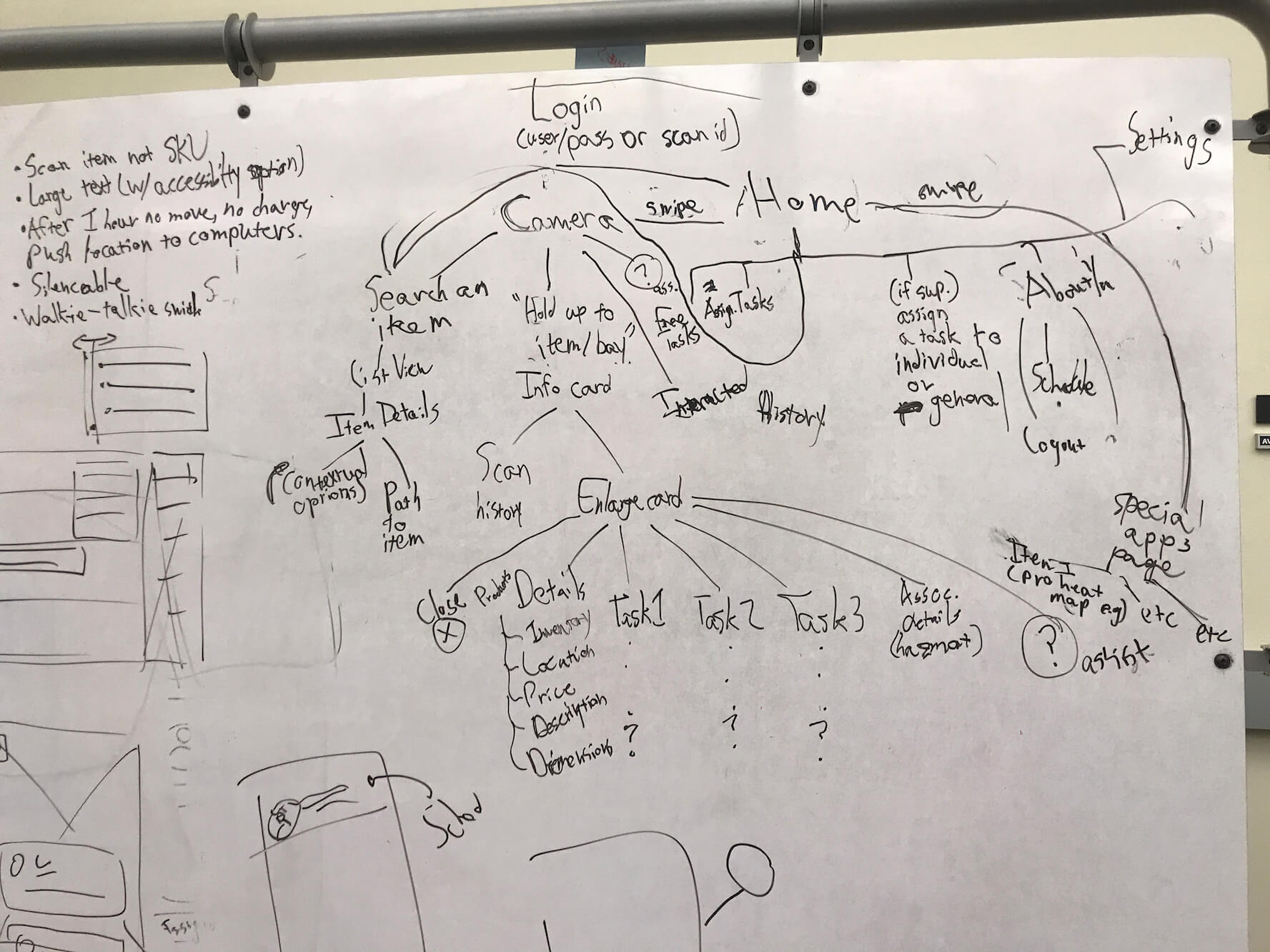
IA & Prototyping.
To convert the concept to a design, I led my team in iterating an information architecture. This was important to show the overall structure of our system, ensured that it was understandable to users, and that it included all our necessary functions.
We focused on our principles while developing the information architecture, and made design decisions based on them, such as ensuring each feature was close in hierarchy to the home screen.
We presented this concept to The Home Depot associates during our second round of testing as a high-fidelty interactive prototype, allowing them to get a better feel of what the finished product would look like and so we could get valuable feedback and iterate based on that.
Evaluation.
The final iteration of our prototype encompasses everything we learned from our user testing with Home Depot store associates, supervisors, and assistant store managers.
Our design addresses the main problem by retooling how associates would approach a problem. Currently, associates would have to identify an issue, choose the correct app from memory recall, and follow the steps within apps that are inconsistent and unique from others. Through this, work experience becomes the key to a successful associates, after braving a field of trials and errors. Our design instead approaches issues from an item-based standpoint. Associates would first scan a product and then identify a task they want to accomplish through the design. This would make it easier for day-one associates to learn the process, and experienced associates to accomplish tasks faster.
We built a final interactive prototype with Sketch and InVision and brought it to Home Depot UX designers and store associates for a final round of validation testing. Below are some quotes from both The Home Depot designers and store associates.
Amanda, 3 year Store Assoc.
"It's very streamlined and easy to figure out...it covers everything I can think of."
Bill, 5 year Store Manager
"It's pretty straightforward...the tasking is one of the most important features I've seen."
Kristin, Senior UX Designer at The Home Depot
"A much simpler flow...the tasking feature is really cool, there's a lot that could be built on that."
Shaun, Store Ops Manager
"The AR is cool for both the customer and the employee. I think it would be really easy to use if I'm day-one. I would 5/5 use this design."
Derrell, Lead Designer
"Clean and simple."
With the Home Depot designers, our design fared extremely well in how it restructured the employee workflow. They also liked the aesthetic design and consistency. However, parts of our design still needed to be improved, such as including providing more error prevention and designing a clearer visibility of system status. These factors were extremely important for us to consider, with the large portion of the user group would not be intuitively familiar with new technology.
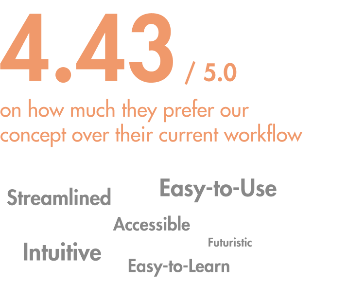
With the Home Depot store associates, we had them accomplish tasks with our design and took note of metrics such as time to complete task and amount of errors made. Some users did have some confusion regarding the AR concept and were lost in the pages. However, users accomplished tasks much faster with our design, as opposed to the traditional FirstPhone and day-one employees especially found it much more intuitive to use. The response was overwhelmingly in favor of our new redesign.
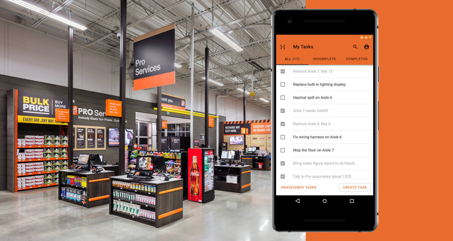
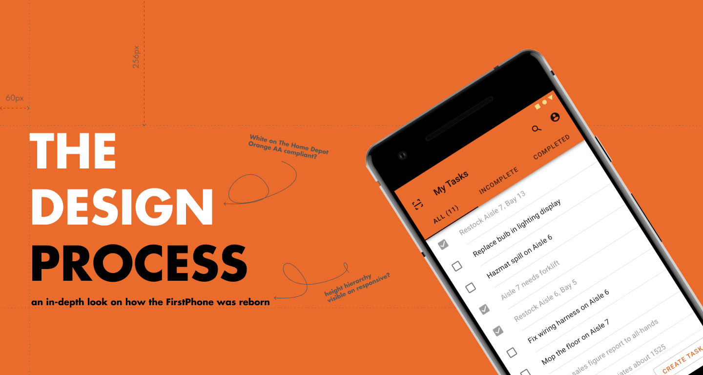
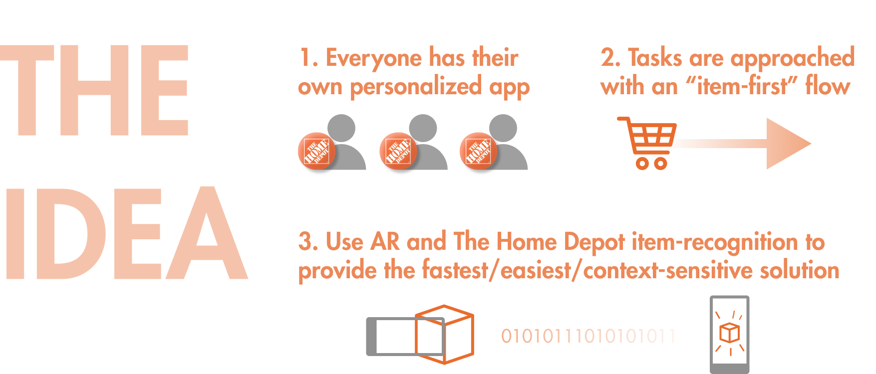
An augmented-reality solution that pushes context-awareness and intuitiveness, with a focus on tasking and a revamped workflow that approaches problems from a "product first" user flow.
Concept.
Color.
Typography.

Material.
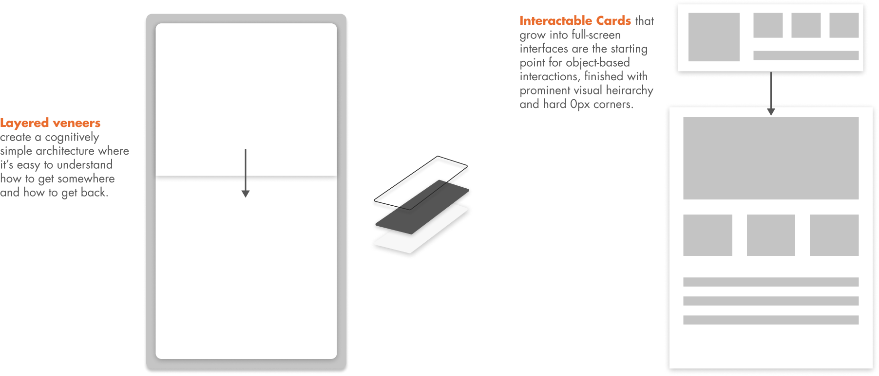
Experience.
All together now!
Other Features.
Login with a single badge tap, reducing frustrations with FirstPhone handoffs.
Search simply, with results that help customers and associates.
Easy employee tasking with feedback and permission control, improving efficiency and communication.
Final Note.
This project was extremely interesting to dive into a specific enterprise tool for such a vast user base. The study of a role with such extreme flexibility and how the result of following conventional design trends ballooned into something nearly unsuable really expanded my line of thinking.
Moving in the future, it would be insightful to see how well the design could extend as the responsibilities of a The Home Depot associate evolves, as well as its fidelity when instant object recognition improves.