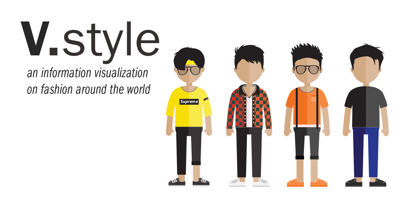
An information visulization system built for the fashion-curious in the world.
Visual representations of styles for easy scanning and discovery.
Timeline scanning to see how styles evolve over the year giving advanced insight on fashion trends and differences.
See exactly the source of the data so users can see live world examples of styles.
The User.
People concious about styles and fashion.
The Span.
10 weeks.
The Tools.
Sketch, HTML, CSS, JavaScript, and D3.
The Team.
Yujia Wang, Yizhou Liu, and Yuan Zhou.
MY CONTRIBUTIONS
I contributed in interpreting how the data from the dataset could be interpreted, as well as identifying what users would value from this visualization.
I also did exploration of what was technically feasible, and was responsible for a large part of the frontend and backend development.
intro
People wear clothes everyday. As well as for practical reasons, it is also a way for people to show personal identity and an important part of culture. Every culture, or even every city has its own clothing style at certain time of the year. This information visualization system aims to capture and present style trends of cities worldwide at different times of the year and enable users to explore and get a better sense of worldwide clothing trends for inspiration.
To create this system, we coded it with D3.js and were limited by an open-source dataset from Cornell University, which contains over data from over 27,000 pictures from Instagram taken in 44 major cities worldwide.
USER RESEARCH
Before designing, we wanted to better understand our user and what they would look for. Due to the nature of the data, we wanted to identify how people interested in fashion would use large amounts of data to inform their decisions. The main audience for our system ended up with people interested in personal fashion and curious with the fashion styles of other countries compared to their own.
At first, we devised a survey asking users on what information would they want to get out of a dataset with these various features of data. We quickly learned that this method was not very useful, as it was hard for users to find value in non-formatted data. From this we discovered that we not only had to design the interactions for exploring the dataset, but also provide and present specific points of the data for it to bring value to users.
In our next iteration of research, we instead presented participants with a range of choices on narrowed down aspects of the dataset they would like to see, such as “I would want to see what clothes people in Germany wear in the fall”. From this, we were able to better identify what information our primary users wanted to see from this dataset.
At the end of this phase, we identified a few primary questions that users would want answered when approaching this dataset:
- What are the different styles in different areas?
- What patterns in worldwide style trends occur over time?
- How do styles compare between different countries?
- How can I inspire my own fashion choices based on what I learn?
INITIAL DESIGNS
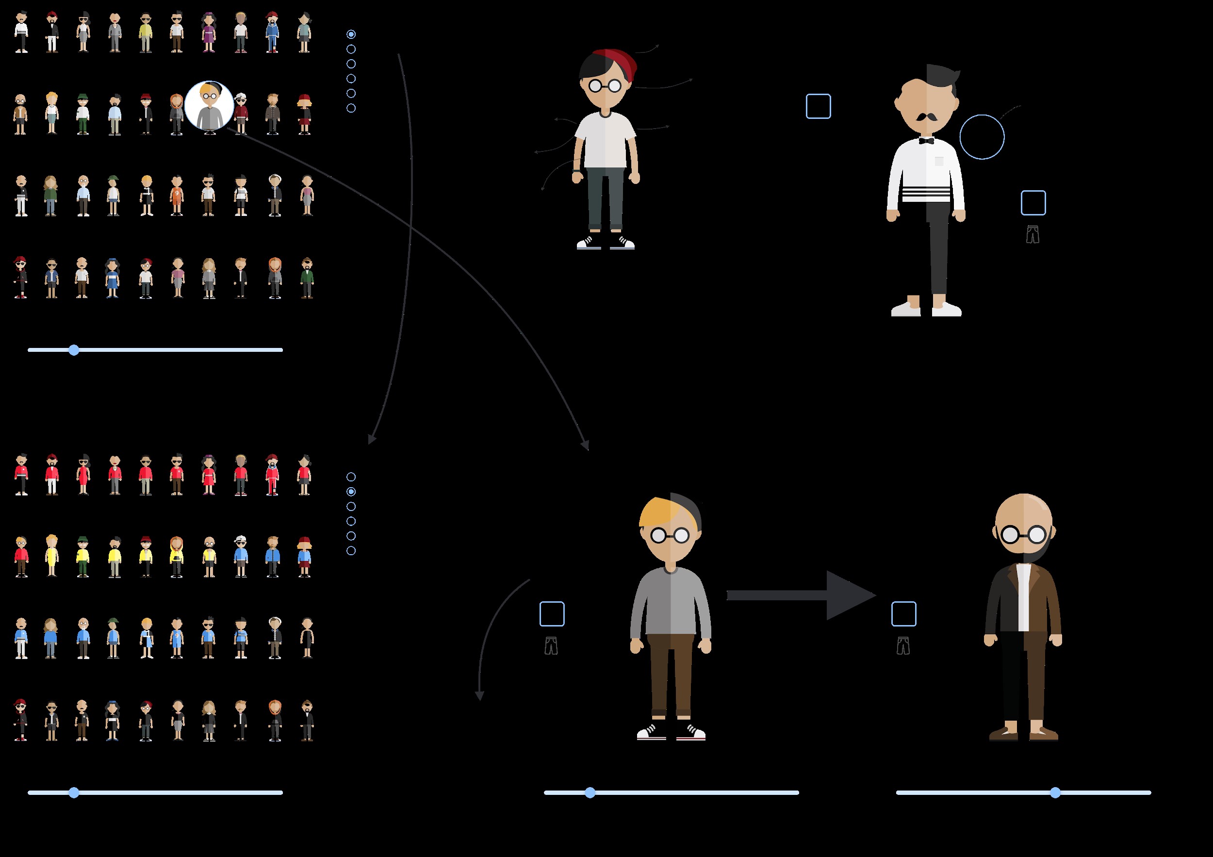
For brainstorming on how to address our identified questions, we first began by individually sketching out our own designs to solve our goal. We focused on designing out how we would visualize the information, and then created rough high-fidelities to communicate our ideas. We took these concepts and introduced them to lots of people for general feedback. Below are our initial design interations:
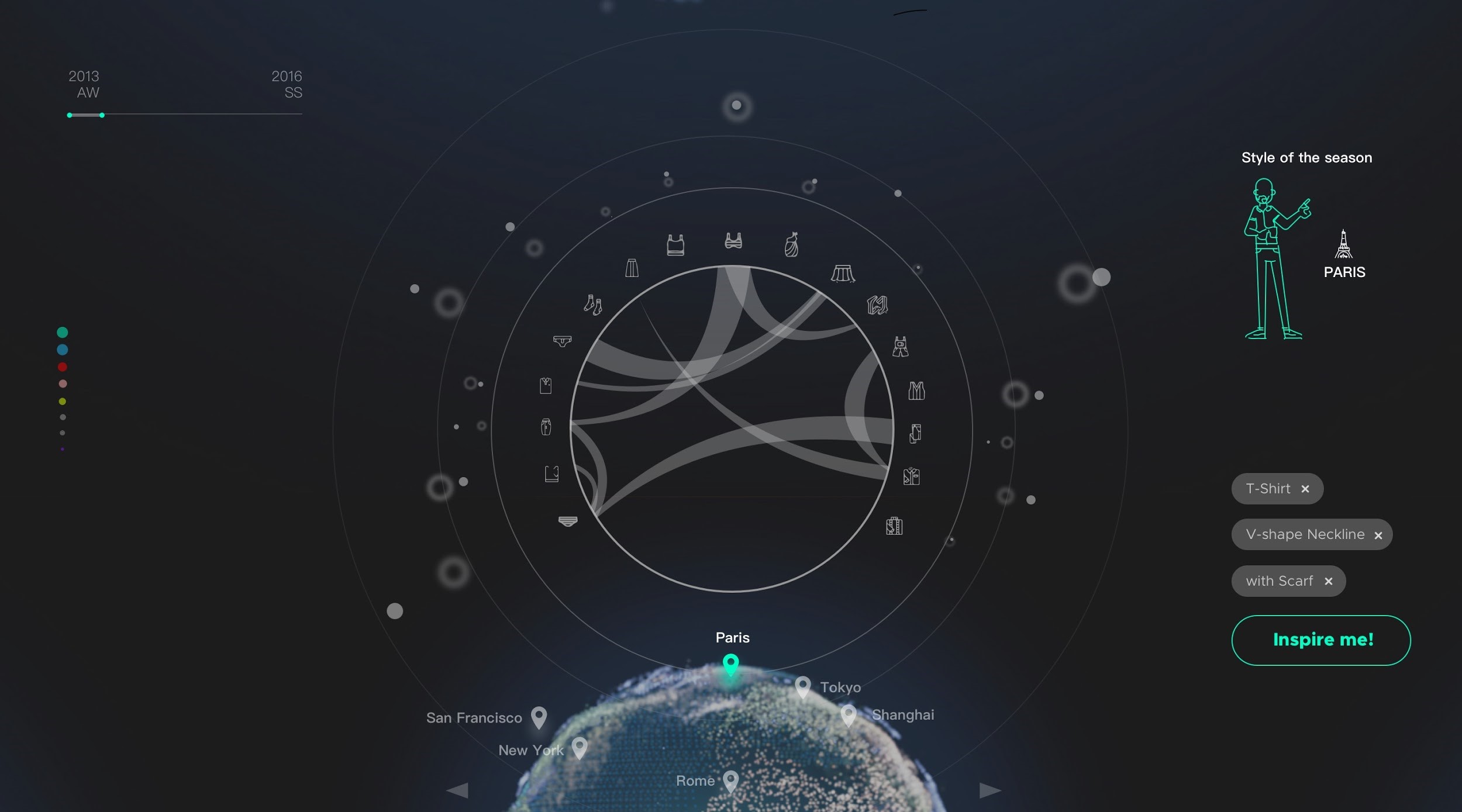
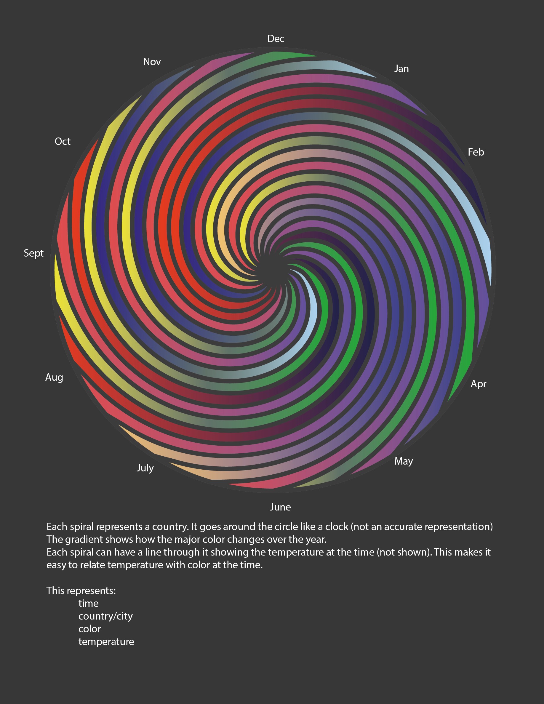
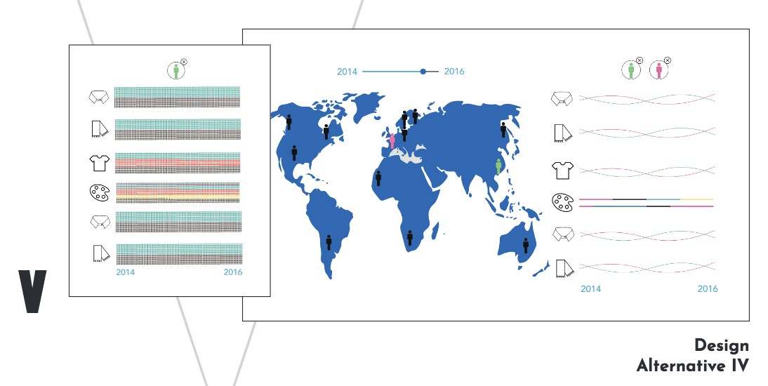
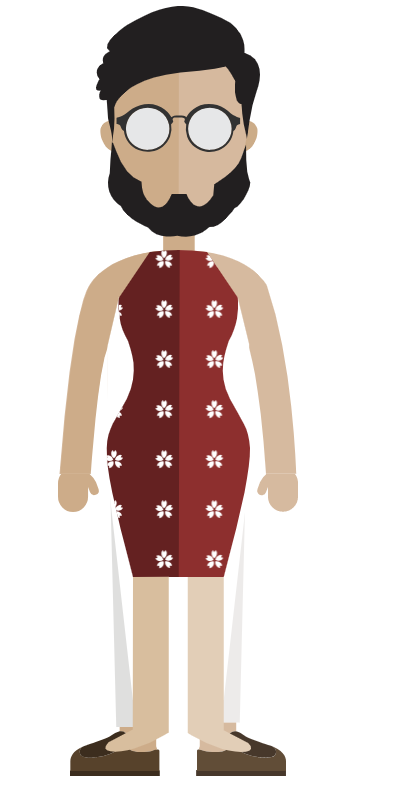
Based on our feedback, we decided to move in the direction of our second concept with the Chernoff faces due to its attractive visual nature and easy-to-understand nature. This strongly resonated with our primary user because it offered a very visual way in displaying an inherently visual medium. We also pulled in different ideas from the other concepts to expand our design and give it more flexibility and breadth in presenting information.
ITERATIONS AND TESTING
We began coding and testing mocks in parallel in order to meet nearby deadlines. Through our iterations, we learned a lot regarding visualizations for our primary users and what made sense for our data. For example, we explored using chord charts within our visualization as a way for people to get a deeper understanding of clothing combinations. Initially, we thought this was a strong visual way to show distinct clothing combos. However, we found that users were confused about what the diagram actually represented, as well as the chord chart being strong favoring most common combos, such as people wearing shirts and people with collars.
We also ran into issues with coding with our dataset, which we quickly learned that we had to take into account edge cases that wouldn’t skew an accurate perception of the data.
However, at the end of our iterations, we were finally able to determine exactly what we had to offer, what visualizations worked best, and what interactions were most intuitive. Also, because of our parallel workflow, we were able to start off on our final design running.
FINAL DESIGN
At the end of our iterations and coding, our final design offered the user the ability to:
- Sort by style strength
- Instantly visualize a city’s major style at a given time
- Compare and contrast between different cities
- Explore clothing trends in a city
- Identify a city’s most common clothing combinations
- See real pictures that represent the data
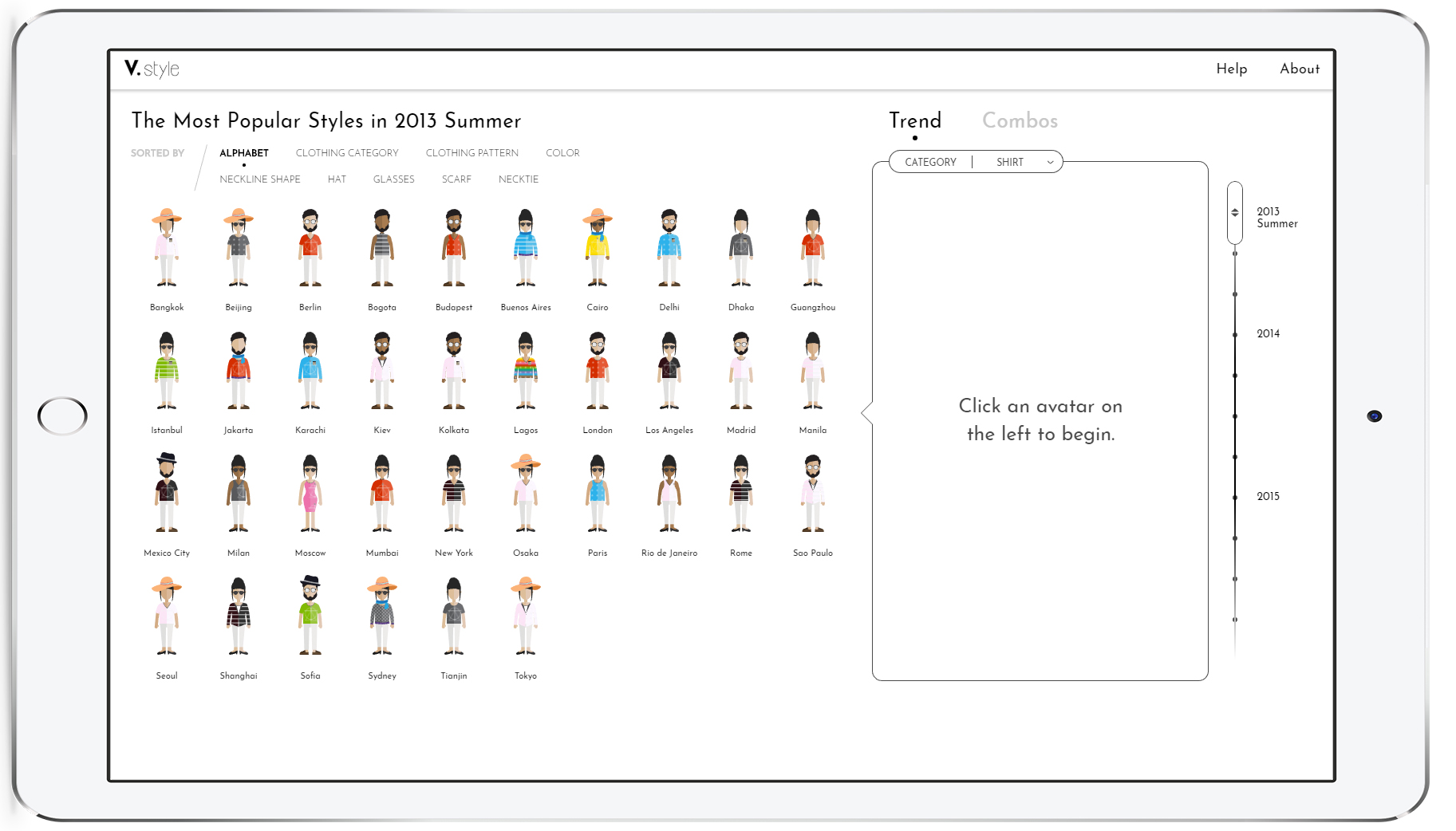
For the main interaction and information visualization, we used Chernoff faces, or glyphs, to present each city’s most popular fashion attributes at each certain city at a certain time. By hovering over each human glyph, users can view text description of the most popular attributes for a deeper view.
Once a city is selected by clicking the human glyph, the graph on the right side of the main screen will be activated. Users can click on ‘trend’ to view the line chart showing how percentage of certain fashion attribute in each city changes over time. Different attributes can be selected using the drop down menu. Users can also click on ‘Combos’ to view a correlation matrix of the common combos of fashion style in that city, with the color showing the dominant color of that combo, and the saturation showing the combo’s prevalence in the city. By clicking on a cell, corresponding pictures will show up.
When one city is selected, the other city’s human glyph will dim with respect to how similar these two cities’ fashion trend are, similar to a heatmap. Users can also click on a secondary city when a primary city is selected to compare specific fashion trends or combos between the two cities on the right side of the screen.
This project was coded with HTML, CSS, JavaScript, and D3 and can be explored by clicking the button below.
click to explore V-Style