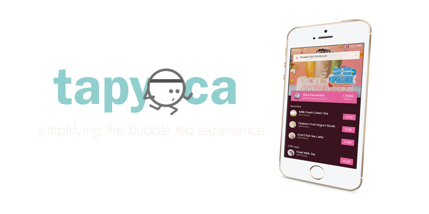
An app for the connoisseurs and bubbly, emphasizing rewards and simple satisfying transactions for bubble tea.
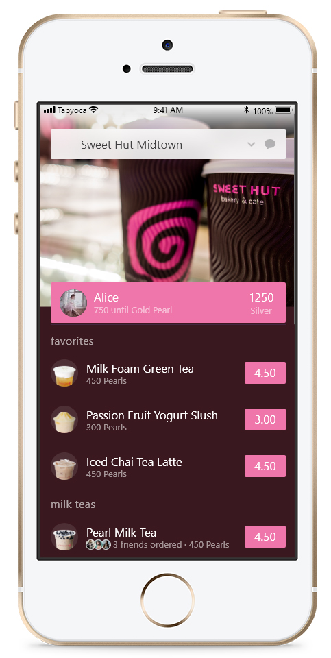
Easy drink selection and building, ideal for even the most fastidious customers.
Order from your phone with a simple scan and with big orders comes big ways to easily split drink costs for group orders.
Switch between your favorite bubble tea stores, with localized rewards for each one.
Easily track reward progress, gain tiers, and redeem rewards knowing exactly what you're going to get.
The User.
Bubble tea veterans and inexperienced drinkers.
The Span.
15 weeks.
The Tools.
Sketch and Adobe XD.
The Bobas.
Chia Hsieh, Gaurav Tamhan, and Peiran Tan.
MY CONTRIBUTIONS
I completed this project as a freelance designer, where I independently conducted research, design, and even development. I also had access to the client's Google Analytics and other resources to help align my design process to best match all stakeholders.
intro
Bubble tea, boba, pearl milk tea… Each place in America has a different way of calling it, due to bubble tea quickly becoming one of the most popular foods in America, with different stores offering their own unique style on the drink. For many, the act of getting bubble tea is inherently social and rewarding. However, with complex menus, a myriad of choices, and purchasing dilemmas, buying bubble tea can confound even the most practiced aficionados.
To resolve these user pain points, we created an app called Tapyoca to improve the purchasing experience by letting people earn rewards while helping facilitate social connections so that even a novice bubble tea drinker can get the most out of his or her purchase, while still having the freedom to be loyal to the store they want.
Our process for this project went through several stages:
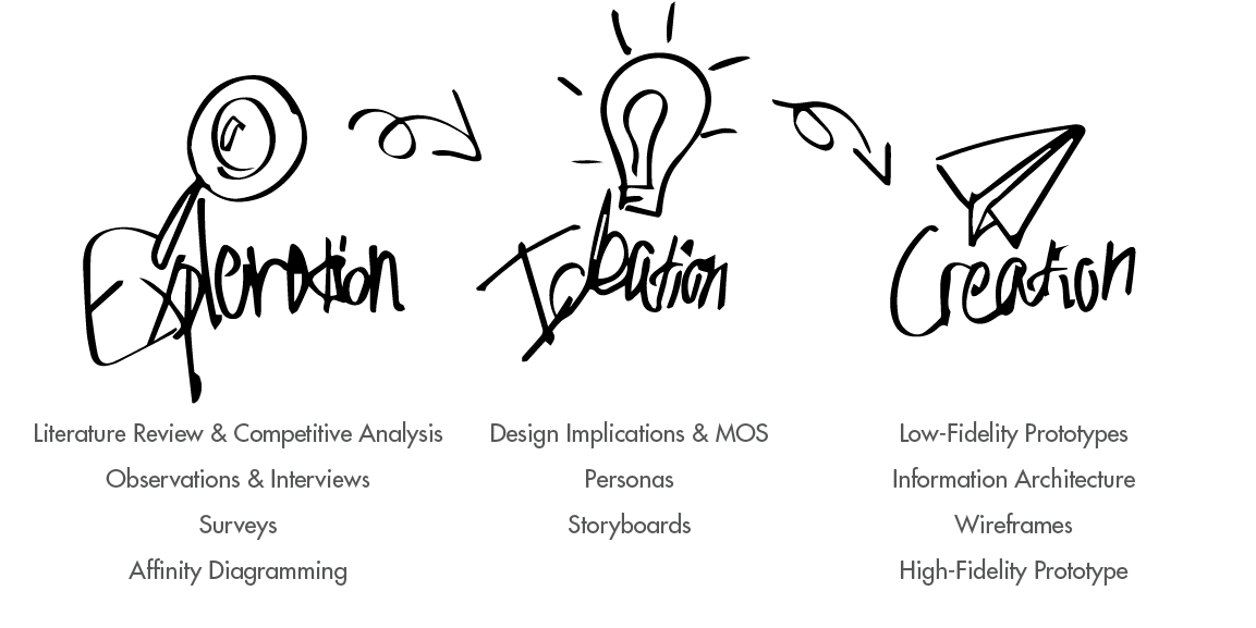
EXPLORATION
“Our investigation of the user’s context, pain points, and needs”
LITERATURE REVIEW & COMPETITIVE ANALYSIS
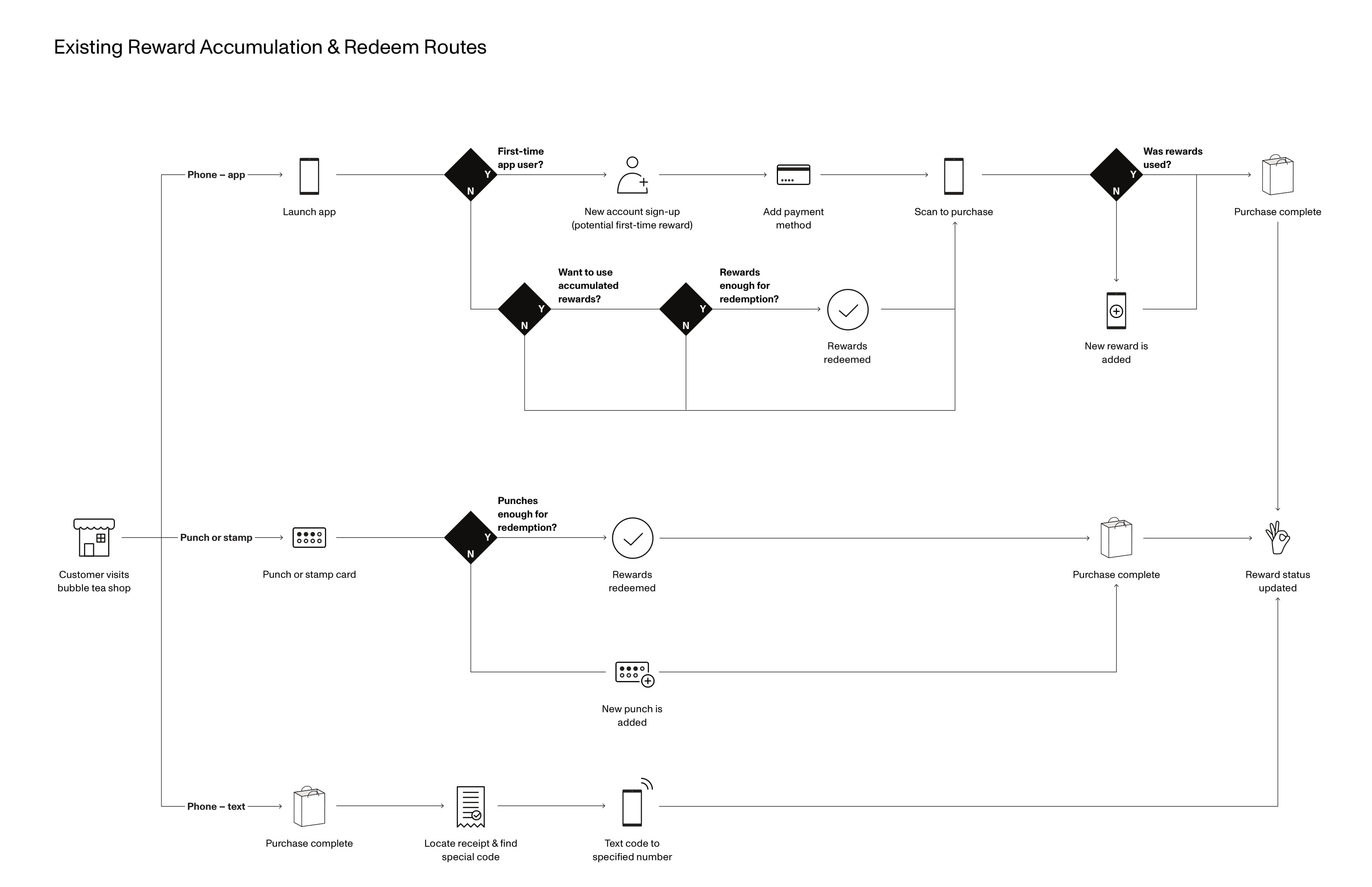
Before we began, we wanted to understand our problem space a little more. We used literature review and competitive analysis to examine what was commonly known in the field and what products have been made to address these issues.
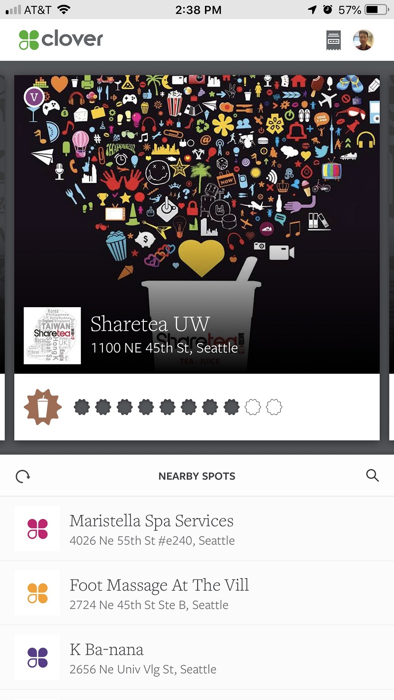
From these studies, we found products such as Clover, stamp cards, and more as competitors. We noted what they excelled in, what they lacked, and how the user experience process was. We also found numerous studies regarding reward systems which we were able to draw a number of high-level design recommendations.
OBSERVATIONS & INTERVIEWS
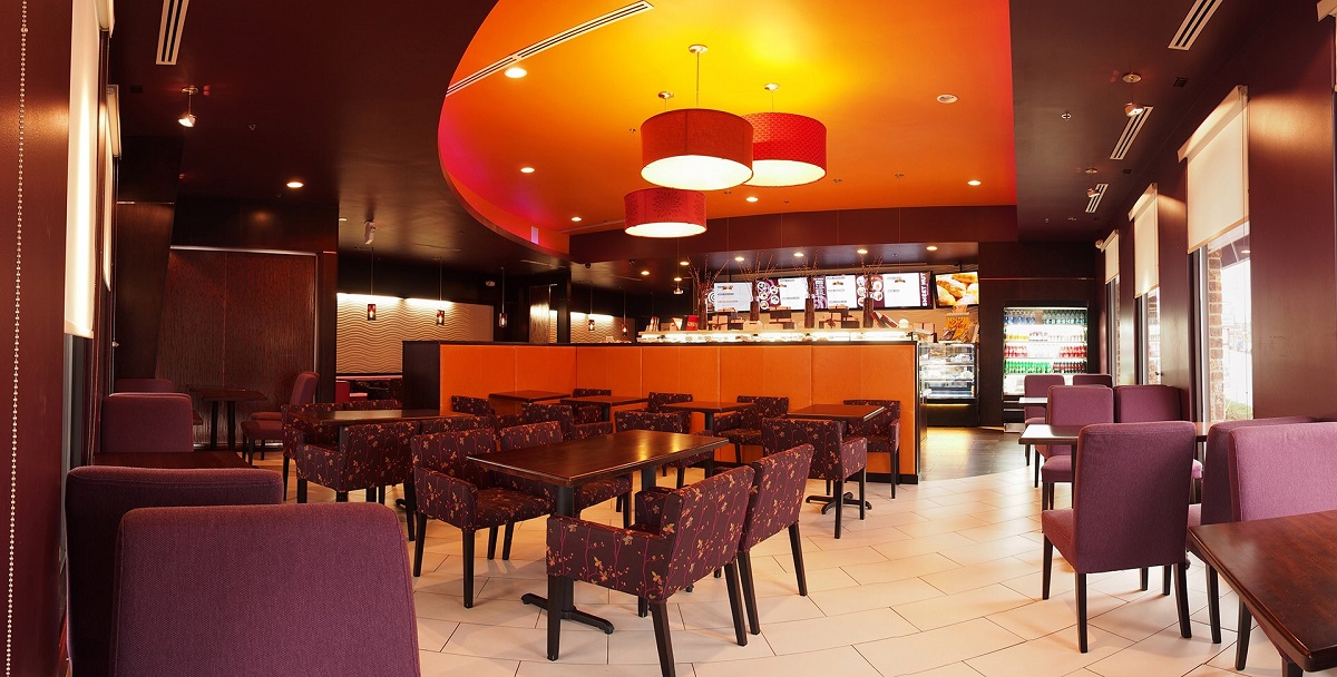
After that, we engaged in ethnographic research consisting of observation and interviews. The purpose of this was to locate pain points in the bubble tea ordering process and also discover what people valued in systems that augmented their purchases, such as stamp cards, and also discover who represents the main audience of bubble tea.
SURVEYS
Through the previous studies, we were able to get a pretty good idea of who our user was and what they wanted. However, we wanted to confirm what we knew, to ensure our data wasn’t being skewed by a few individuals. To do that, we created a survey, which we distributed online with screening questions to ensure participants were bubble tea drinkers.
AFFINITY DIAGRAMMING
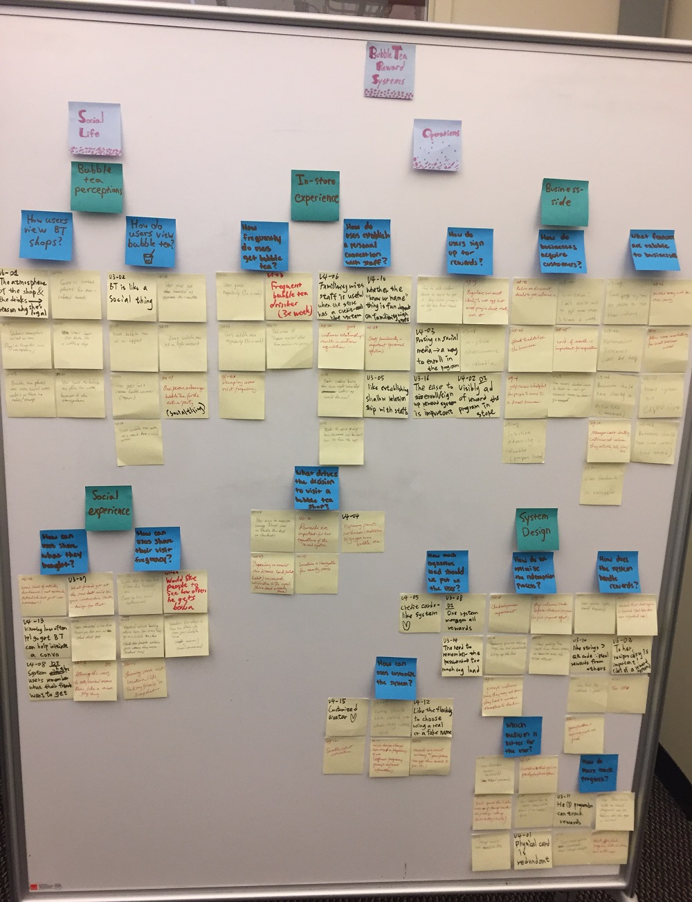
Using the data we gained, we did affinity diagramming to organize our data and translate it into usable design information.We put up sticky notes of pain points, environmental context notes, user habits, and more. We then grouped them based on relevancy and brainstormed design recommendations for each group.
IDEATION
“Our transformation of research data into design information”
DESIGN IMPLICATIONS & MEASUREMENTS OF SUCCESS
From the our research, we were able to establish a strong set of design implications that would act for the basis of our design. Our final design needed to hit all of those points. We also were careful to note our measurements of success, which we would refer back to at every design iteration to ensure it meets our ultimate goal.
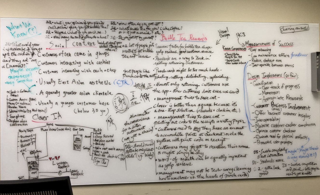
Below are some of the high-level design implications with the justifications sourced from our research:
- Let users see what drinks their friends like
- Many new bubble tea drinkers struggle with deciding a drink, and often turn to friend's recommendations for the final choice.
- Reward system should be easily accessible and trackable
- Reward systems are successful when users feel like they have a high-level of control in the system. By ensuring that things aren't hidden, we can increase user trust.
- Simplify the drink customization process
- The many customizations options daunted people new to bubble tea, while veteran drinkers sometimes forgot to customize their drink to their liking.
- Enable users to split costs of an order
- From our research, many people went in groups and ordered on a single order, splitting the costs through various apps manually later. Offering native order splitting would be a welcome feature for users.
PERSONAS
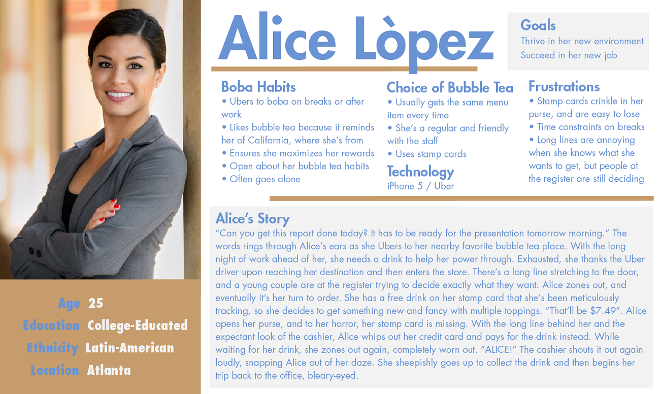
We also needed to create personas so that we could understand exactly who were designing for. From our research, we were confident in creating a persona that represented a majority of the bubble tea drinking demographic.
STORYBOARDS
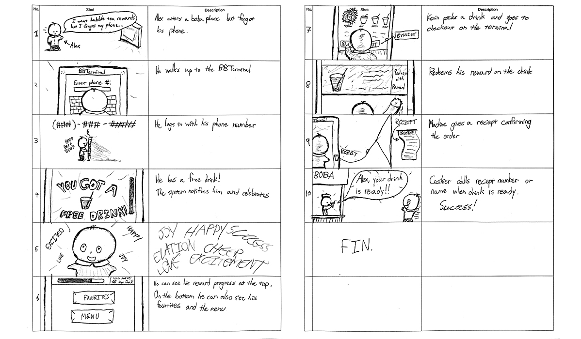
For that last part of our ideation stage, we created 3 storyboards, which would walk through the ideal user experience we were aiming to create. For our next step of designing interfaces, we would match it with the storyboards to ensure the design offered the right experience.
CREATION
“The birth of a design in its true form (through multiple iterations)”
LOW-FIDELITY PROTOTYPES
Armed with our design specifications, we began considering what form would best serve our user base. We considered a physical kiosk, a digital card, and a phone app. Based on our design requirements, we created a low-fidelity prototype of each to test and discover which form would be the best.
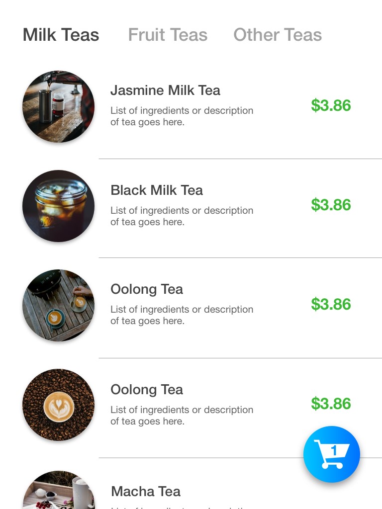
The first concept was a kiosk that would exist in the stores that would allow users to login, collect rewards, and place orders. This was based on research that showed people didn’t like carrying around something extra or downloading more apps.
Pros: In the environment, simple-to-use, no commitment
Cons: No commitment, doesn’t encourage the user to go get bubble tea, expensive implementation
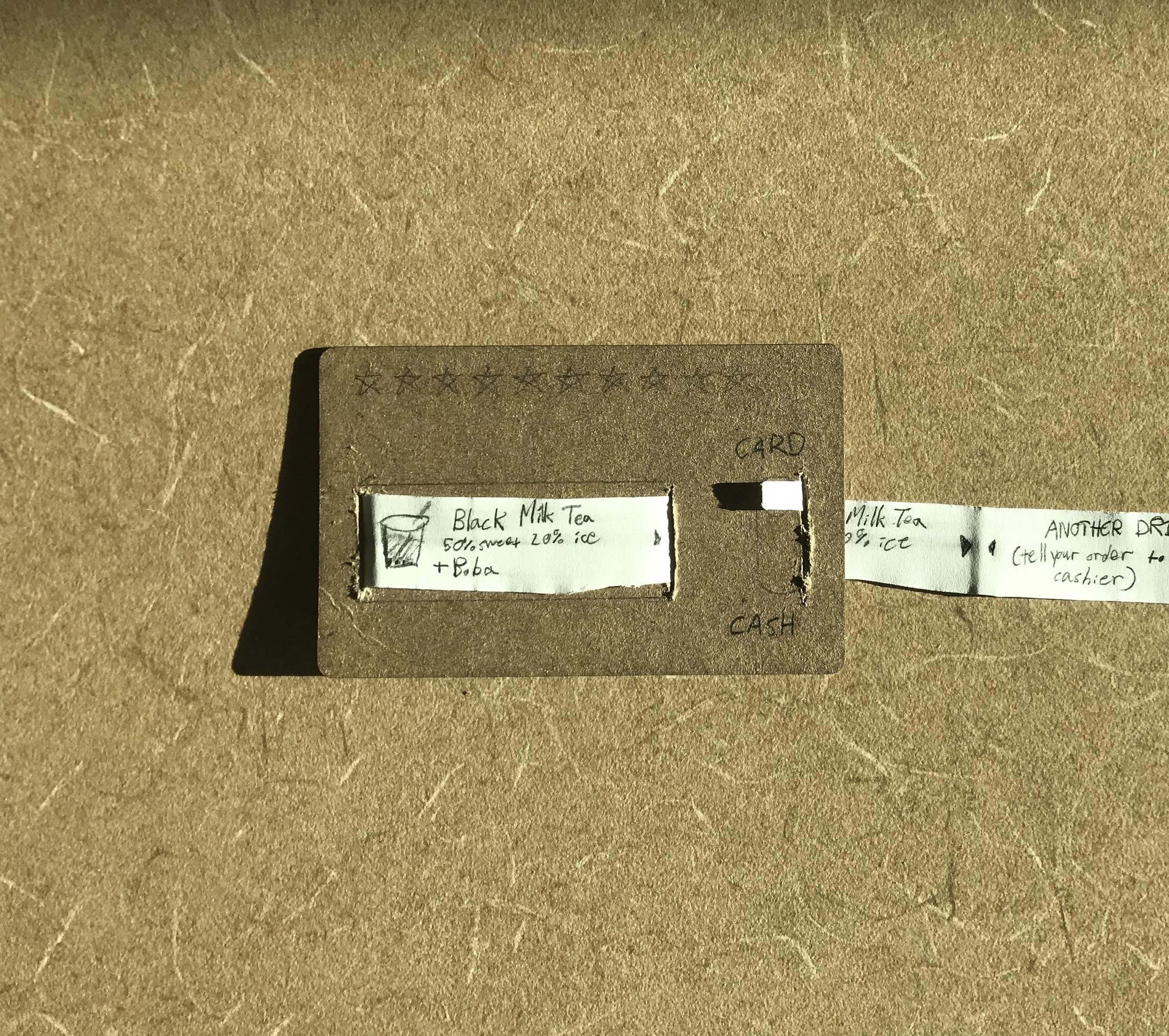
The second concept was a digital card, where our focus with it was to augment the normal checkout experience. Users could load favorites and balance on the card, so they could order, pay, and collect rewards all with a single swipe.
Pros: Novel, cool, doesn’t change the normal user flow, builds on top of the current experience, easy to learn and use
Cons: Physical, takes up space and can be forgotten, potentially expensive, daunting onboarding
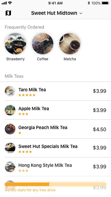
The final concept was an app that people had on their phones. From it, people could place orders, pay, split order costs, and see what drinks friends get. We considered this concept because of its flexibility and ease of access to our user group.
Pros: Flexible, easy to onboard, always accessible, uses advantages of current technology such as cross-app compatibility
Cons: More ordinary, less eye-catching, requires download
Based on the feedback from these testing sessions, we moved forward with the app concept, though we pulled ideas from other concepts into it that people liked.
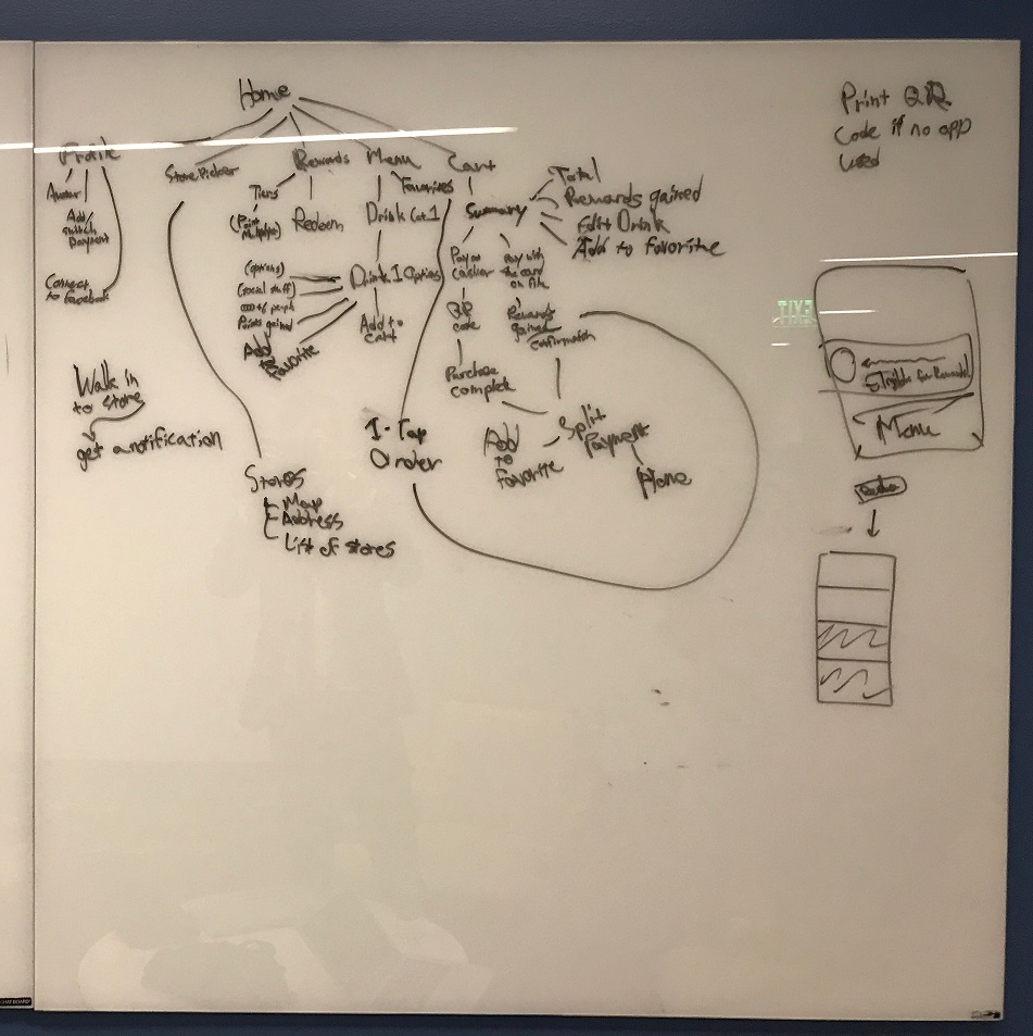
INFORMATION ARCHITECTURE
Deciding on building out an app, we needed to create an information architecture for it before drawing out screens. This architecture would need to include all the necessary features decided upon earlier at the design requirements. To help inform this stage, we also broke down other competitor's apps into their information architecture, such as the Kung Fu Tea App.
WIREFRAMES
Wireframes were next step, where we could build out rough prototypes of user flows for some user testing. This allowed us to get quick iterative feedback on our design which we could quickly implement and test again.
HIGH-FIDELITY PROTOTYPE
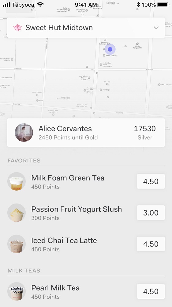
Based on our rounds of iterations, we built our high-fidelity prototype for the final iteration. This would include adding in colors, graphics, text, and more to make it look and feel like an actual app. We conducted another round of testing after creating this to validate our design (while getting some extra notes for the future). From our testing, people really liked the new features that the app introduces and all consistent bubble tea drinkers we tested with said they would use the app if it existed on the market.

MOVING FORWARDS
Though we succeeded in terms of our earlier established measurements of success, there are still some improvements that could be made to our design.
From validation testing we discovered having a more upfront way to access rewards and better information on how to redeem them would help first time users catch on faster. In future iterations an onboarding tutorial could be implemented, or a greater emphasis on rewards in the information heirarchy. We would also want to do more research in other areas, since the target audience might have different characteristics in different areas.