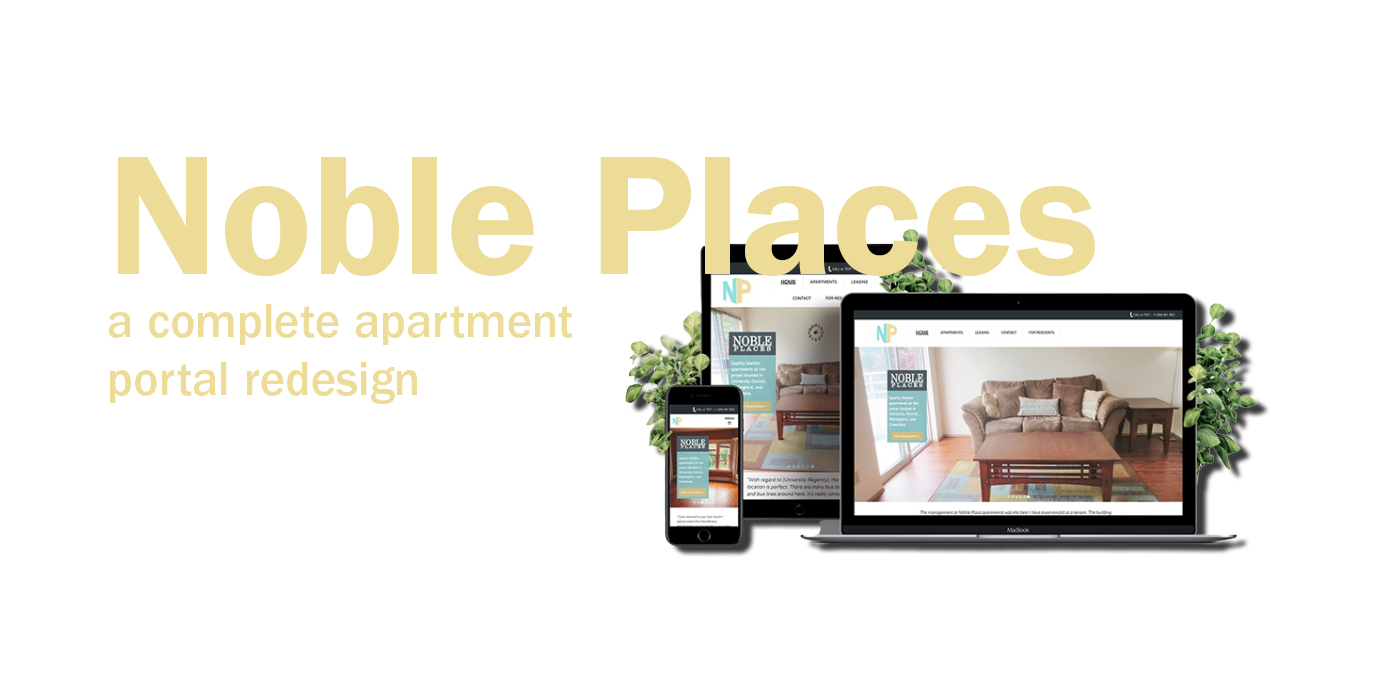
An apartment complex website redesign targeting college students.
Location-based sorting, with high-priority information clearly visible for easy browsing.
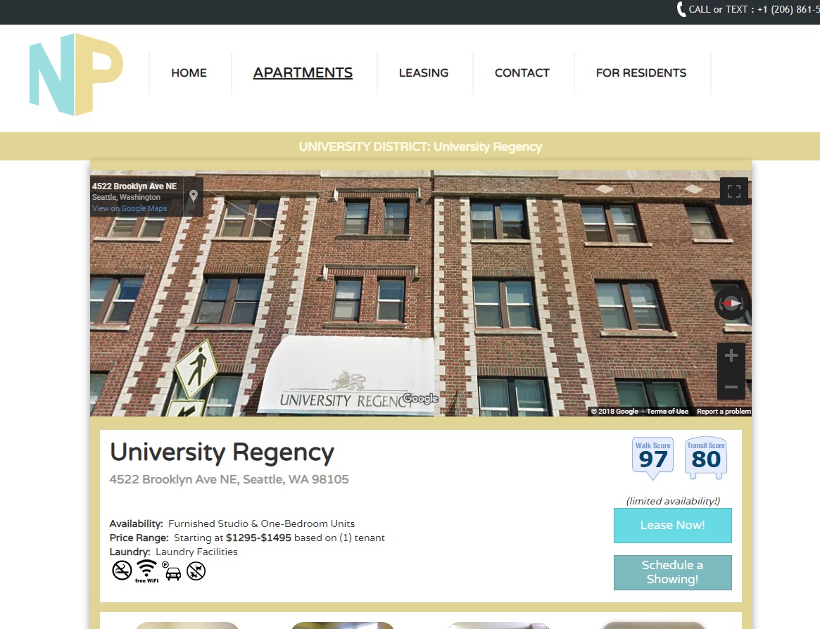
Clear, clean, and user-centered information such as Google StreetView, WalkScore, apply buttons, and more.
Easy, clearly laid out next steps, so even first-time tenants know exactly how to apply.
The User.
College students looking for apartments.
The Span.
8 weeks.
The Tools.
Google Analytics, Adobe Illustrator, Adobe XD, Webflow, HTML/CSS/JS.
The Client.
Noble Places LLC.
MY CONTRIBUTIONS
I worked as an independent UX designer and full-stack developer for this project.
I established and conducted my own research, drew implications from it, created a design, and developed it for delivery to the client.
intro
The NoblePlaces is a collection of apartments based in Seattle owned by NobleGroup LLC. Previously, they had a website that existed purely for tenants to use as reference, and it offered little other functionality. Promising tenants would have to find the site, find an apartments that was relevant to them, and then contact the manager via phone call. I was contracted to bring their site up to modern standards, while also improving the user experience of the system.
The requirements were pretty general, with no real problem statement existing other than it being outdated. Therefore, to define the problems, UX research would have to be first conducted. Then, UX design solutions could be created, implemented, and tested.
- Research
- Observations
- Competitive Analysis
- Interviews
- Design Requirements
- Design
- Personas and Scenarios
- Information Architecture
- Design Sketches
- Final Design
RESEARCH
“Identifying the trends, users, and habits”
Beginning with research was important for this project to mainly identify who were the users to target, and what were their trends, habits, and values. I also wanted to research how other apartment complexes in the area advertised and gained tenants.
OBSERVATIONS
To begin my research, I implemented Google Analytics into the site and took note of certain statistics, such as user demographics, behaviors, bounce rates, and more. Using this information, I could surmise areas of weakness I could focus on resolving in my redesign, while also better understanding the user.
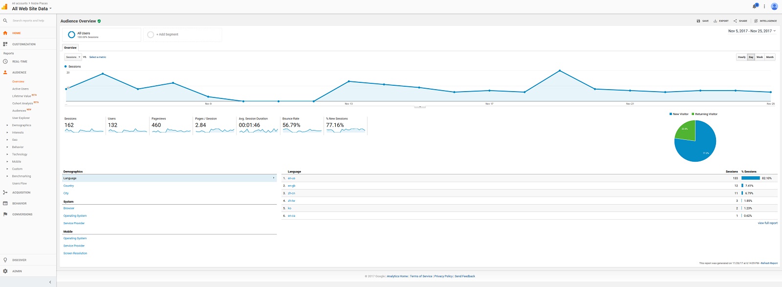
Through this, I could gain a deeper glimpse on exactly who is the audience I’m building for, and also how they behave and interact with the site.
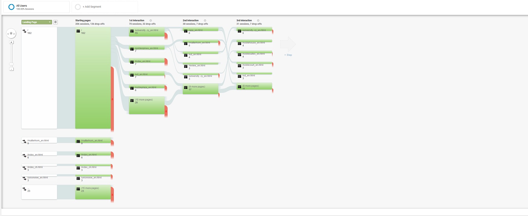
Over a few weeks of observations, I gained a sample size of over a hundred unique users. Conducting data analysis for this was difficult, due to the large amounts of data, yet I was able to isolate drop-off users’ flow and discover problem areas causing them to leave. Furthermore, this also provided me with general demographic information about my audience. For example, I discovered a majority of the users were from the University District area and between ages 18-24. This implied that most visitors were college students.
COMPETITIVE ANALYSIS
In my competitive analysis, I compared sites of other apartments that existed around the area, finding the most direct competitors possible. Through this I found information about the basic flow of apartments sites, and what information was valued when advertising places, such as floor plans. This information would be useful when designing my own information architecture. I also discovered that their main target audience was college students at the University of Washington, something that I learned from previous research. One site even had a page addressed to parents of college students, explaining why it was best for their kids to stay there.
INTERVIEWS
To better understand what primary users looked for when renting apartments, I interviewed college students at the nearby campus who lived in apartments. I asked them questions regarding things they valued about apartments, how they searched for places to live, and what led them to make a final decision. From this I discovered more about the user process when searching for an apartment.
DESIGN REQUIREMENTS
I compiled my data into groups and wrote up design requirements for each grouping, translating data into design information. I examined these narrowed and refined these requirements to develop a list of design requirements. Below are some examples with design justifications:
- Detailed information on list of apartments pages
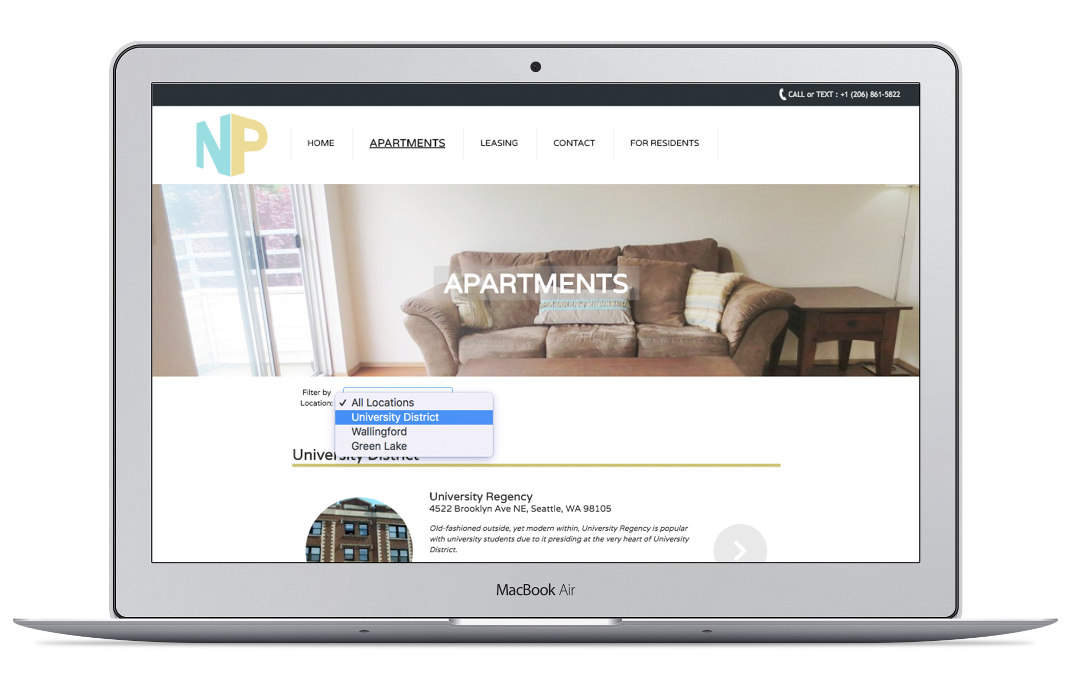
- Many users had to click back and forth from the list of apartments to apartment pages, a behavior created from the necessity of comparing properties. This arduous task could be resolved by allowing users to filter and compare places on a single page
- Ensure possible interactions are evident
- 73% of user were domestic, a majority being from Seattle; however, the remaining 27% were from China. To ensure globally inclusivity, all interactions should be clearly labeled and common American-centric design conventions, such as overly flat UI or unmarked hamburger menus, should be removed.
DESIGN
“Transforming requirements into the design”
Armed with loads of research, I moved onto design, describing how the user would use the website and building to meet and improve that experience.
PERSONAS AND SCENARIOS
The very first step was to establish personas. The personas represented my main target audience and also the deciding voice in all design choices. From my previous research, I found that the biggest user demographic were college students at the University of Washington. Using the university’s publicly available demographic reports, my own previous experience, and also interviews, I could develop a strong primary persona that accurately reflected an average college student.
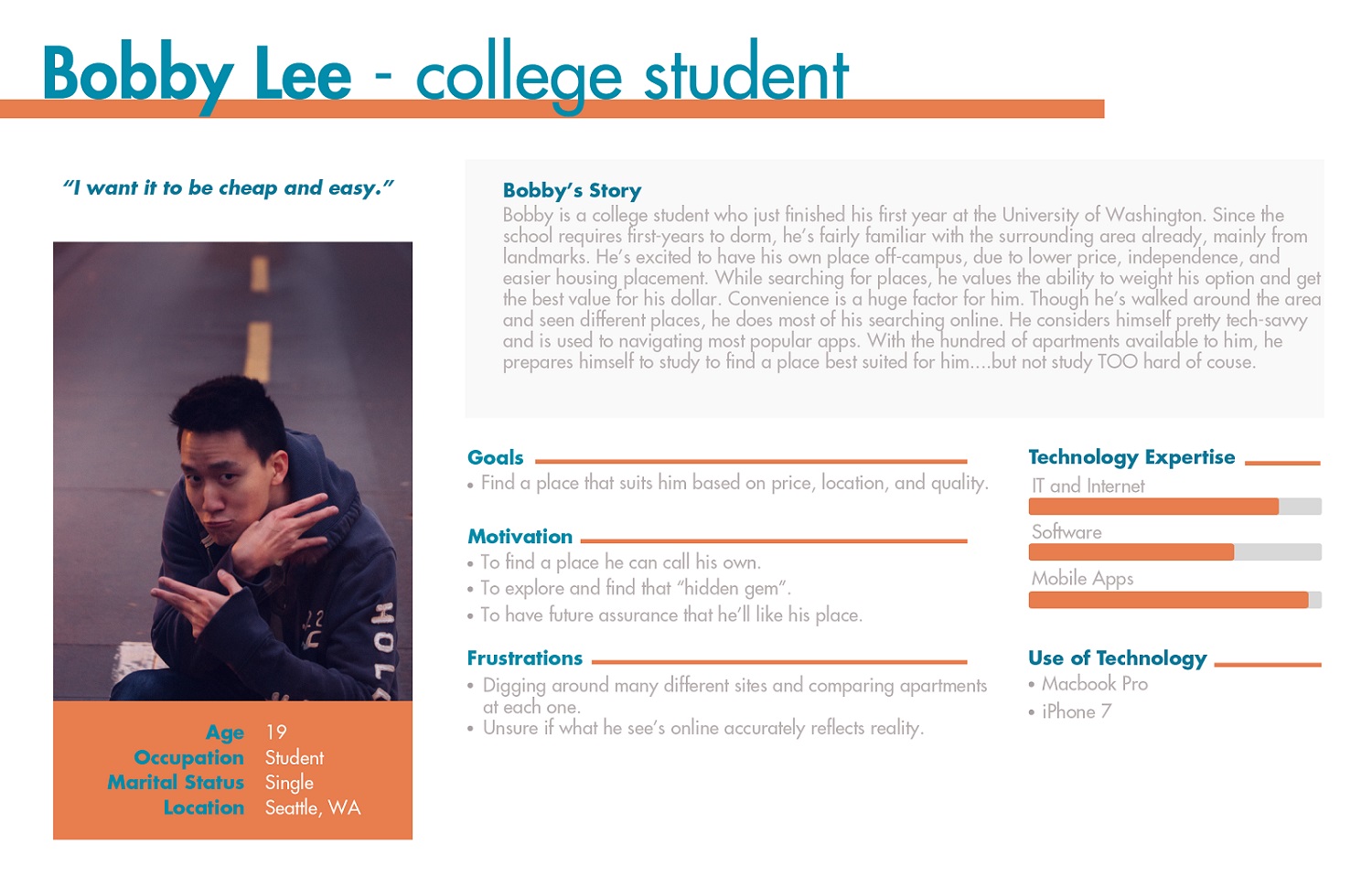
Using this persona and also research found earlier, I examined and summarized my list of design requirements, emphasizing what the persona would want from an apartment website. With these design requirements, I could ensure that my final design would offer the features needed for the best user experience.
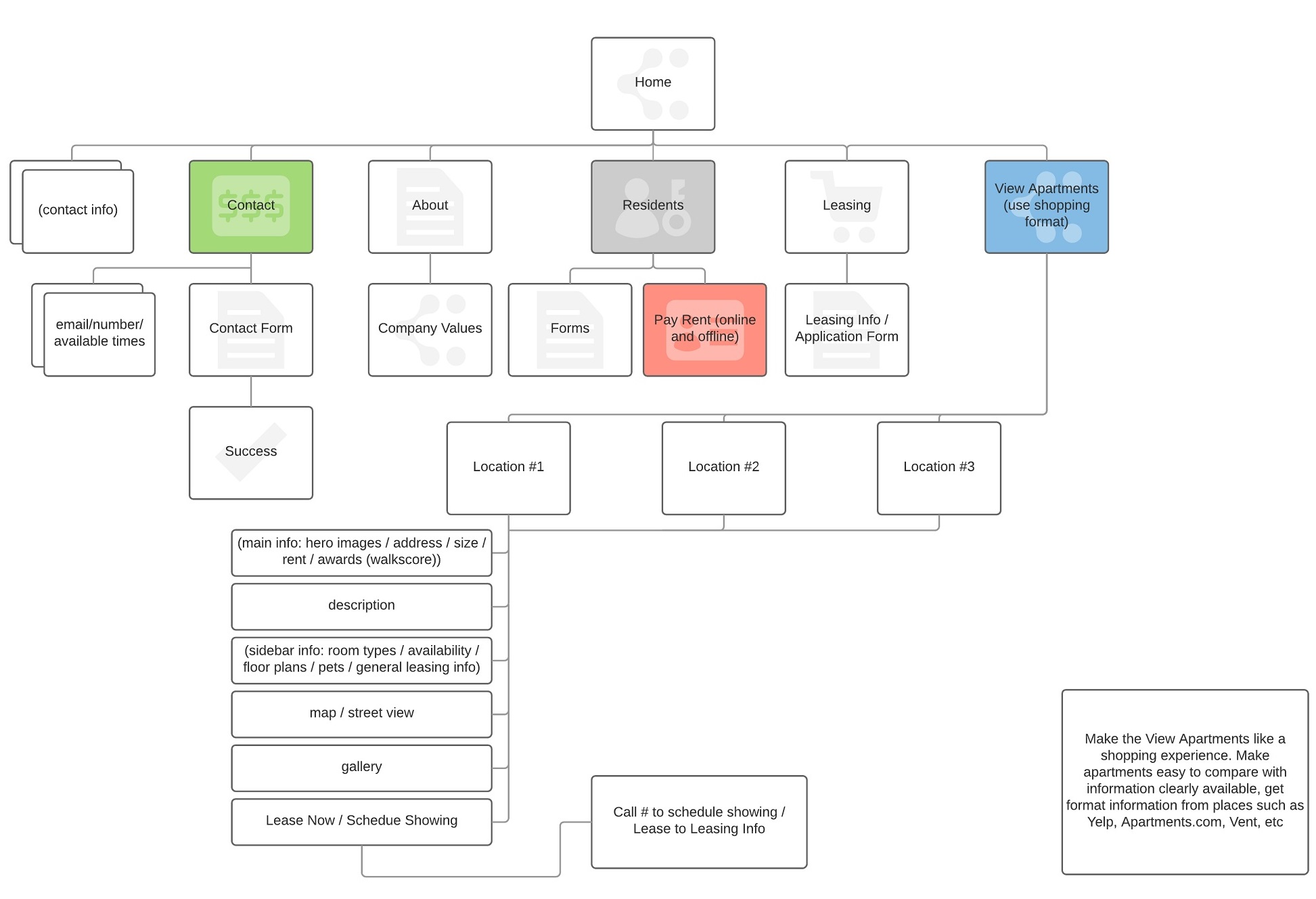
INFORMATION ARCHITECTURE
Knowing all the features, I tied them all together with an information architecture. I structured the architecture in a way that best met the needs of the users, such as emphasizing a leading flow over a minimalized interactions. With this, I could test and easily iterate on the overall experience design. Through this I could know exactly what screens to make and what flows to test.
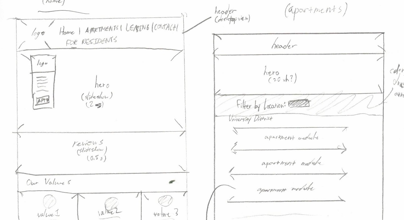
DESIGN SKETCHES
Based on my information architecture and scenarios, I created design sketches of screens that went through a user scenario, such as finding and applying for an apartment. I tested this with various primary users to see how they responded to the concept, while also taking note on any difficulties they had going through the flow. I took the information from each session and iterated on the sketches, as to rapidly build towards a final design.
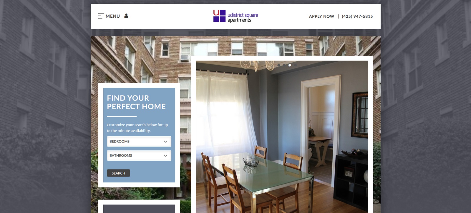
FINAL LIVE DESIGN
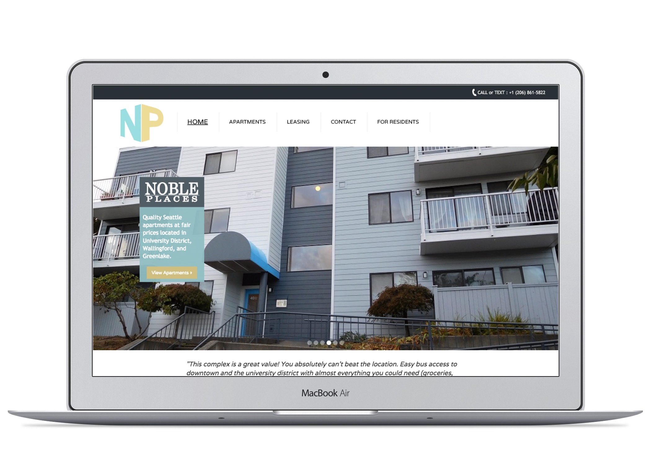
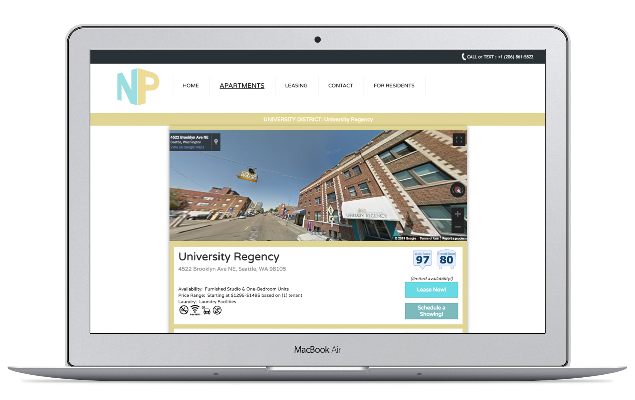
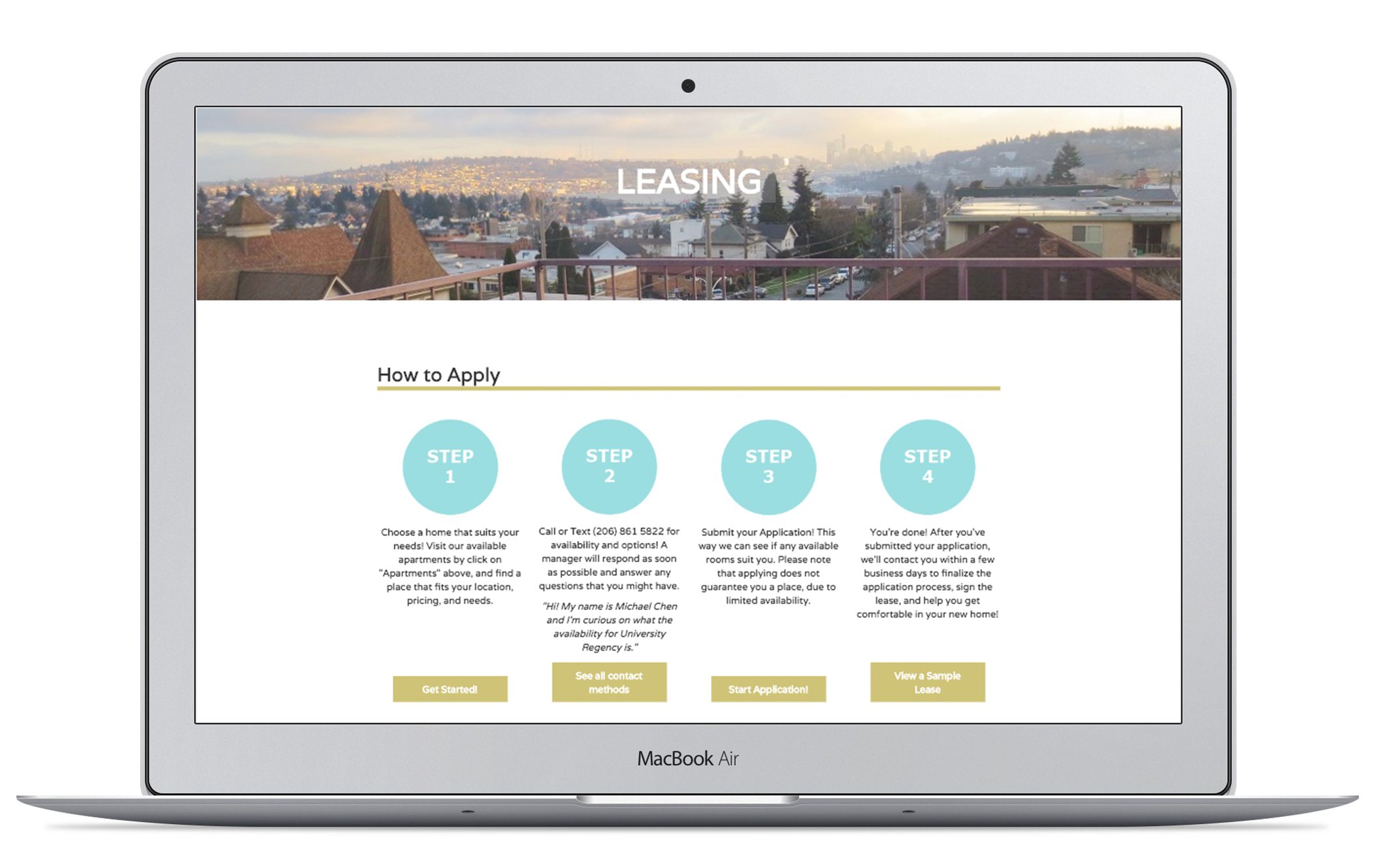
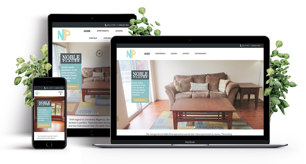
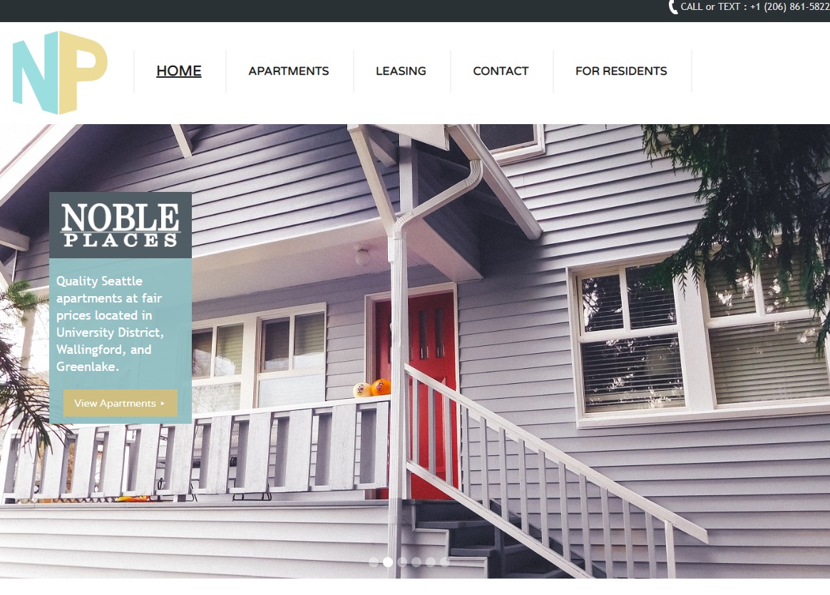
Using Webflow, HTML, CSS, and JavaScript, I created a live design based on my final sketches and my information architecture, that incorporated UX research and design to understand user requirements and create a website that met those goals. All aspects of the visual design were chosen based on user research. For example, color choices on the website matched the company brand, as well as aligning with colors that users found more welcoming for apartment pages. The leasing page was broken down into steps, so users could easily understand and be informed of the application process. A Google Streetview shot of the apartment banner was on every page, based on users often going to Google to look around the apartment in Streetview to better grasp the location. These were just a few of the informed design decisions that contributed into creating a better user experience.
For coding, I used Webflow, a new web design tool I wanted to test, to create the initial design of the site. I then exported the site, making changes and iterations with HTML, CSS, and JavaScript, based on responses from internal testing and live debut. Since the new site has been live, there has been a notable increase in applicants, a lower bounce rate, and a clearer user flow.