
The User.
Cloud Engineers, Solution Architects, IT Directors.
The Timeframe.
15 weeks.
The Tools.
Figma.
The Role.
UX Designer.
The Problem.
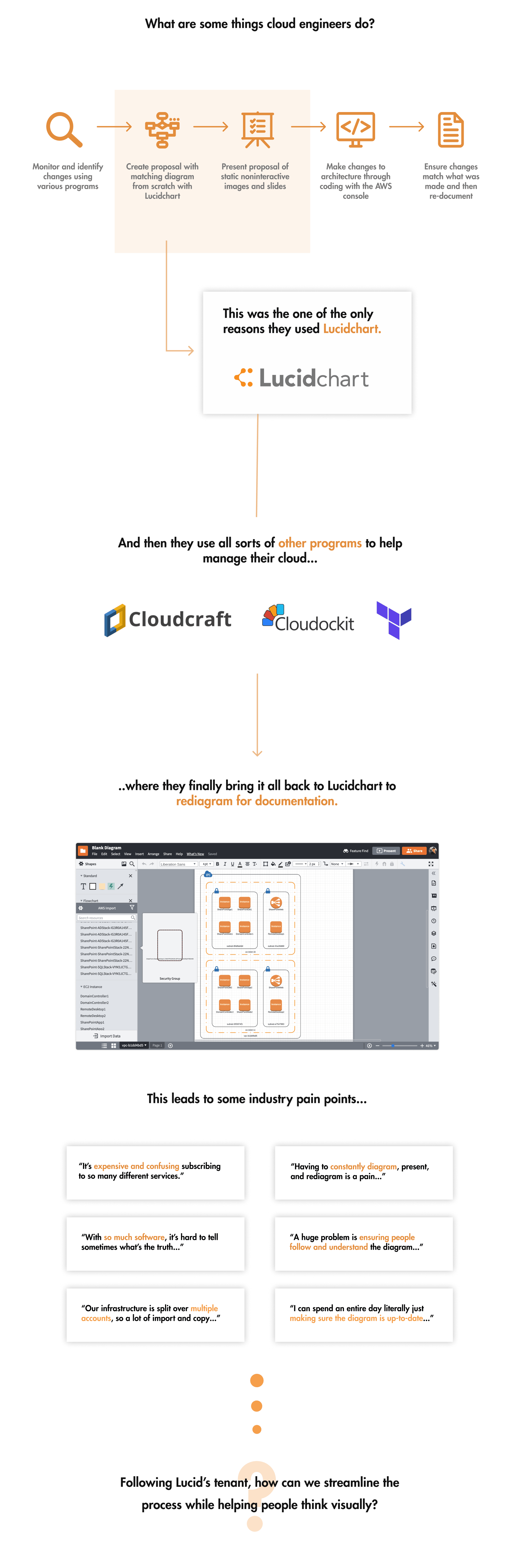
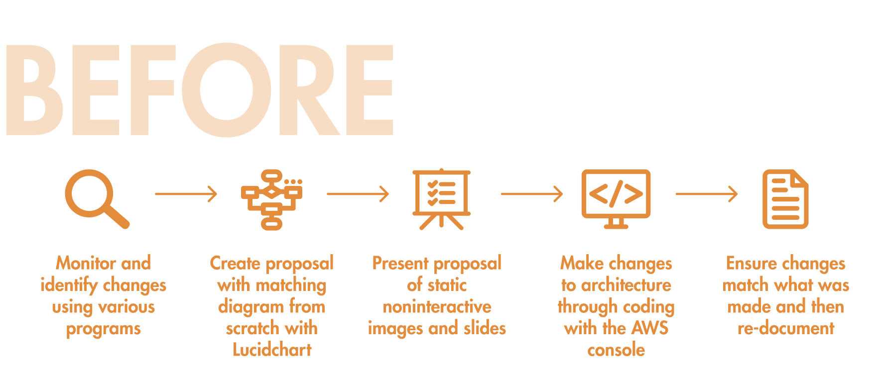
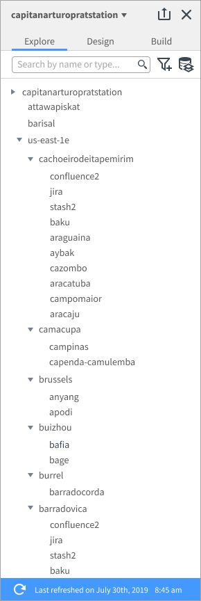
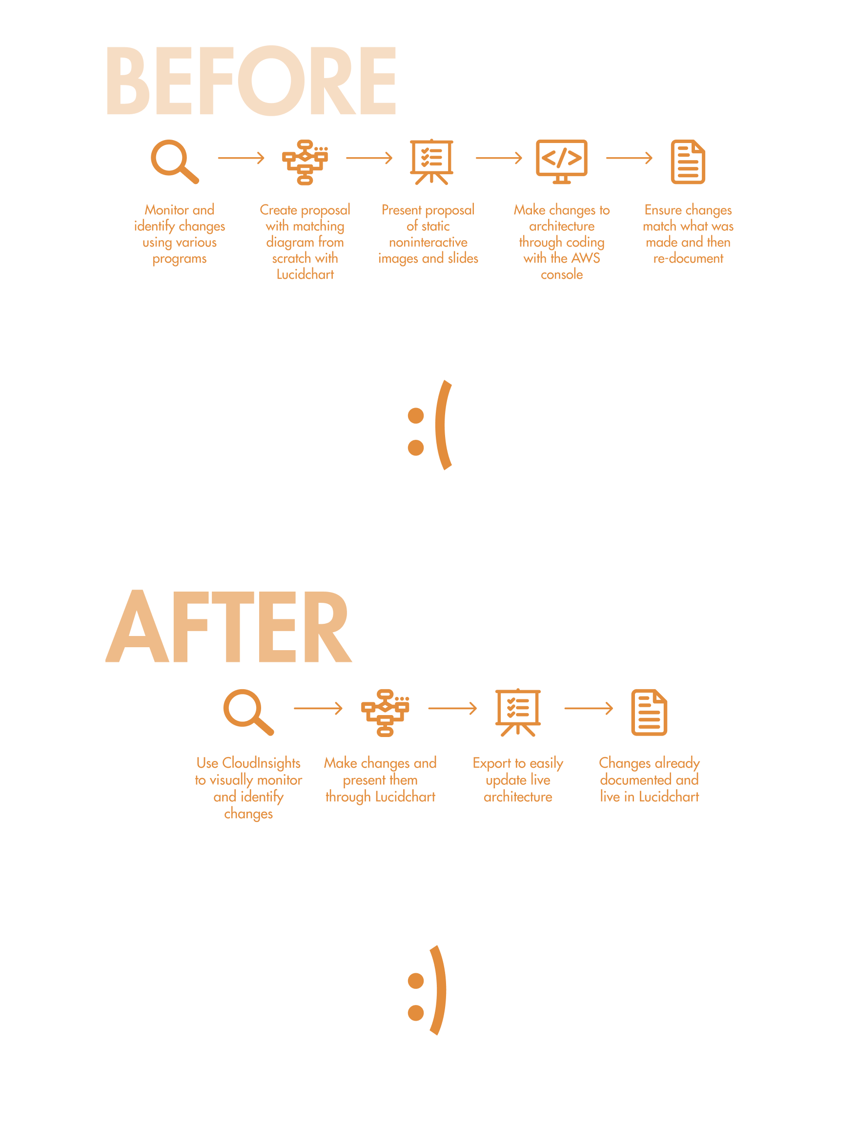
Cloud Engineers have to make enormously complex diagrams for numerous reasons, whether it’s communicating changes or for documentation purposes. Lucidchart had just a barebones feature for importing architectures, but it was rarely used because it was hard to import the data correctly and even harder to manipulate it. Often times, engineers would end up deleting the imported architecture and remake it from scratch. Making a cloud architecture diagram is a pain and a nuisance no one looked forward to doing.
The Solution.
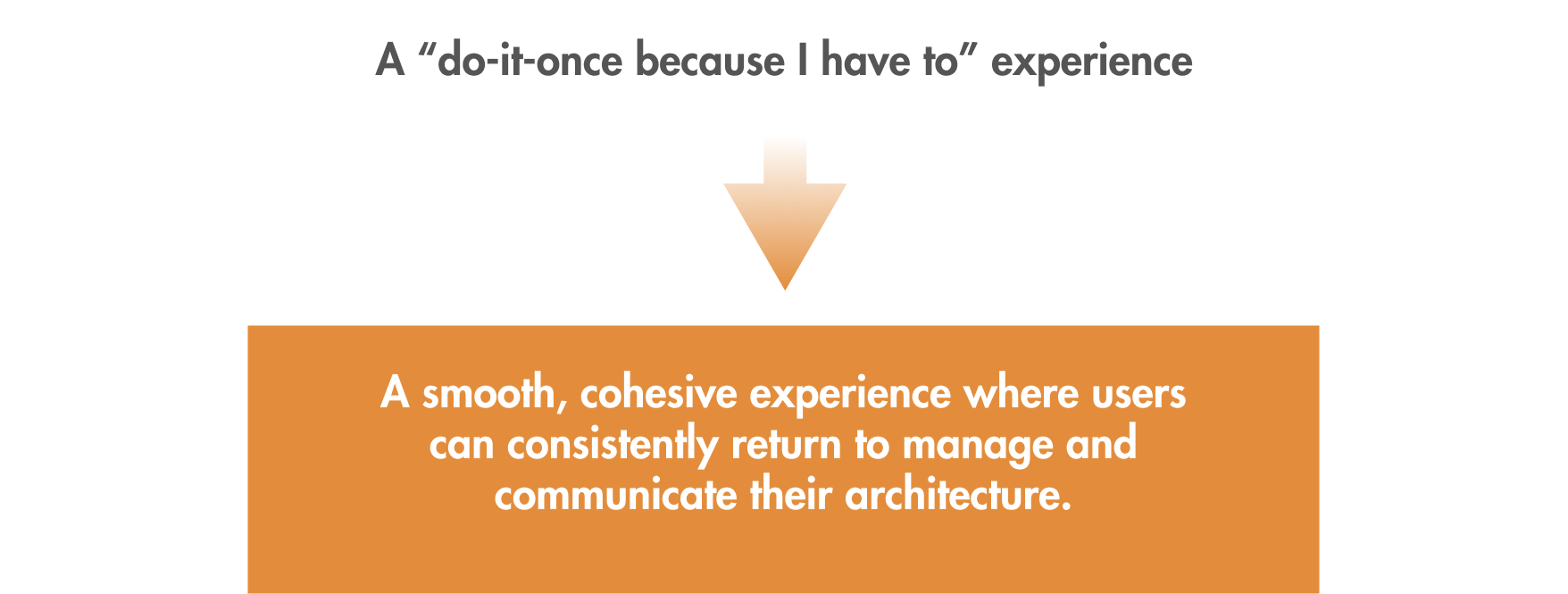
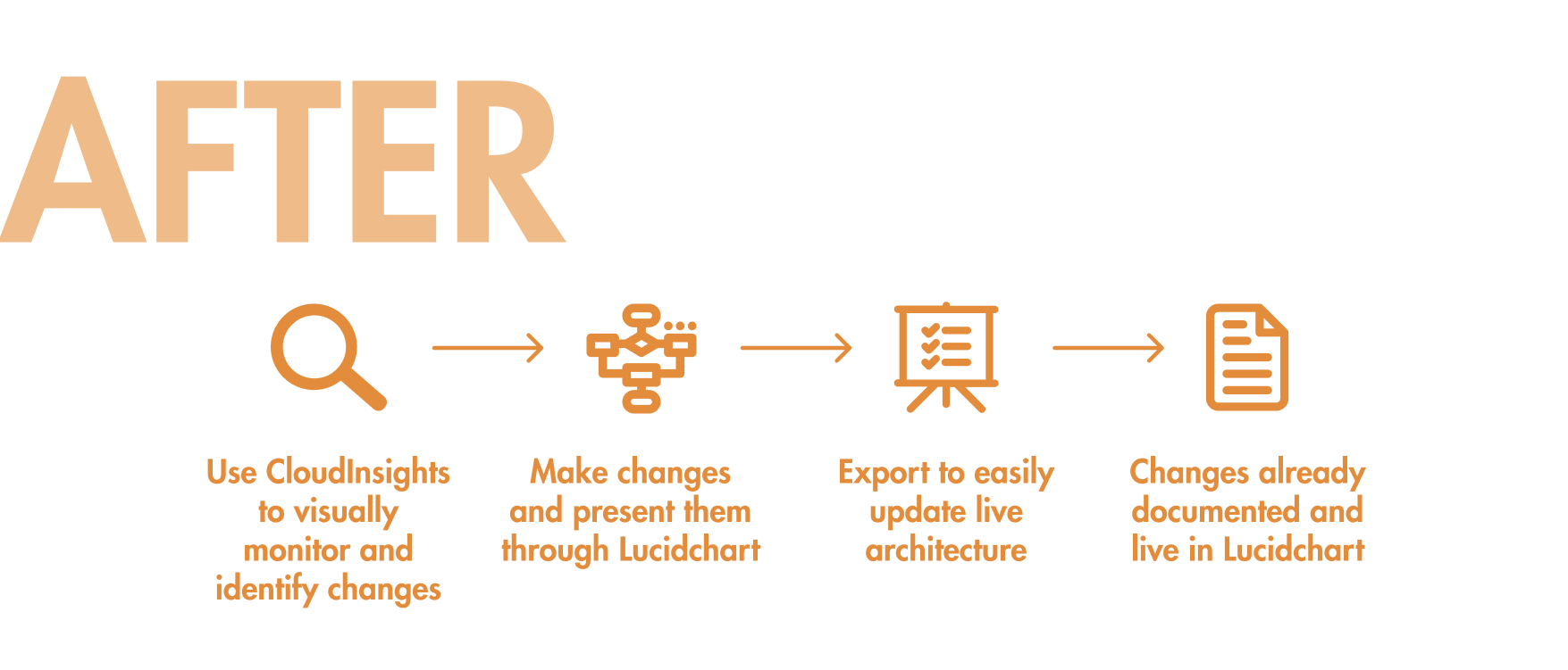
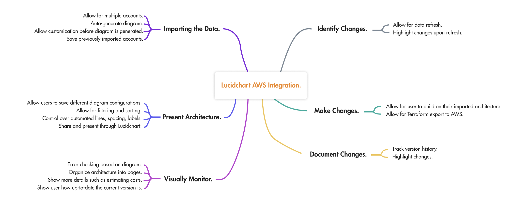
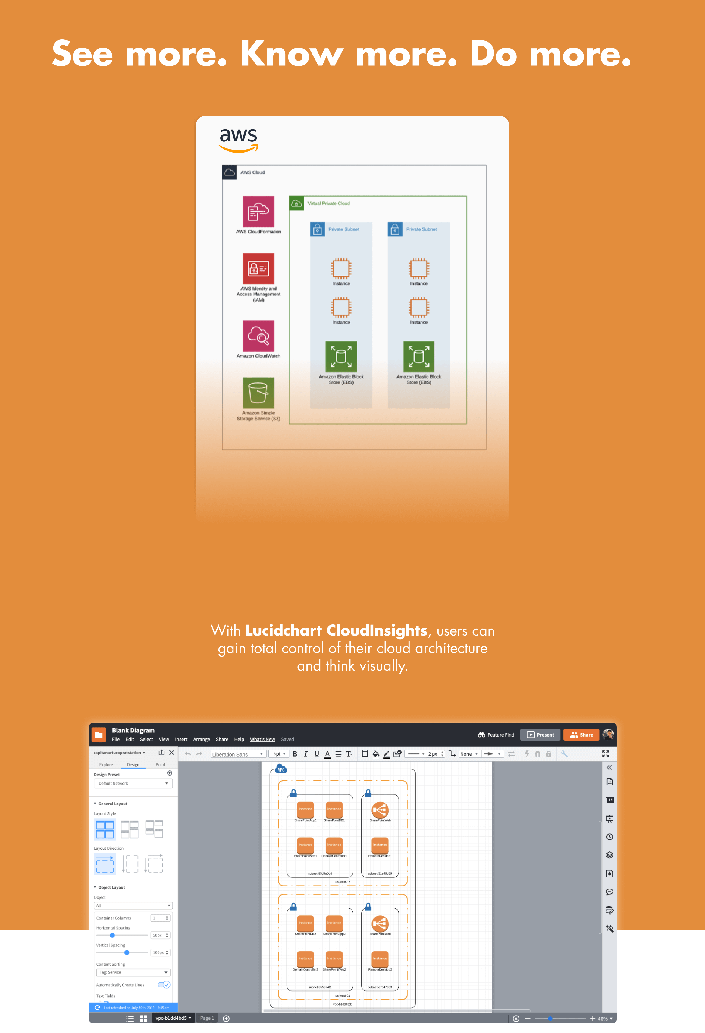
We wanted to reshape the industry and change the current perception on cloud management entirely. This effort led to Lucidchart's CloudInsights feature.
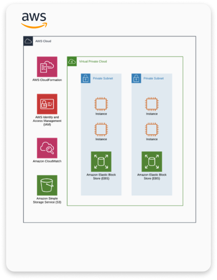
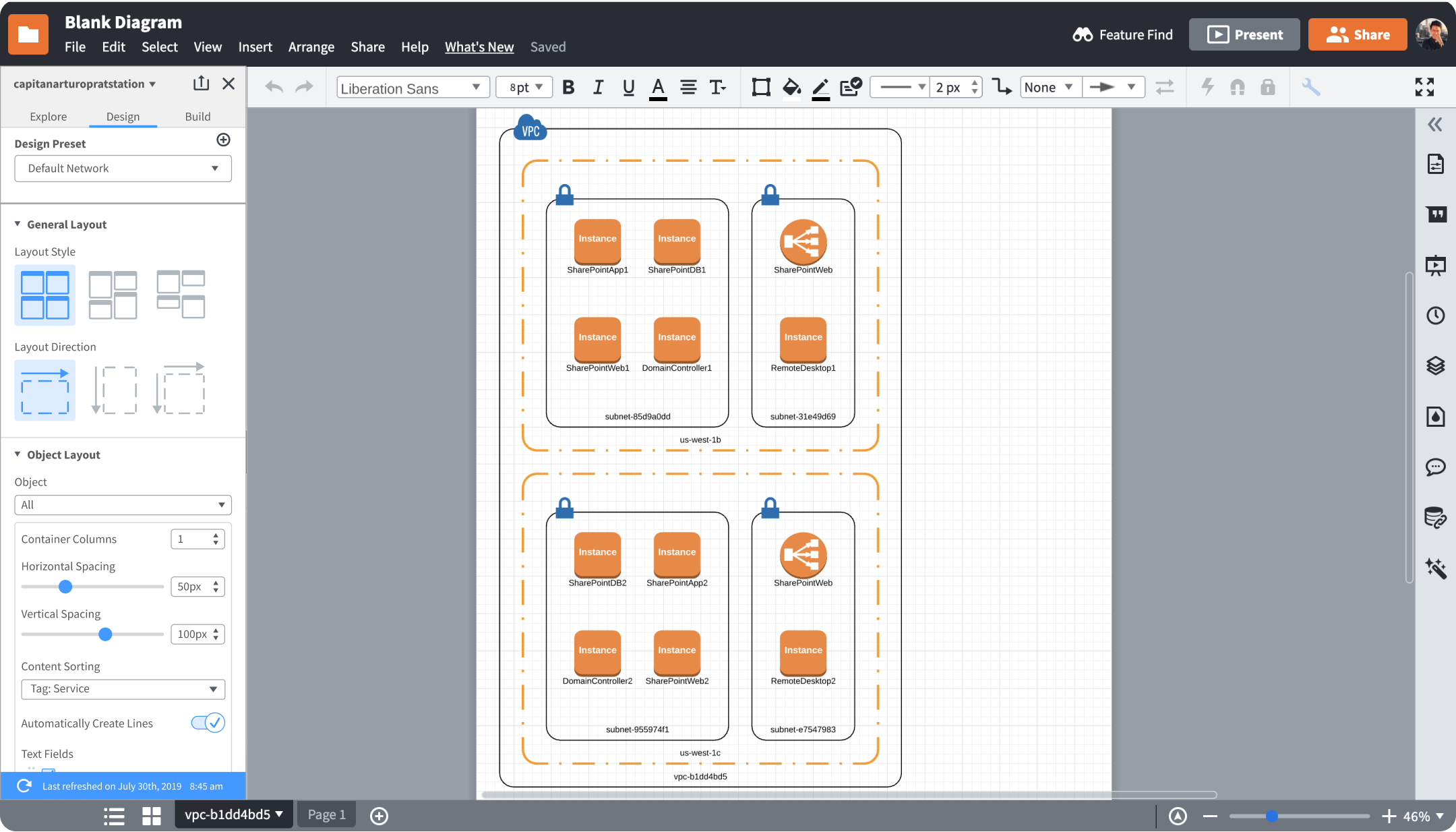
Visually manage clouds.
In the process of designing this feature, I also created two new base components necessary for a better user experience that was added into Lucid's design system.
More about the final design can be seen in the "Final Design" tab.
My Impact.
For this project, I was the sole designer on a scrum team working within a 2-week sprint cycle. My team consisted of myself, a product manager, five engineers, and a QA specialist. I was responsible for designing the experience around the import of Amazon Web Services (AWS) cloud architectures into Lucidchart, ranging from how users import the architecture and how they can interact with the diagram on the canvas.
The early metrics set for this project was a set number of users who would adopt the integration. Through sales tests and post-release data, CloudInsights far surpassed the metrics set before it.
The output of the project was the first version of Lucidchart’s CloudInsights, which now has an additional three teams dedicated to its success. It also led to two new components primarily focused for complex data-diagrams and was scaled into other integrations such as Salesforce or bambooHR.
This feature has since been extended to its own separate productL Lucidscale.
My Plan.
On starting this project, I took stock of what was already done and strategized my plan for designing this experience. Following the user flow for other integrations in the product, I split the design based on two factors to design for:

Though the process varied in some details throughout design, it ended up in the following stages:

Getting Started.
Hitting the ground, I had no idea how an AWS architecture worked. I was pretty lost in this extremely complicated world. So here's a short crash course as how I understood it.
To design for architecture diagrams, I had to first understand them. While conducting research, I also independently learned about AWS architectures and how they were structured.
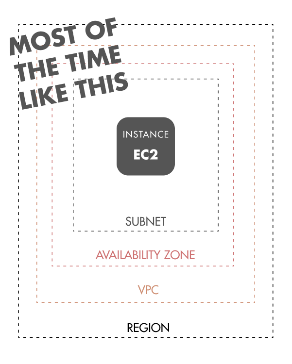
In short, clouds provide multiple services ranging from computing servers, deployment services, traffic distribution, and more. An entire system, from the moment a user enters a website and finally completes their goal, can exist on the cloud.
Cloud architectures are structured in a certain way, with some elements only allowed to live in some objects. For example, an EC2 must exist in a subnet, which exists in an availability zone, which is in a VPC, which is in a region. However, there are hundreds of different types of instances and each has their own special rules. Don’t worry, I hate it too.
Research.
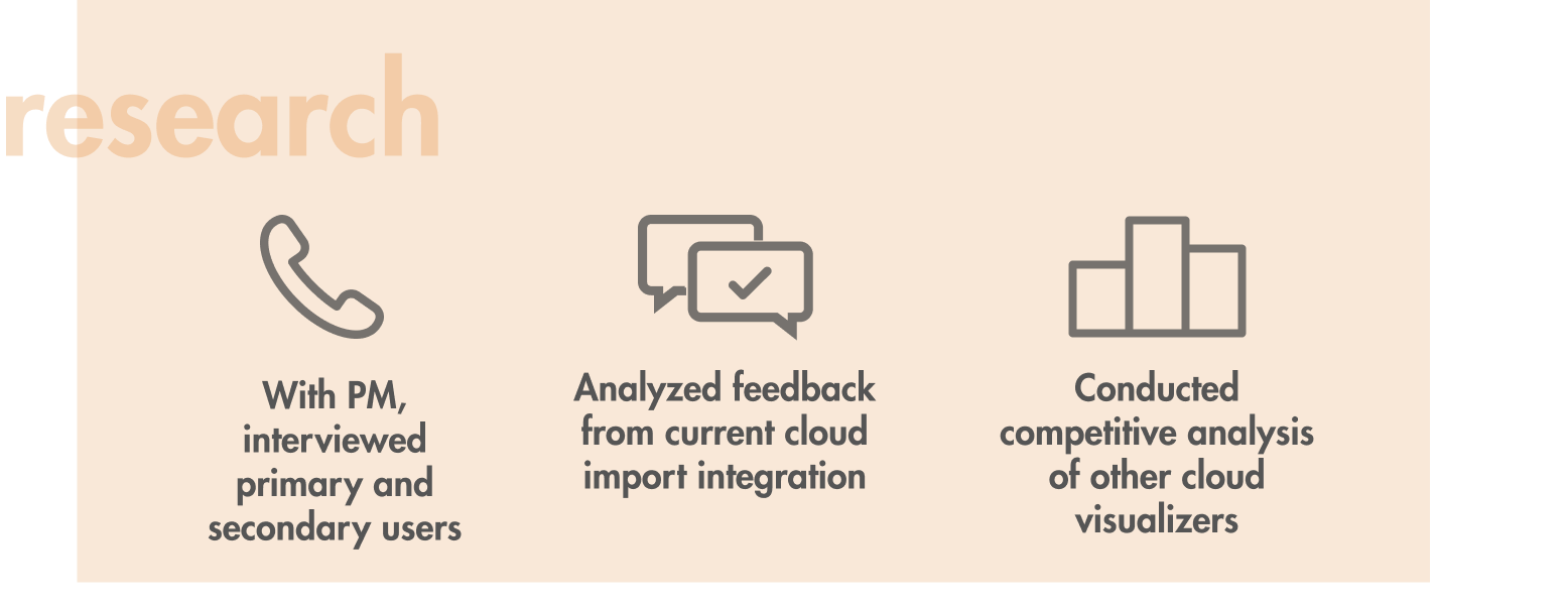
I first wanted to understand the problems with our primary users, hoping to understand the higher-level problems and motivations, while identifying key pain points in a DevOps personas job. Through this stage I conducted three types of research:
Competitive Analysis.
First off, I looked into the market to examine whether existing products efficiently help users visualize their architecture.

I found that:
- Services like Cloudcraft and CloudViz offered a way to import and visualize multiple accounts, but didn't have a way to see everything all together.
- Some lacked some of Lucidchart's base functionality such as collaboration or preview modes.
- Some allow users to customize how each element is displayed, but no way to quickly switch between customized options.
- Most services only offered the ability to make a diagram and export it as an image.
With this information, I knew no other competitor had a holistic offering and also that our design should include the ability to import multiple accounts and customize views in order to surpass competitors.
Interviews & Affinity Diagramming.
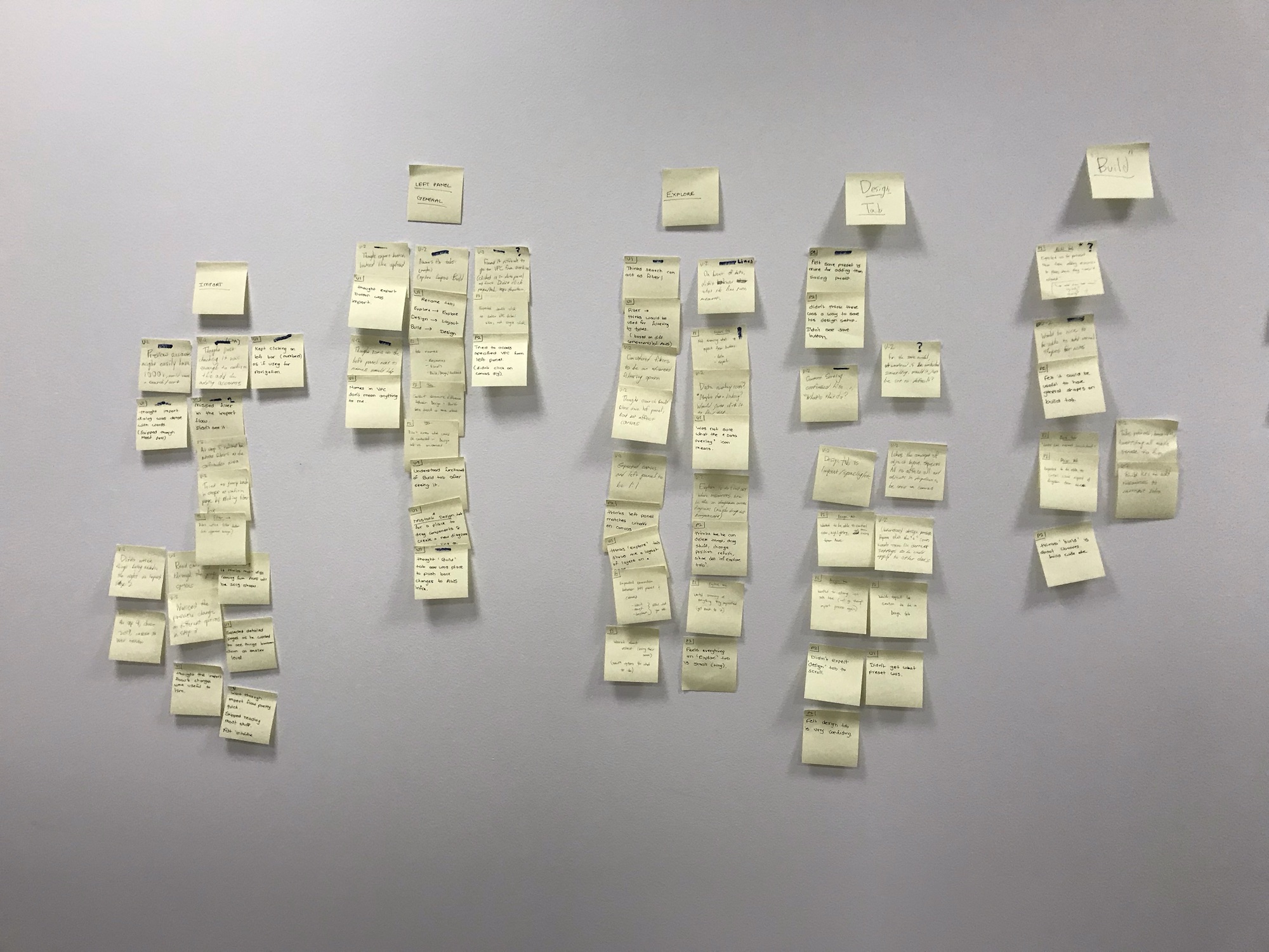
Through out the process of competitive analysis, I also conducted 20+ interviews with real users along side my PM. The goals were to identify their "jobs to be done", needs, pain points, and goals.
With this I conducted affinity diagramming to summarize our research.
From this, some key problems surfaced:
Multiple Programs for Management.
Users often end up using 3-4 programs to manage architecture. Some to document, manage costs, simulating changes, or to see the current status.
"Hacky" Methods.
For more customization, some users would paste different account views on top of each other to get it all on one screen.
Long and Tedious.
Cloud Architecture can be huge, extending to thousands of objects. Creating or manually correcting one can take hours.
Repetitive.
Every time a change is made to the architecture, a diagram must be updated and new documentation must be generated.
Wide Audience.
As well as creating a full picture of the architecture, architects must also create views to communicate changes to both engineers and directors, each with different goals.
There also was valuable information regarding user workflows, motivations, and more that was helpful in building out our personas and fueling our design thinking.
Personas.
From synthesizing the research I generated three personas, two who were primary users and one who was secondary. These personas were posted up at every table in the scrum team to ensure we were focused on our user.
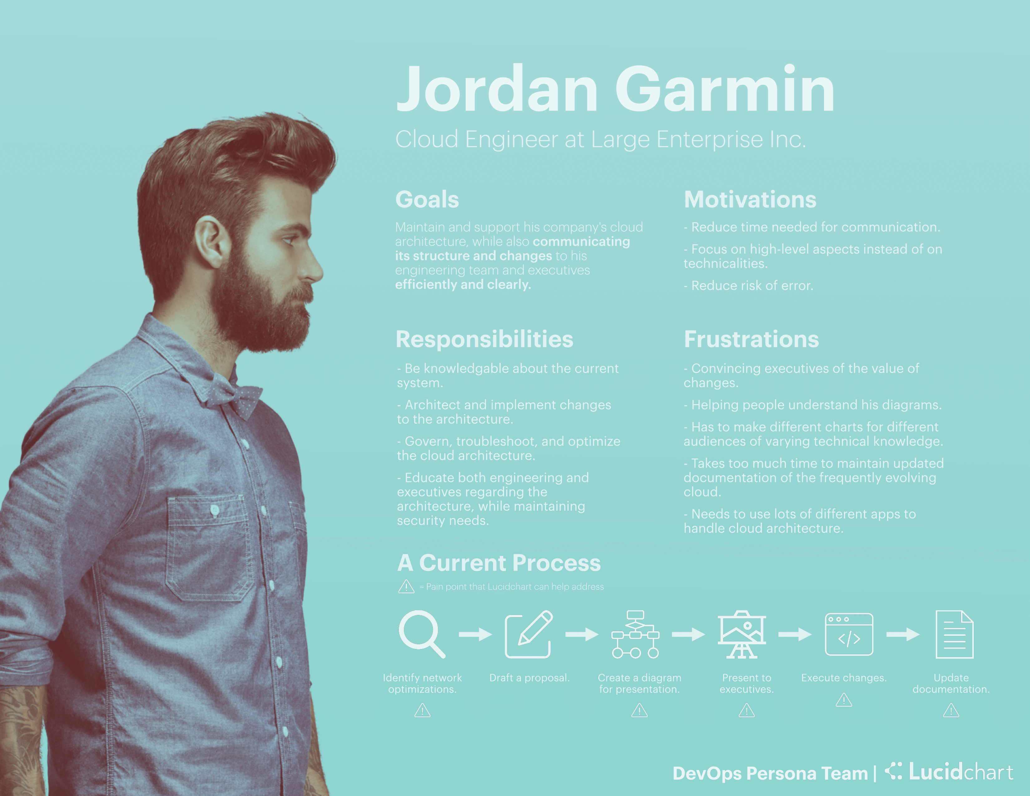
The Cloud Engineer
Directly responsible for his company’s cloud, Jordan governs and makes changes to his cloud while communicating changes to other engineers and executives clearly and efficiently. He wants to keep errors low and everything clearly documented. Some jobs to be done (JTBD) include creating diagrams for presentations, analyzing the current infrastructure, and updating documentation.
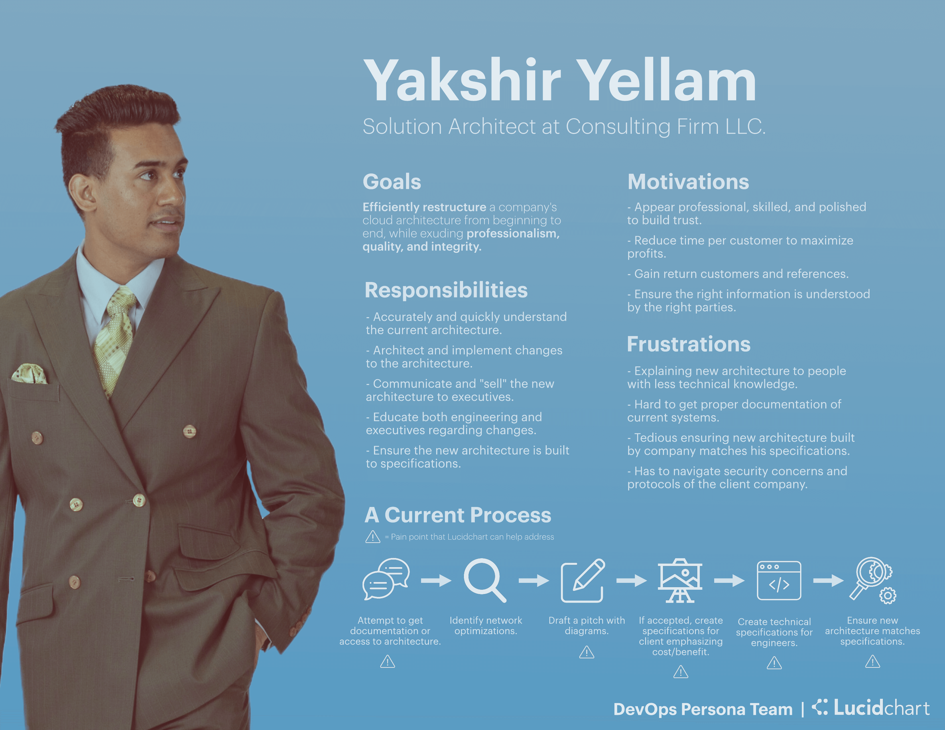
The Solution Architect
Yakshir works at a consulting firm for building and optimizing companies’ clouds. While exuding professionalism and quality, he wants to efficiently restructure a cloud with proper documentation so it can be handed off easily. Some JTBD include quickly understanding the architecture, drafting and visualizing changes, and ensuring that changes match specifications.
The IT Director
Ryan doesn’t directly interact with the cloud, but he knows the importance of it and what tools best help his company. He’s primarily responsible if his company picks up a new tool or not. If so, transitions need to be smooth and benefits need to far outweigh the costs.

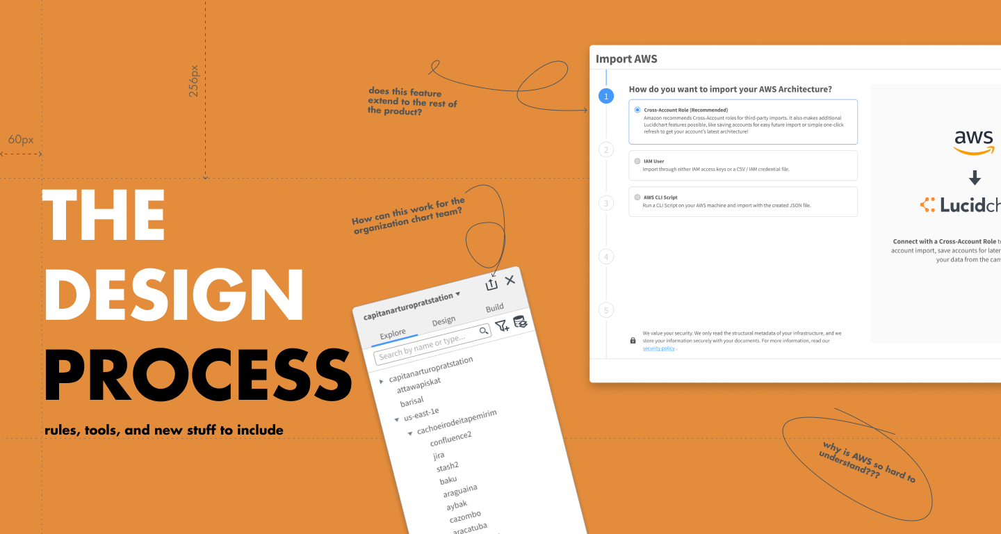
Design.
Brainstorming.
Building off the research I worked with my PM to imagine how we could re-engineer our user's approach entirely.
I lead this conversation by focusing on the entire current user journey and looking deeper at other applications that our users used. My goal was to see how Lucidchart could become the single solution for their needs.
This lead to our solution: an end-to-end flow where users could build, monitor, and present all from Lucidchart.
Based on the flow, I worked with my PM and came up with a number of high-level features or capabilities. To further understand these features, I went through this flow in treating out how these features would behave and act:

Using this model and working with the PM and the team tech lead to see what was feasible, I built out the core functionality of this integration:
Prototype.
Using Lucid's design system, I implemented the features in a prototype, which my PM took on sales tests to see whether this cohesive experience appealed to users. Through these tests, CloudInsights was projected to surpass its adoption metrics.
With all the features designed out, the project was complete. Or so I thought.
In testing with actual users, problems arose, particularly around two areas: the import flow and the left panel.
Users found the import flow dense and difficult to understand, with it lacking information and also producing diagrams they didn't expect, leading users to redo the flow again and again. The left panel also had issues, with users having difficulty finding tools and not even exploring the menus to see the options available to them.
To provide the best possible users experience, these components had to be redesigned, yet also work when extended across the product.
Challenge #1: The Import Flow.
The Problem.
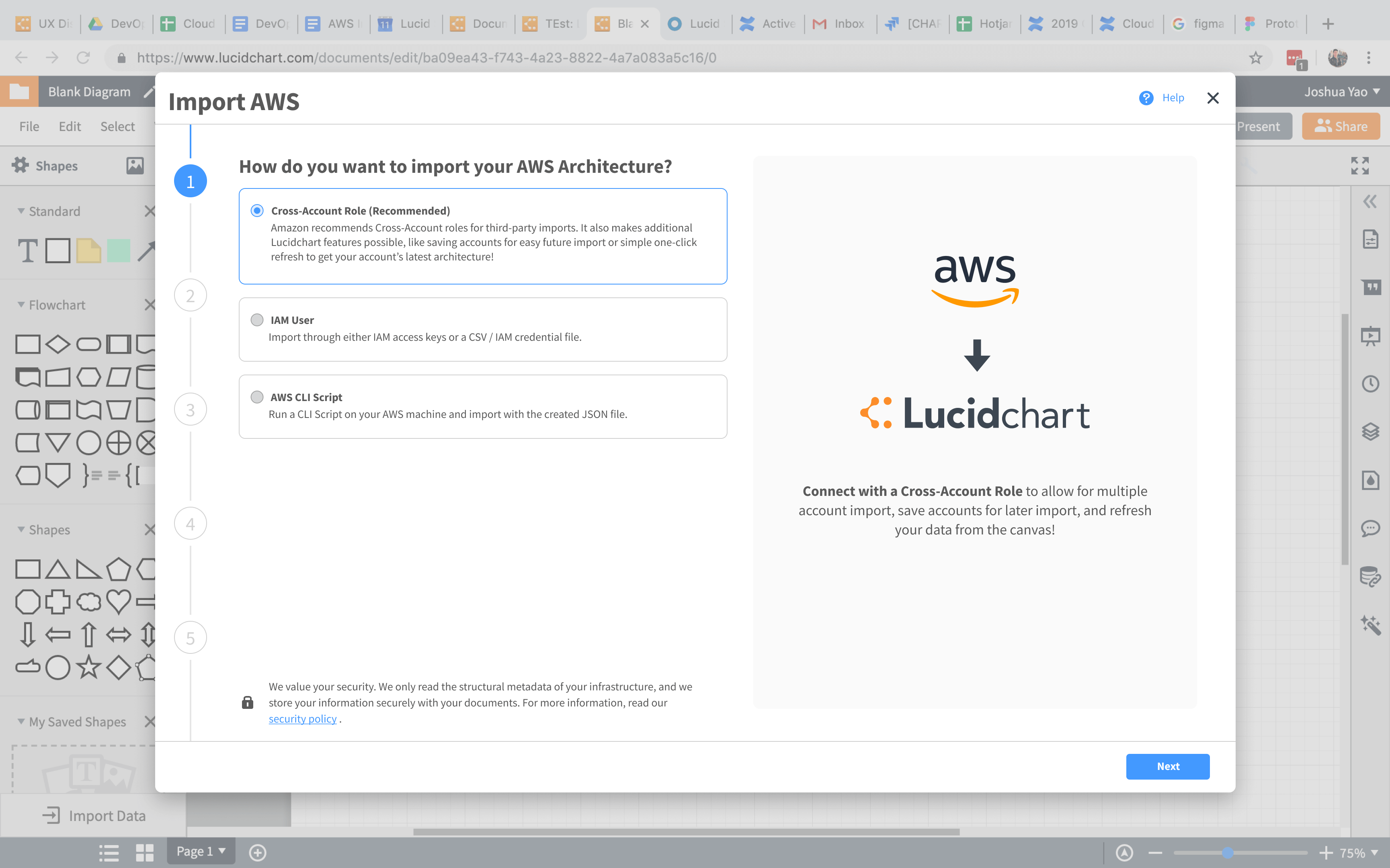
The current import flow allowed for users to import their account through three different methods, choose a few options, and get it on the canvas.
However, in order to offer a more robust experience, the new import flow would have to manage this:
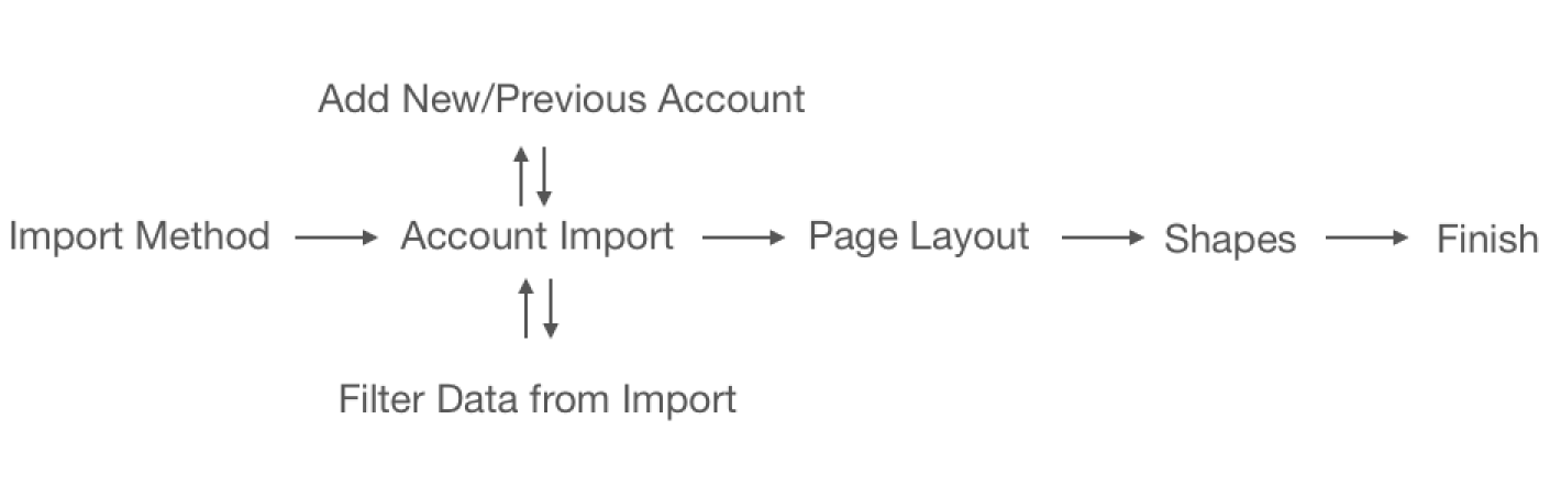
The reason for this far more complex flow was due to user needs and also experience design decisions:
Multiple Accounts
Being able to import multiple accounts is essential, as many users often have a single cloud spanning across multiple AWS accounts, but need to be able to see everything on one screen.
Filtering Data
Despite the security of our product, a small portion of our users would need to keep some data regarding their architecture removed from import. We wanted to meet the needs of these users and provide that ability, instead of forcing them to manually diagram their architecture due to requirements.
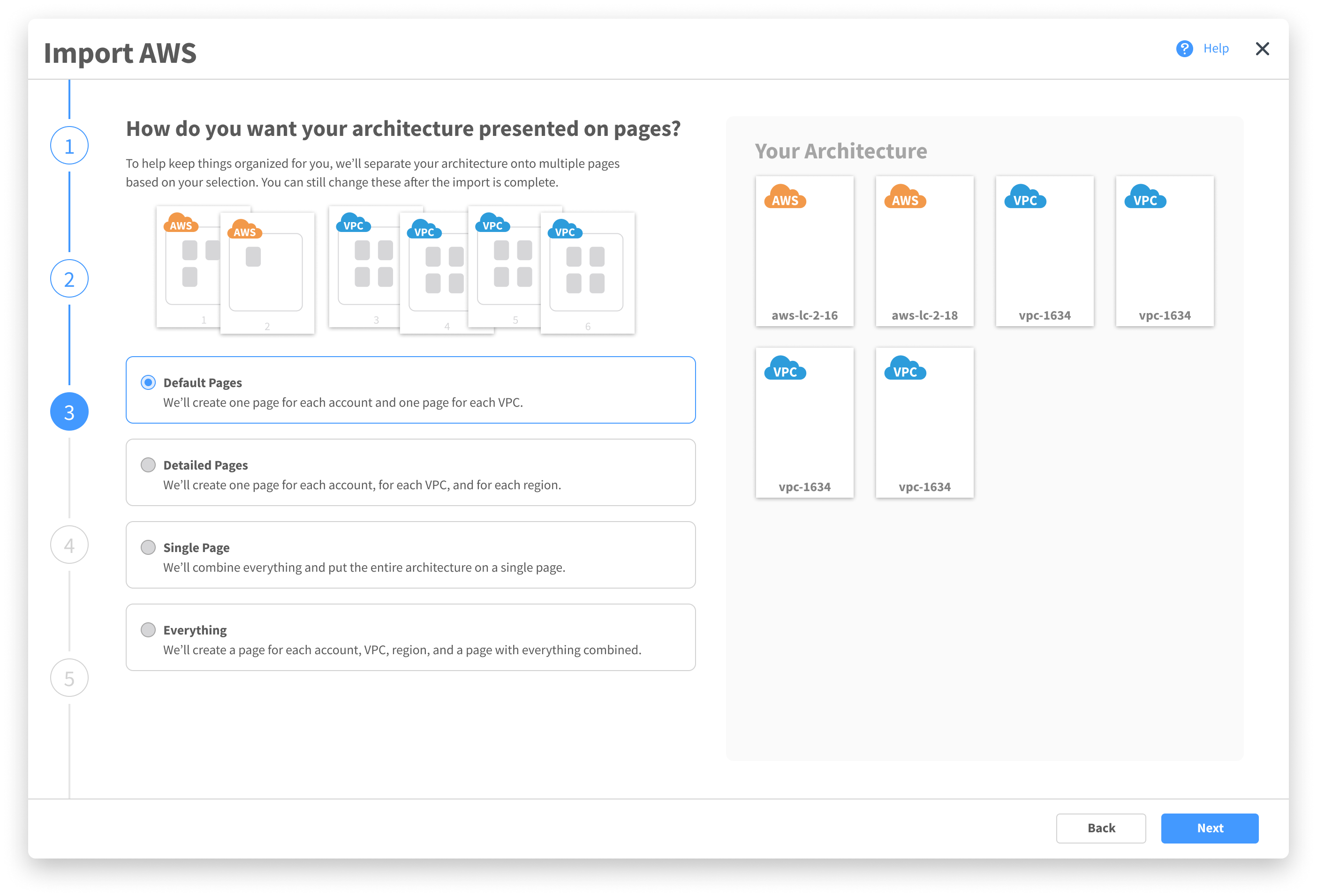
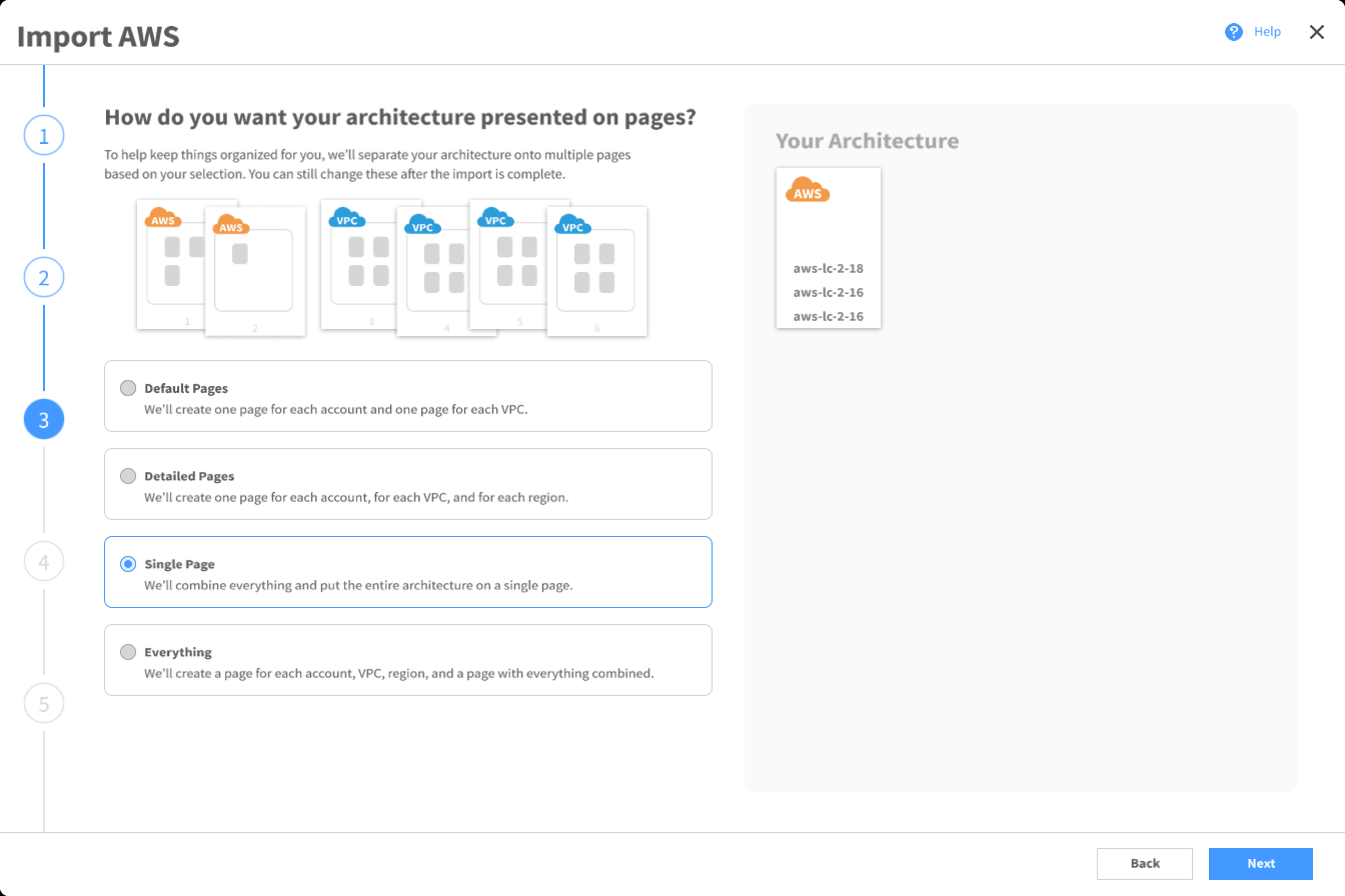
Page Layout
We found that if users weren’t happy with how things were automatically laid out, they often found it easier to restart from scratch rather than move everything around. By enabling more flexibility in the final layout, we could ensure a better user experience all-around.
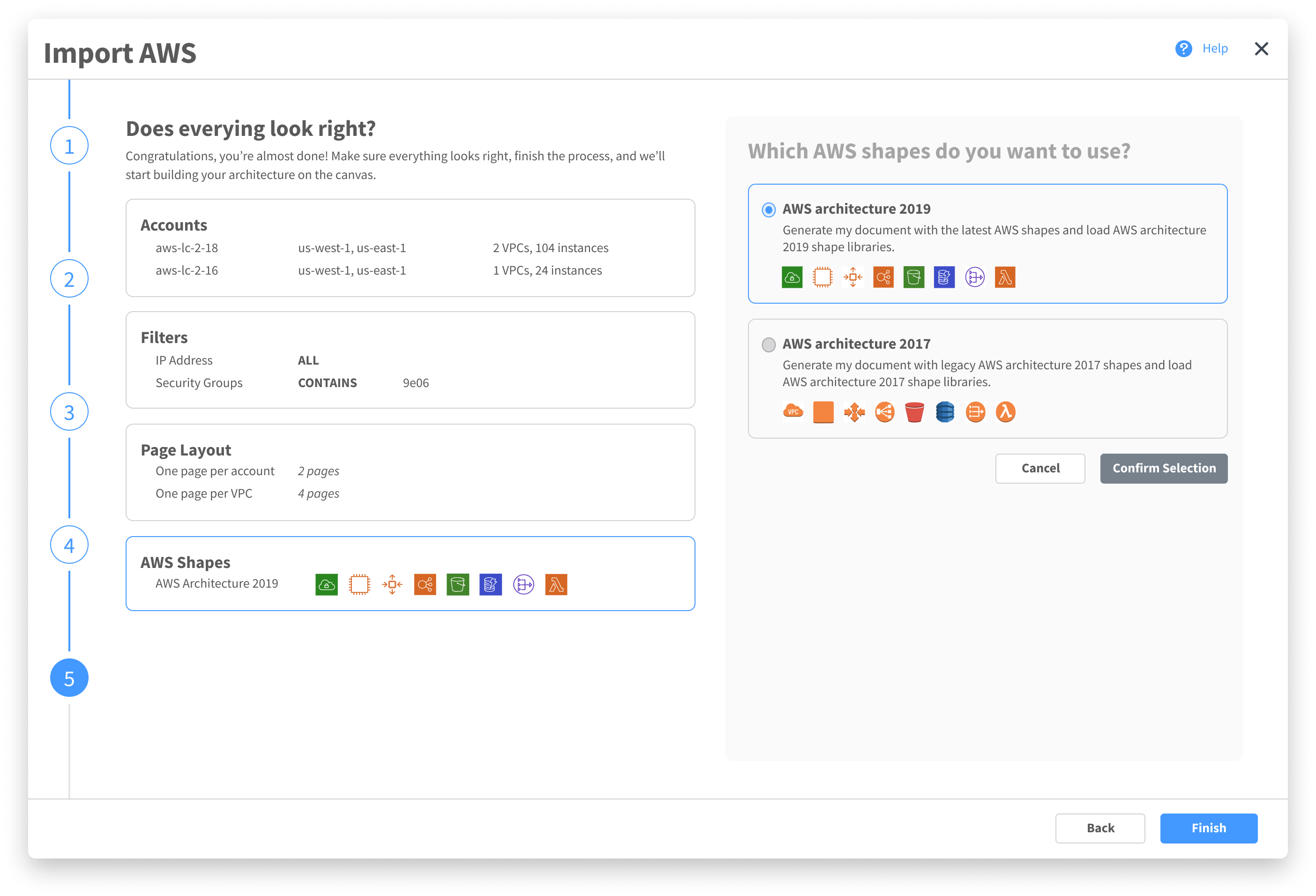
Shapes
AWS comes out with new shapes to represent their instances rather frequently. Unfortunately, not all users like to represent their diagrams with newer shapes, some preferring the older skeuomorphic designs.
With the pre-existing component and to maintain consistency across the product, a tried to fit this new flow in the current import modal.
Explorations.
I created multiple versions in the import modal, each with a different approach, and tested them with both users, my scrum team, and the UX team. Each one ran into problems.

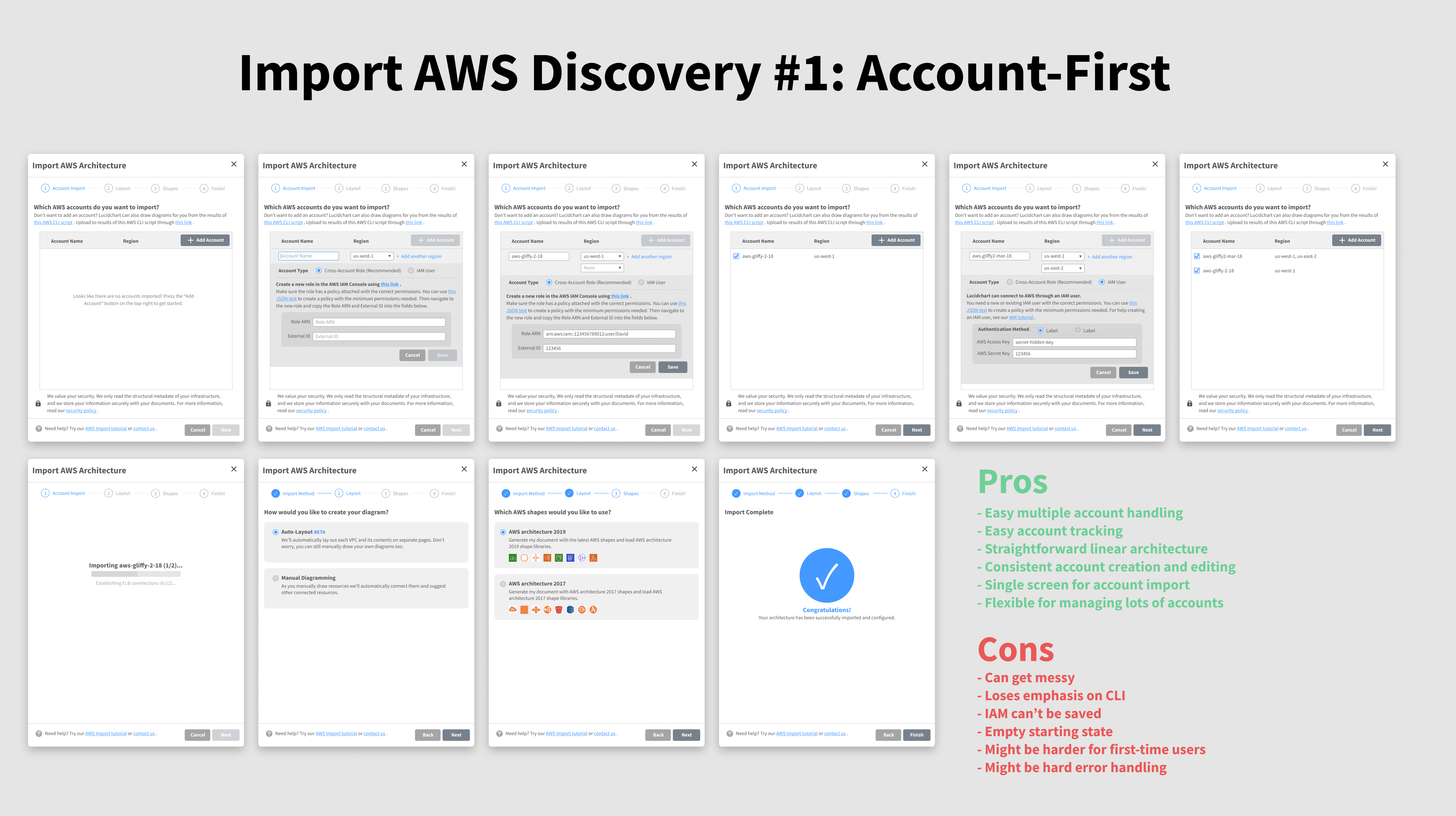
Uses dropdowns to add multiple accounts. It gets messy fast, and has poor support for one of the three possible import types, IAM role. Also, the density made it hard for new users to understand what to do.
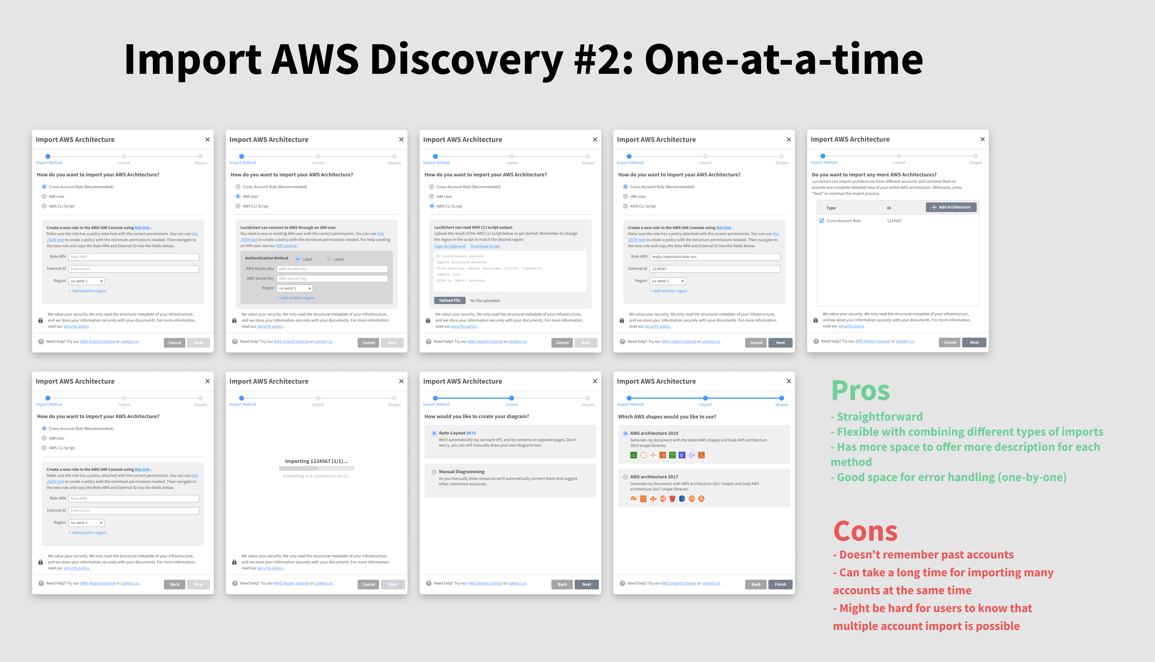
Has users import accounts one at a time. Straightforward but takes an extremely long time, especially with a user could be importing five or more accounts. Visibility on the ability to import multiple accounts is poor as well.


Focuses on cross-account roles, the most popular import type. Has lots of potential in a more fluid flow, but also is hard for the user to understand that they’re adding accounts to a queue due to poor visibility.
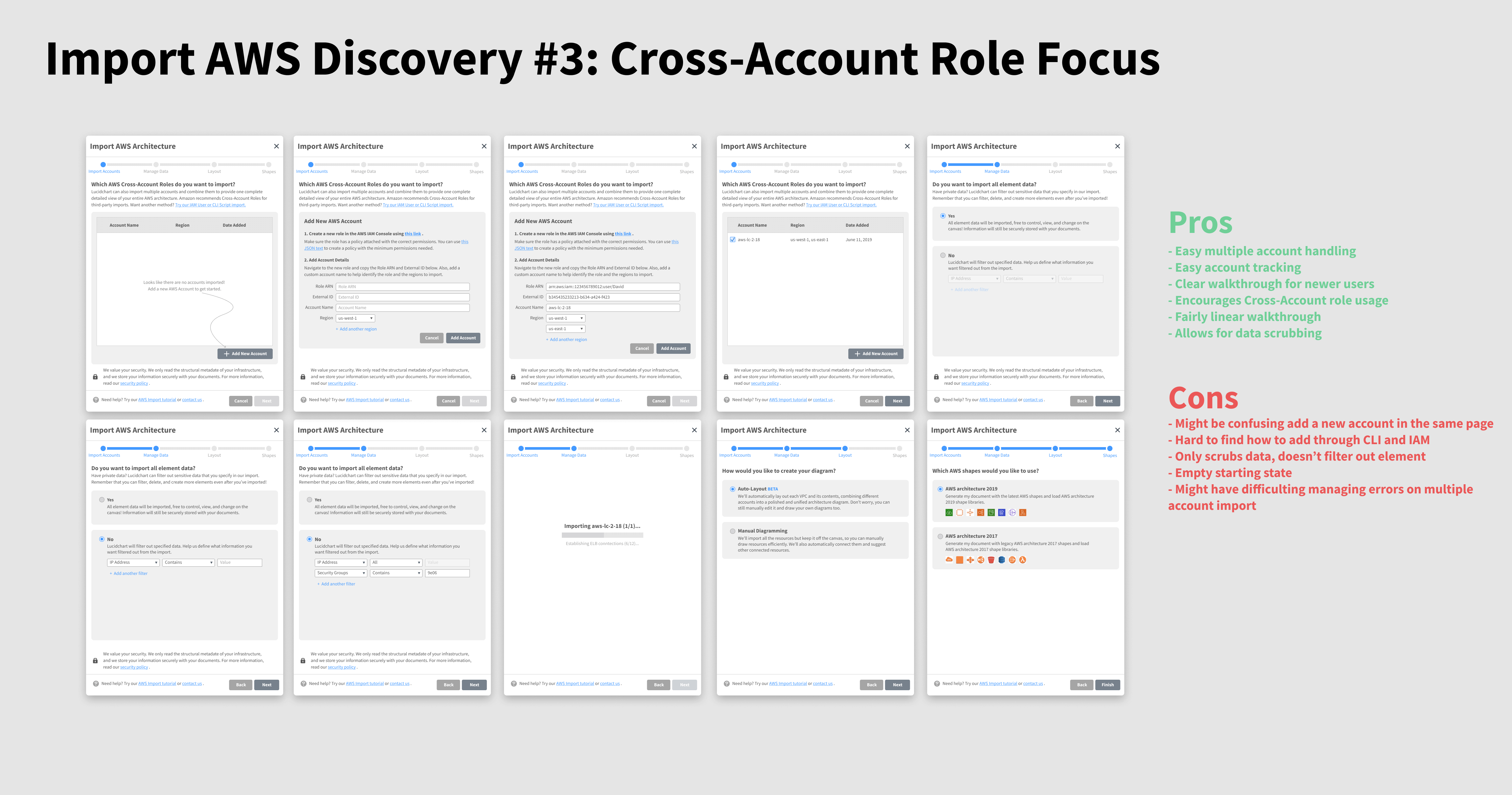
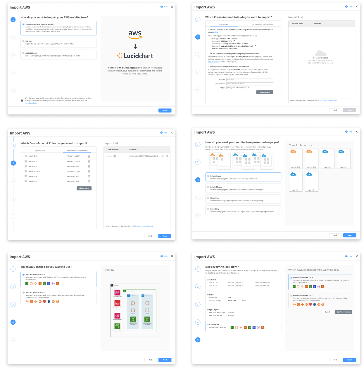
Building on the feedback from the testing, I combined strengths of each concept into one design.
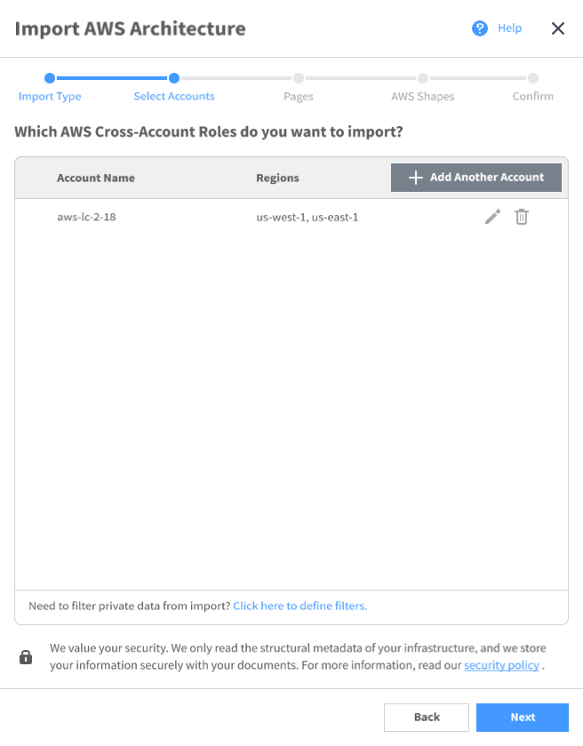
In the next iteration, I created a version that leverages motion to communicate states to the user. It performed better, but there still was confusion caused due to all the screen switching.
These iterations trying to fit it in this modal but constantly ran into problems in testing: mainly around users getting confused, losing place of where they are, or the output of the import not being what they expected.
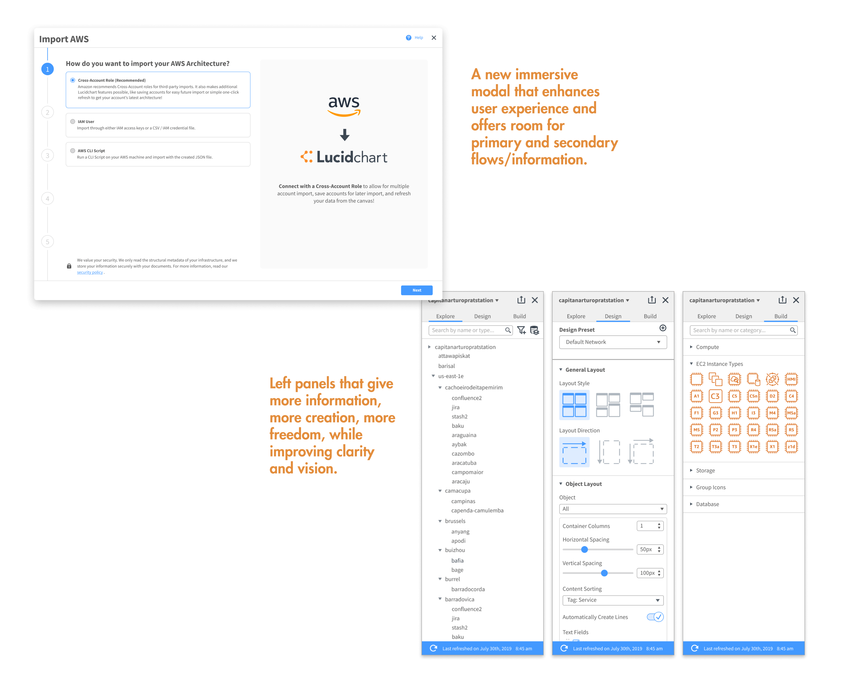
I also noticed a number of issues with the modal itself, primarily in the small size not providing an immersive experience, no progress trackers, poor navigation for long flows, and lack of supporting information.
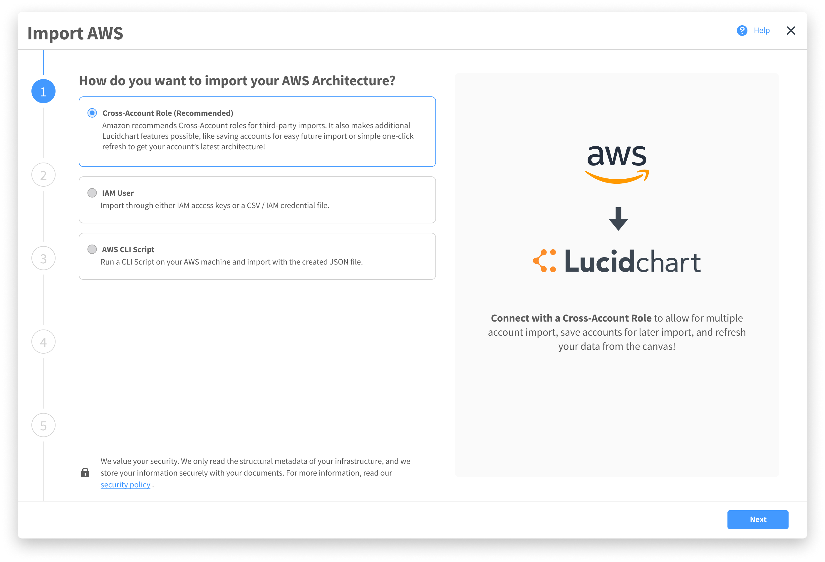
Rethinking the Modal.
Bring the issue up with leadership, I was asked to rethink the import modal. Moving back to scratch, I explored more on the purpose of modals, how they’re used across the product, and best practices:
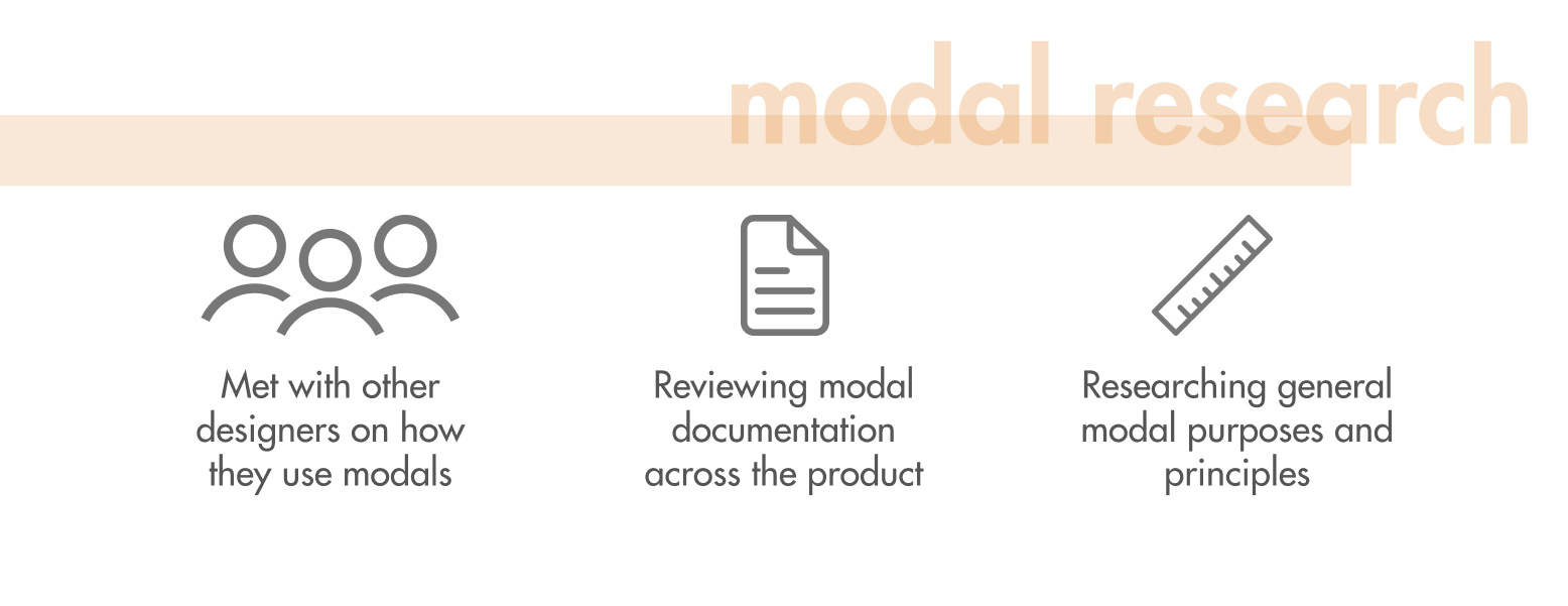
From this, I developed a list of overarching modal principles that would guide me as I designed a new import modal to house the AWS import flow.

Attention
Modals demand the user’s full attention and should be engaging to warrant it.

Functionality
The goal is to get the user’s data reflected on the canvas accurately, and each step should reflect its purpose for this to the user.

Efficiency
Users shouldn’t feel dragged down by the modals. It should reflect progress and efficiency.

Security
The user should feel an assurance that their choices are recorded and that they aren’t losing anything, either in choice or what’s currently on the canvas.

Informative
Offers all the information a user needs at a moment, but not more than they need.

Flexible
Works across the product in different contexts.
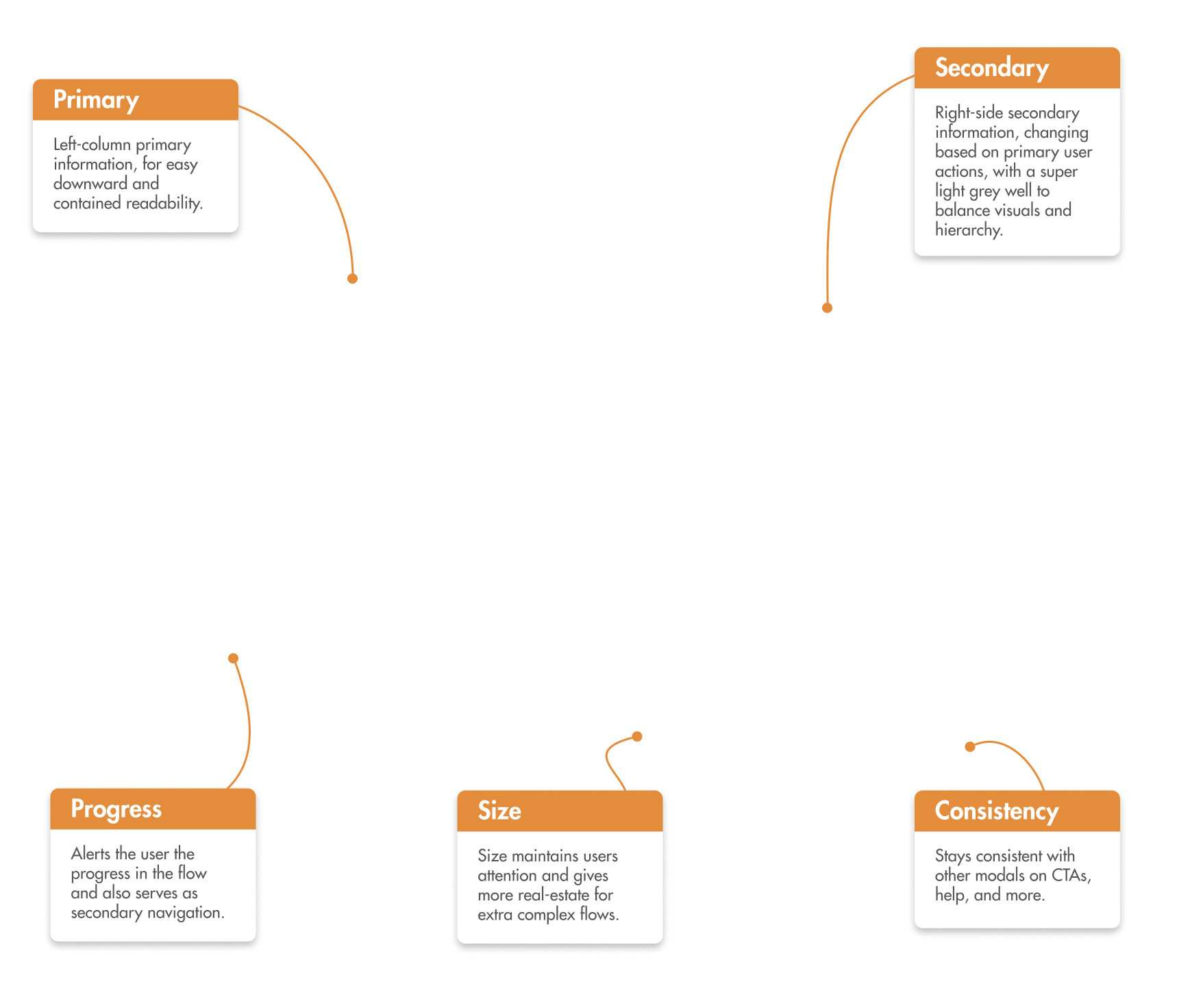
Through this exploration, I created a new modal that was built on the current small import modal and the principles.
- Twice the width of the old import modal.
- Left half for primary interactions, right half for secondary flows or supporting information.
- Modal to ensure the canvas is still safe, but large enough to demand full attention.
- Left vertical progress bar that doubles as navigation.
Due to this extension of the old design, I was able to cleanly implement my previous import flow design into it. I tested the flow in this new modal and it performed far better.
Overall, the design of this import flow performed extremely well amongst users and also impacted the product by giving a place to offer more informative and cohesive complex experiences within Lucidchart. This modal was added to the design system and extended to other parts of the product.
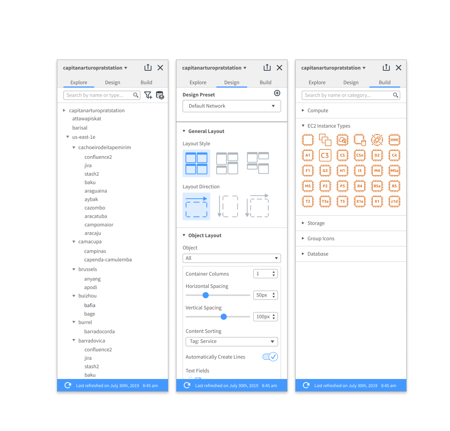
Challenge #2: The Left Panel.
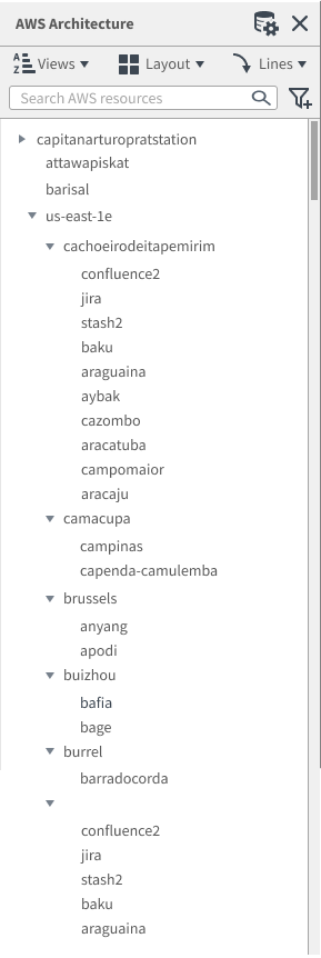
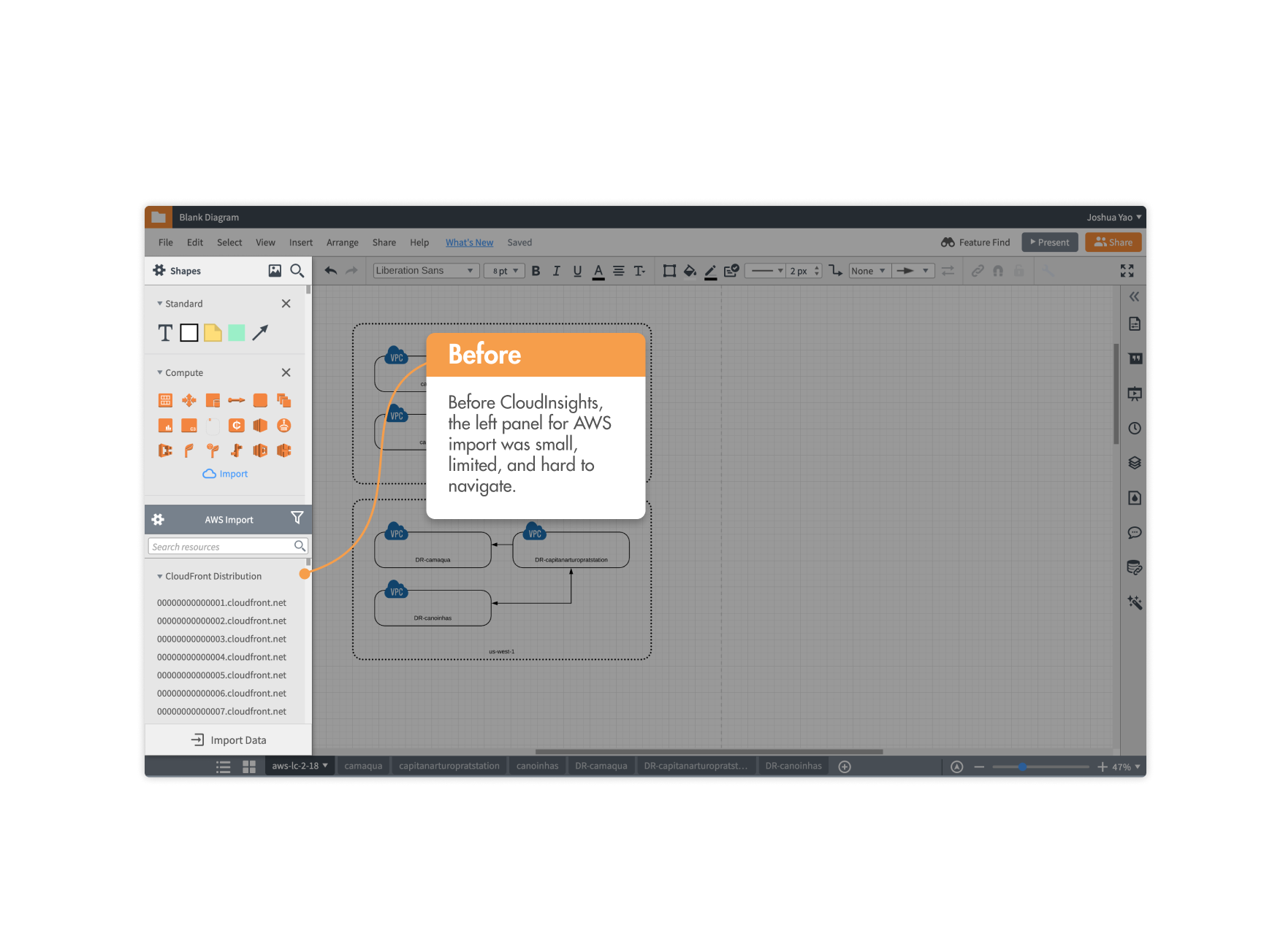
Upon importing their architecture into Lucidchart, users previously would be greeted with the diagram on the canvas, with the default left panel being overlapped by this new left panel to edit the architecture.
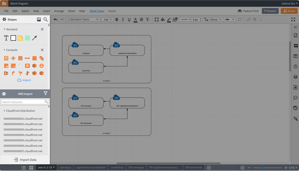
In Lucidchart, the left panel is the primary interaction point where users can drag shapes onto their canvas. If they’re interacting with a complex data-linked shape, like an organization chart, the left panel transforms for manipulating the shape.
The Problem.
The new AWS architecture import needed its own left panel. This left panel would be the point where users could control their diagram.
Following the structure of the left panel from other integrations, I attempted to make one that would serve the needs of CloudInsights.
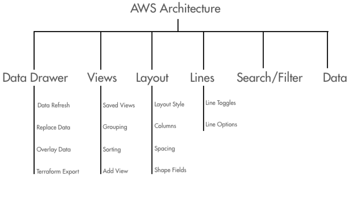
As I was building it out, however, I noticed that the given menus became jumbled and messy. With multiple functionalities, menus became just drawers where features were stuffed in for convenience. This is what the current information architecture of the left panel looked like.
Exploration.
I worked through this information architecture and conducted card sorting sessions with users.
With features sorted by purposes or intents rather than function, it became clearer and offered a cleaner user flow based on their goals. With the expanded set of features that allows for multiple flows and goals, it made sense for features to be sorted by that criteria.
However, this separation could not exist in just menus. Detailed interactions and supporting different cognitive states were necessary and required a deeper experience than dropdown menus.
Again, I established design principles for the left panel through meeting with other designers and establishing high-level purposes of the left panel.

Goal-Oriented
Since users come in to accomplish certain high-level goals, features should be organized by goals.
Functionality
The left panel should bring functionality and match 1:1 with what users see on the canvas.

Structured
Actions relevant to a goal should live under it. Higher level tasks spanning multiple goals lie higher.
Informative
The state of the panel should reflect where the user is, and aid in further navigation.
Flexible
Must be capable of meeting the demands of other parts of the product ecosystem.
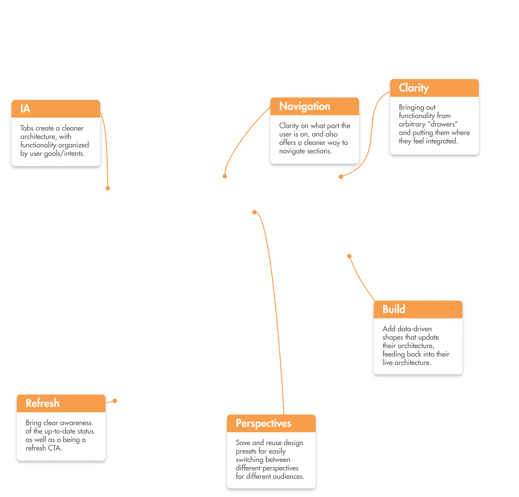
I began exploring and moved towards tabs as it closely matched the principles, resulting in the birth of the tabbed left panel.
This underwent lots of iterations while I worked with other designers and my PM at Lucid, as well as testing with users.
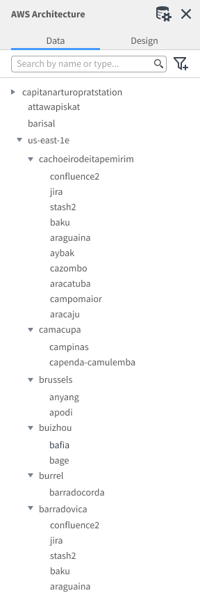
It began with two tabs, but users found the “Design” tab confusing and split in purposes. They also found it hard to accomplish higher level goals, such as refreshing their architecture. However, the tab structure made what was presented much cleaner and easier to find tools.
With three tabs, users found it a little easier to grasp the goal of each tab, but still had difficulty in using the left panel as navigation through pages of their diagram, along with some icon ambiguity.
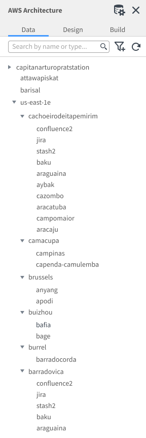
In the final iteration, the refresh was a banner that offered more information. It also was able to switch through high-level containers, such as accounts, through the top title bar.
Final Iteration.
The final iteration was one that held up extremely well under testing, where all users were able to accomplish all of their goals. Working with other teams across the product, it was also easy to apply it to their use cases.
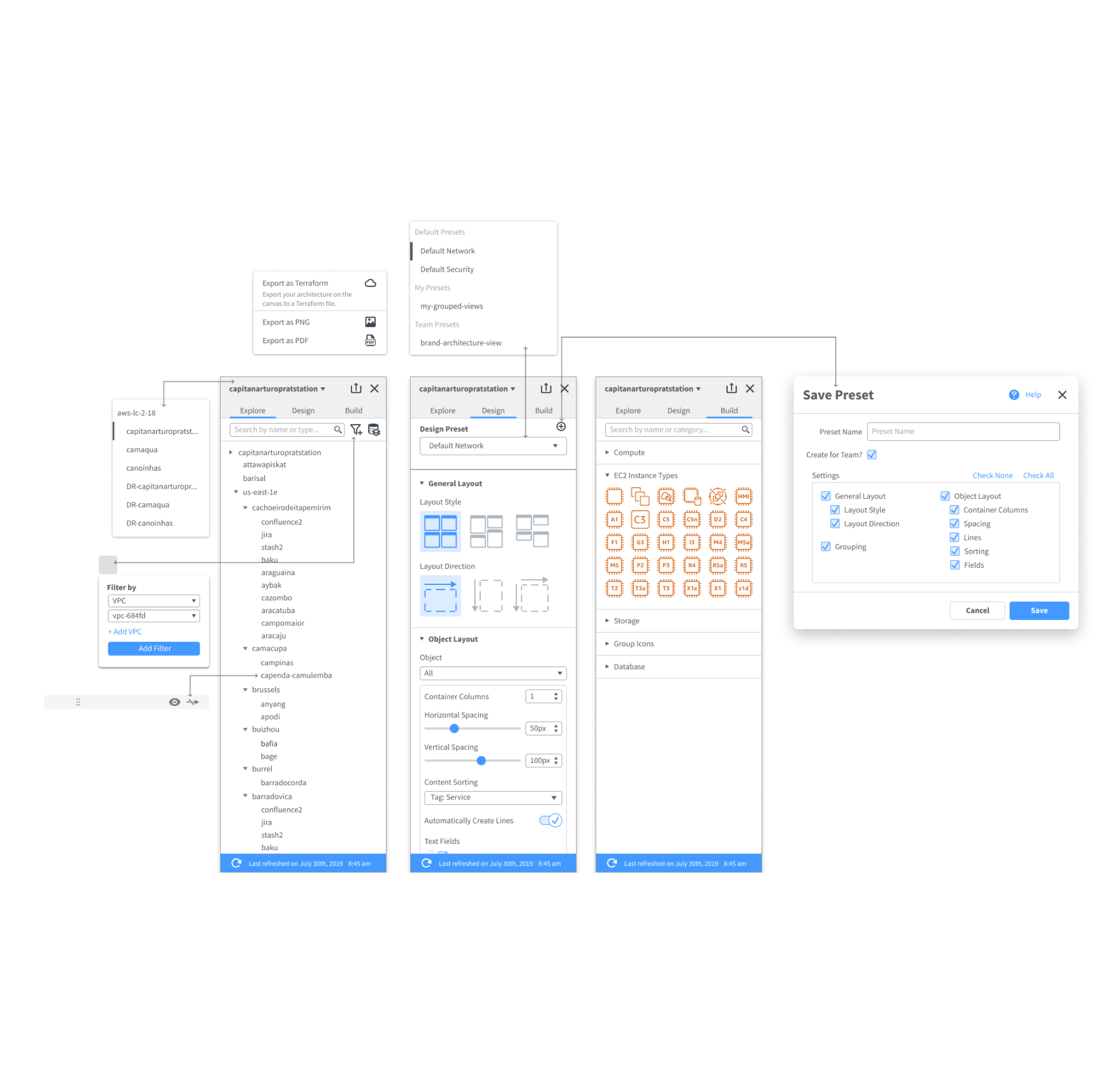
The end result was a more powerful “task-oriented” panel that presents information through user discovery and allows for “Perspectives”. This left panel was added to the design system and extended to other parts of the product.
Bringing it Back.
With the design of the new import modal and left panel, I was able to work with my team to design the AWS import experience, as well as add value to the rest of the company. CloudInsights surpassed its metric goals in user adoption and continues to grow.
I learned a lot during my time here in how to work in a fast-paced environment, and take initiative and ownership in design. I also learned to think more holistically regarding the company on how things can extend or remain consistent with the rest of the product.
CloudInsights has since then been released on Lucidchart, and has expanded to include multiple teams to support it.
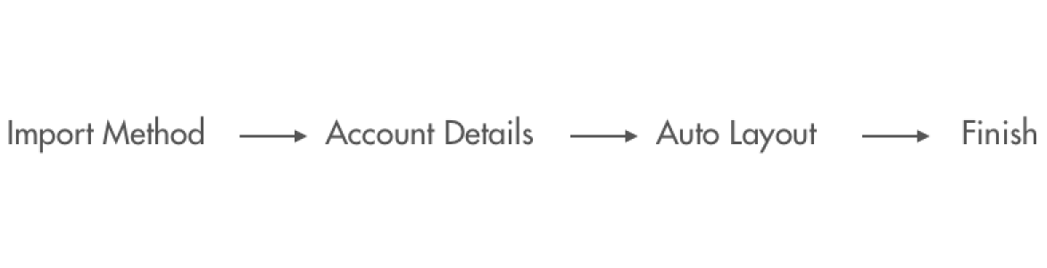
Import Flow.

The Flow.
Lots of ways to import, but each comes with different capabilities. Education for each option is invaluable.
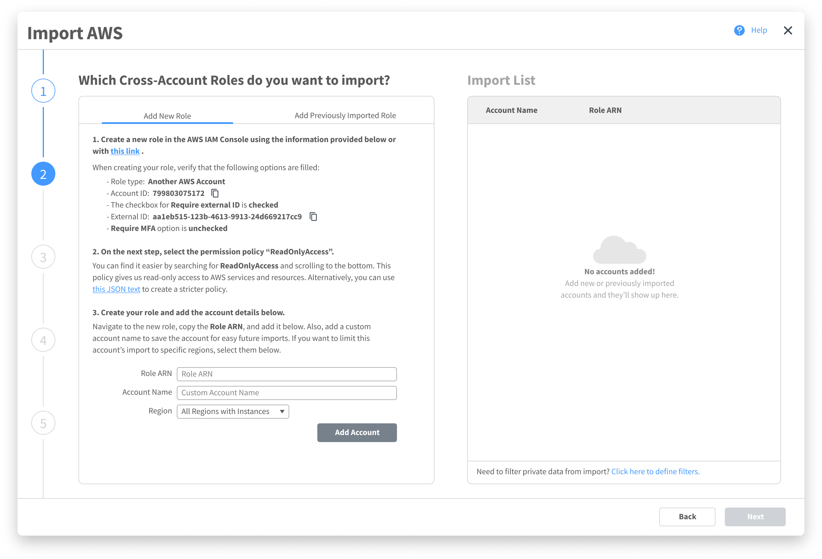
An advanced step that allows for multiple account add, previous accounts, filters, and supporting information.
Choosing how the architecture is laid out with instant feedback gives users control and delight.
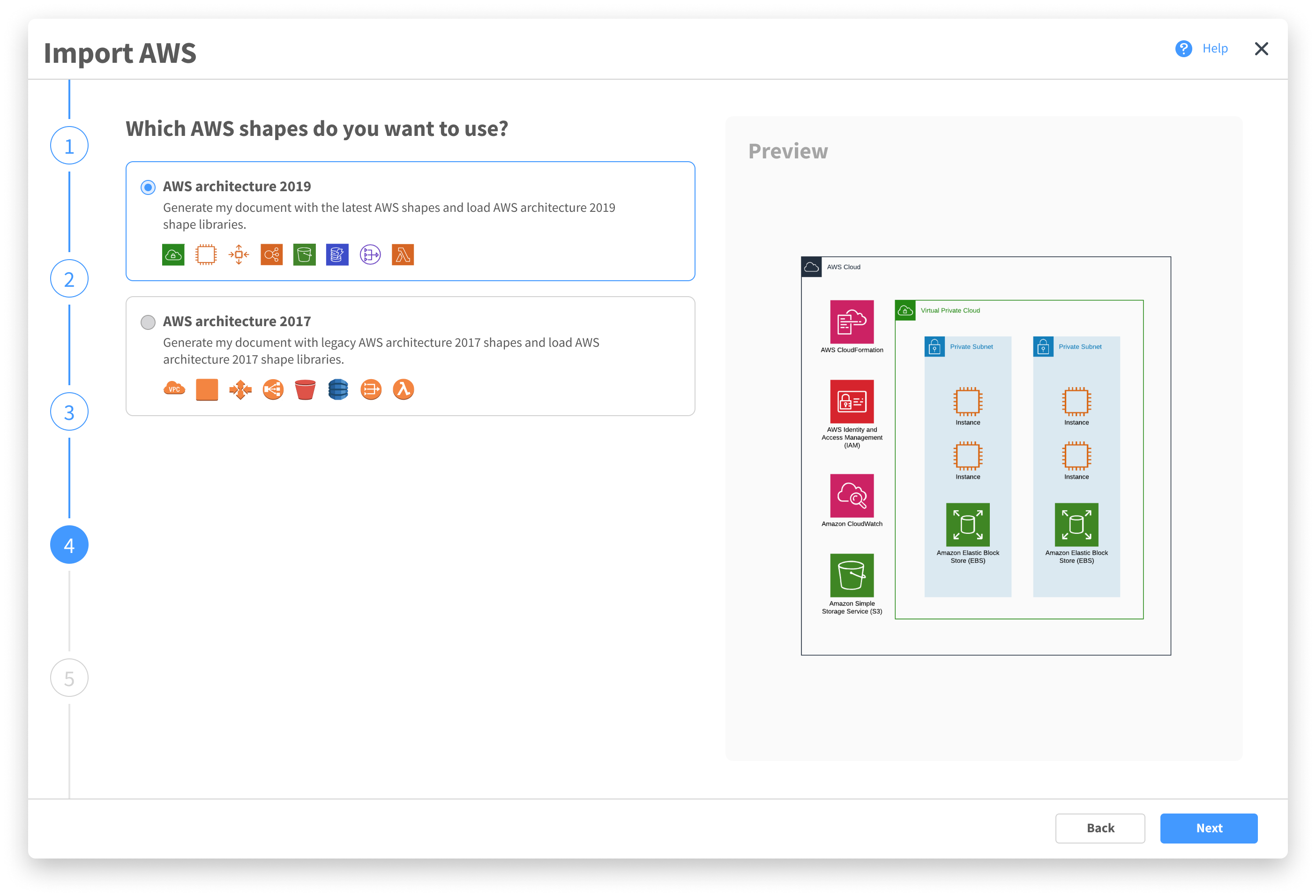
Helping users select their visual preference, while also letting them see exactly what that entails replaces frustration with delight and discovery.
A final summary page with an easy way to make minute corrections quickly.
Motion Design.

Left Panel.

Final Note.
My experience in designing for Lucidchart was extremely fun and extremely demanding. While working on this product, I became aware of the importance of not designing in a bubble, but including other parts of the company as well, even if their features seem unrelated at first.
One of the most important lessons I learned was that taking the initiative and involving users and others earlier usually results in better results, something I will be sure to do in the future.
This design is now available to use on Lucidchart.
As of November 2021, this feature has been extended to its own product: Lucidscale.